Download
1 / 22
230 likes | 397 Views
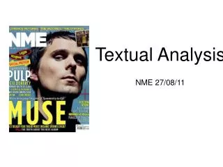
TEXTUAL ANALYSIS. METAL HAMMER & KERRANG! Georgia Wilson. METAL HAMMER. Publisher; Future Publishing Editor; Alexander Milas Circulation; 52,272 Readership; 137,427 Mission statement

E N D
TEXTUAL ANALYSIS • METAL HAMMER & KERRANG! • Georgia Wilson
METAL HAMMER Publisher; Future Publishing Editor; Alexander Milas Circulation; 52,272 Readership; 137,427 Mission statement Metal Hammer is the UK's market-leading monthly hardcore rock magazine. It is also the only music magazine that covers traditional and nu-metal bands, punk, hardcore and gothic rock. Metal Hammer's aim is to satisfy fans of established, traditional metal bands as well as to break new artists and to keep readers informed of everything happening in the world of metal. Reader profile85% maleAverage Age 22. Average Income £30,722. The vanguard of the rock and metal movement. First to know about new music, and advise their friends on what to buy. Spend at least three hours reading each issue. Spend on average £112 each per month on music, tickets and merchandise - equating to £138m per year. Future publishing Other magazines: Guitar Techniques. Guitar World (US). Guitarist. Guitarist (Australia). Metal Hammer. Revolver (US). Rhythm. Total Guitar. Classic Rock. Classic Rock Prog. Computer. Music. Future Music. Guitar Aficionado (US). Guitar Legends (US).
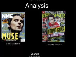
Front cover; The front cover is two dark colours and two lighter colours that stands out, black, red, silver and white, this is quite common for the genre of the magazine, which will appeal to the audience, as metal and hardcore music in some eyes are associated with darkness, death and the devil. Black and red are usually associated with negativity and darkness but they are colours that go, they look neat and colours such as red could symbolise passion for the music. The white makes the text stand out and the white text is sometimes covered by something such as the main image over the title and the red banner over the main cover line, this could suggest that as white may suggest purity, that purity is behind the magazine, in the past and this is now. Finally there is a shiny silver colour, as it is the 25th anniversary special, the silver suggests a sense of value and importance which appeals to the audience as it is an important issue. Contents page; The colour scheme is constant throughout the magazine which is neat and professional looking, the colours are not over powering and they’re not boring either. There are a few more colourful pictures in the contents page which lightens the mood that the other colours bring. The use of these colourful pictures are to make the contents page more interesting and makes the reader want to read on. Double page spread; Again, the double page spread is red, white and black. The black and white could symbolise Cliff Burton’s past, the main focus of the text. The red is mainly to add colour to the page so it won’t look boring and plain. COLOUR
LAYOUT AND DESIGN House Style The house style is neat, contrasting colours such as white, red and black. There are use of lines throughout the magazine that make the magazine look more defined. Metal Hammer will always have a big picture that covers the title. There is a red banner logo, which I really like, used on most pages to symbolise importance. All pictures are centered in the middle of the page as the audience eyes will focus on the model. Front cover; Image The front cover is quite crowded but the text fits round the image with out taking the focus away from it. Font All fonts are easy to read. The fonts contrast between each other the heavier and bolder writing could symbolise the heaviness of the music, they are also the main attractions of the magazine, which are eye catching and stand out, automatically appealing to the audience. The lighter fonts such as ‘CLIFF BURTON’ is typical text that you would find metal albums or band logos. The text looks almost rough and worn out, which could symbolise the remembrance of Cliff Burton and the old age of Metal Hammer. Rule of thirds The front cover image is not using the rule of thirds as then the text would be thrown off. There is so much to look at on the cover that the audience eye would look over the whole magazine and not just a section of it.
Contents page; LAYOUT AND DESIGN Font I really like the style and font used of the contents, the layout is simple and neat and explains everything the reader needs to know. The red numbers are clear and easy to see. House style The images are in the middle of the page and fit around the text. There is the metal hammer logo that is seen throughout the magazine. The colour scheme is still noticeable and there are lines uses as a type of border. Image The images and text fits together well as the images are visual guides of the text. There isn’tmany photos on the contents page due to all the writing, I think that the list of all who works in the magazine shoudn’t be on the contents page. Rule of thirds The contents is using the rule of thirds because it doesn’t fit with the house style, all images are in the middle and even within the images, they aren’t in the rule of thirds.
LAYOUT AND DESIGN Image The image and text fit together really well as the text shapes round the photo and looks apart of the photo. The image is in black and white and fits the colour scheme. There is a smaller image of a skull which fits the genre of the magazine. It could be disturbing because of Cliff Burton’s death but it match the text. House style There are lines around the edges for a border that are continuous throughout the magazine. There are the banners, that are contain information, they draw the readers eyes to them and make them want to read on. Rule of thirds There is a rule of third over the two pages as the main focuses of the double page spread are the title and his face in the image, the readers eyes will go to these points first before reading on. Font The font is typical metal font, used on albums and band logos. It also looks faded which could symbolised the death of Cliff Burton.
IMAGES AND ELEMENTS WITHIN Front cover; The main image represents the target reader as it is someone they would connect with, the long hair, the ring and the jacket are all typical elements of someone that would want or wear or buy. He is someone they would all recognize as he was a bass guitarist for Metallica, who became a music legend and died in an accident, the readers would want to know about him and what the band thought of him. Being a music legend the reader would want to aspire to be like him and would make it a selling point. The image reflects the content as it is a tribute to him, it also establishes the colour scheme. Pose The pose shows Cliff Burton to be calm, cool and collected which would make the readers respect him. He is holding his fist out as a sign of respect which connects him with the reader. The pose is staged but the model seems to be calm making the pose feel natural and calm. His facial expressions show that he is manly. Style The style is really down played, it’s not big and bright which fits with the genre and the audience, you wouldn‘t usually see members of the target audience in colourful clothing and being loud. The image is in black and white which fits the colour scheme and the audience. Hair Being a male model they may not have done a lot to his hair. His hair is tucked behind his ears to show his face, so he is recognisable and to show the expression on his face. His hair would connect with the target audience as they are stereotyped to having long and messy hair. Make-up Again, being male he is most likely not wearing make-up which shows he is a typical male and shows the stereotype of a strong male figure. Even if he was wearing make-up the photo is in black and white and wouldn’t be seen.
IMAGES AND ELEMENTS WITHIN Contents page; The contents page show small images of bands and people on stage. I don’t feel like the image is big enough for the audience to find a connection with the people in it. The images are in colour to make the contents page less dull and more interesting. The image reflect the contents as they are all images that are within the magazine and images from the next issue. Pose The images relate to the genre as they are all typical rock poses, on stage playing bass and guitar, singing, symbol of rock hand signs and intimidating facial expressions this appeals to the audience as it is what they expect to see. Style The style of the photos are all different, there is one in black and white and the others in colour, they are all different to show that the magazine has a lot of different things in it. Hair Most of the models hair is long and messy, these are the usual hair styles of people associated with metal music. There is a photo of a man with short hair which shows that the magazine isn’t based around the stereotype of metal. Make-up It isn’t clear if the models have make-up on but judging by the front cover they wouldn’t as they are stereotyped to be typical hardcore men. If they were to be wearing make-up they would be wearing dark make-up such as eye-liner, which seems to be the only suitable make-up, following the stereotype.
IMAGES AND ELEMENTS WITHIN Double page spread; The image is of Cliff Burton, the music legend that died this would appeal to the audience as they would want to know more about him. They target audience could connect with him through what he is wearing and his hairstyle as they would most likely look the same or aspire to look the same as him. Pose He is sitting down, cross legged which suggests youth and would appeal to a younger audience. It is also him as before he died and he was young. Cliff looks quite vulnerable and laid back which could show his inner feeling and could relate to an audience that feels the same. Style The image is in black and white which suggests a theme of age and could represent the emotions of the photo. It’s a really laid back style which could make the audience feel calm and relaxed. Hair Cliff has long, messy hair, which establishes the stereotype of metal. Being male they wouldn’t have put as much effort in as if there was a female it is stereotypical to have their hair styled. Make-up There is no sign of make-up but there may be a slight bit of eye-liner as his eyes look really dark.
COMPOSITIONAND FRAMING Front cover; The image is a mid shot but may have been cropped to make it so. The background has been digitally manipulated to have a gravel-looking background which represents the rough and ready stereotype of metal music, it doesn’t have a usual background because it would over power the text. Being a reader of the magazine my eyes travel vertically. I noticed his face first as I recognised the musician, I then noticed the 25th anniversary special sign, then his fist. Contents page; The images are all different, there is a full body shot and a few mid shots, this is to show the variety throughout the magazine. The backgrounds are mostly on stage to show that the magazine includes reviews, it also shows the passion of the music. I first noticed the text as I recognise band names and musicians, I then noticed that all the images are all different. My eyes travel vertically down the page, almost like in two columns, I read the features first then looked at the images. Double page spread; The image is a full body shot but he seems to be slumped down. The background is a rehearsal room and show leads and a cup of water, this suggests that Cliff was really passionate about his music. I straight away noticed his face as I recognised him, but people who don’t might notice the title first as it’s bold and easy to read. My eyes travelled from right to left, I noticed him, then the title and then the text.
Front cover; The title makes clear that the magazine features metal music, ‘Hammer’symbolises the heaviness of metal and that it is very ‘in your face’. The target audience would obviously want to read about their favourite bands and news about metal music. The title appeals to the audience as they are interested in heavy music. The title may not be the most visible but other elements of the magazine make it stand out from others. CLIFF BURTON is the main cover line, it is straight to the point and tells you that the magazine features Metallica and what they thought of former band member, and this will appeal to those members of the audience that like Metallica. It’s big writing and is eye catching, definitely noticeable from a distance. 25th Anniversary special suggests that there will be more in the magazine and it will be more interesting than usual. It’s not particularly big but it is eye catching and could be seen from a distance because of the circle. The other cover lines are in bold, they tell you what is featured in the magazine and they are clear and easy to read but couldn’t be seen from a distance but the image makes up for that. WRITTEN CODES AND LANGUAGE Double page spread; The writing of the title THE FORTH HORSEMAN is easy to read and eye catching, it’s an intriguing title and make the reader wants to know more. It can be seen from a distance and is definitely a more interesting title compared to other double page spreads. The article is written in a casual way, as it is a remembrance of Cliff Burton it isn’t too serious as he wasn’t a serious person but it isn’t comical. There are a few of Cliff’s quotes that would really touch his fans and would appeal to the audience as they get to learn a little more about him. Contents page; The features are written in a neat column, they are straight to the point and tell the reader what they need to know is on each page. This would appeal to the audience as they can see what they want to read easily. The font is quite small and wouldn’t be clear from a distance and probably wouldn’t stand out from other contents page. The Metal Hammer logo is really small and the reader wouldn’t be able to see it from a distance.
-My overall impression of the magazine is that it is good but I think there are some things that need improving. • Likes • I really like the house style and think it looks neat. • I think the colour scheme is good, it’s not tacky and everything matches. • I like the fonts as they aren’t over powering yet they still grab attention. • I really like the banners that go throughout the magazine and I hope to use there for my own magazine. • I like the photography and think it looks classy and cool. • I really like the way the double page spread is laid out. • The title looks really good and I think it’s a good logo. • Dislikes • I’m not a fan of the pictures on the contents page. • I think the list of names shouldn’t be on the contents page. • I think there should have been less cover lines on the front page. OVERALL IMPRESSION
KERRANG! Publisher: Bauer Media Group Editor: James McMahon Circulation: 44,013 Readership: 396,000 Mission statement Kerrang! will ensure that we are constantly appealing to our spectrum of readers. From the younger teenage readers who are more open to different genres of rock music – from emo to thrash etc, to the readers who respect Kerrang! as an authority when it comes to our scene’s heritage bands.Each issue will include a balance of bands and scenes to guarantee that we’re providing for our readers’ need for variety and their passionate appetite for their favourite bands as well as their desire to be introduced to NEW MuSIC within our world.We will focus on the BIGGEST things that are going on in our world each week, as well as guaranteeing that we are giving our main base of younger readers everything they need to get into, on top of this the interest in older, harder bands, cementing our role as an educator. Reader profile Jim, 22, lives and breathes rock music: it informs his choice of friends, his hobbies, leisure time, attitudes, fashion sense and lifestyle.Above all he is fanatical about THEIR music. He engages with music 24/7, from the minute he wakes up ‘til the minute he falls asleep: when he is not listening to music or watching music TV, he is talking to his friends about music, attending gigs or playing instruments and dreaming about rock stardom.He is plugged in, sharp, has a strong moral code and rejoices in his individuality. He is a fashion trend setter in his peer group but he is heavily influenced by musical icons and scenes. Like the bands he supports he is extremely loyal to the brands he trusts.The way he looks and the clothes he wears is integral to communicating ‘his identity’ to the world. Bauer media group Other magazines: heat, GRAZIA, Closer, MCN, FHM, Parkers, MATCH and Q.
COLOUR Front cover- The front cover has 4 main colourswhite, black and yellow. The red, white and black are typical colours of the genre of the magazine and the yellow contrasts with them which makes the magazine stand out compared to others. The yellow could be a comical effect against the black and it’s a happy, bright colour on a colour associated with darkness and death. Contents page- The same colours are used throughout the magazine, which makes the house style look tacky, I’m not fond of the yellow and think it contrasts to much. Although, it may attract other audiences as it’s bright and eye catching. Having these colours on the front page and contents page suggests to the audience that there is something light hearted and important throughout this magazine. Double page spread- These colours reflect what is written in the article as it’s they have used light hearted and humorous language style.
LAYOUT AND DESIGN Front cover- Image The image can be easily seen yet the magazine is crowded with writing and other pictures that the musician isn’t the main focus. House style The colour scheme is constant with the yellow, black, red and white, throughout the magazine. Bold fonts are used throughout. Rectangle shapes are commonly used. Font There is bold font on the front cover that shows the boldness and ‘in your face’ attitude of the genre. There is the small font under the pictures that looks handwritten, they have done this to make aware what band they’re from. Rule of thirds The main image is not using the rule of third as they have a lot of cover lines that have to fit round the image otherwise they wouldn’t fit on.
LAYOUT AND DESIGN Contents page Image The main image can be clearly seen but the page is really busy and the other pictures distract the reader from the main picture. All the images are in colour as the style of the magazine is bright and bold. The main image is a mid-shot to show the expression on the bands faces. Font They have used a lot of bold font so it is readable for everyone and is eye-catching. The yellow headings really contrasts with the black textbox. They use big headings to grab attention and small writing to draw the reader in. They have put the date and issue number on the contents page, which is unusual for a magazine but it saves room on the cover page. House style Throughout the magazine they use the same colour scheme, red, white, black and yellow. They use a lot of shapes, mostly rectangles, which breaks the magazine down into sections. There is never just one picture on a page which I find messy and distracting. Rule of thirds The image is using rule of thirds as the top left point draws direct attention to the band members face as those who recognise him will want to read about him.
LAYOUT AND DESIGN Double Page Spread; Image The main is definitely eye catching, the red background stands out and is very different to other images in the magazine, it also fits the colour scheme. The musicians eyes closed is good as it represents the passion for music, something the target audience would want to see. I like the stance of the musician and would hope to get a similar shot for my magazine. House style The colour scheme is the same. The bold writing is a continuous element throughout the magazine. Rectangle shapes, which are used as textboxes. Font The font is big and bold to reflect what is written in the article. All the fonts are in bold so they are easy to read. ‘SIX SIX SIX’ is in a really big font and is white which stands out against everything else on the pages. Rule of thirds The main image uses the rule of thirds so the reader is straight away draw to the musicians eyes, they see that he has his eyes closed and he is passionate about his music which would make them want to read the Article.
Front cover Overall image The main image is of someone that the target audience would aspire to be like. The people who read Kerrangmay die their hair different/ bright colours and wear dark clothing such as the musician they picked for the front cover. The musician is someone that the target audience will recognise and him being in a current band producing new music makes Gerard Way the selling point. The image reflects the contents of the magazine as the main articles are about Gerard Way and his band, My Chemical Romance. Pose The musicians pose shows him to be calm which the audience may like as it implies he is peaceful. I think they have used a bland photo to contrast with the contents of the magazine, it almost makes the front cover look less busy. Style The style of the magazine is big bold and ‘in your face’ so they have chosen a musician who has bold bright hair to reflect members of the target audience who are similar to him. He is wearing dark clothing to relate to the target audience. Hair They have made sure his hair is out of his face so he is recognisable. His hair colour is important as it fits with the colour scheme. IMAGES AND ELEMENTS WITHIN Make-up The musician doesn’t seem to have any make-up on which is good as it might of made the cover look to crowded.
IMAGES AND ELEMENTS WITHIN Contents page; Image The images are people in bands which will attract readers that are interested or are fans of the bands. The main image is a mid-long shot to focus on the musicians faces, the comical expressions implies that their article wouldn’t be serious and may make the readers want to read it to see if it is humorous. Pose Again, they have used a humorous element with the pose to attract readers. They look really cool and relaxed which would apply to the target audience. Style The style of the page is quite busy, and to me looks really un-neat. The band have been put in black clothes to represent the genre and to connect with the audience. Hair They have had their hair styled in a messy way as it is the stereotypical look of someone in there target audience.
Double page spread: Image The image is good as it is a shot from a live show. It has a red background which is different and capture the readers attention. The musician looks hot and sweaty which could show the atmosphere at the show which may make the reader want to see them live. He has his eyes close which shows he is passionate about his music which the target audience would be able to relate to. Style The style is very big and ‘in your face, so the photo fits perfectly with it. The musician is wearing a band top and dark clothing which relates with the target audience. Pose His pose shows that he is getting into his music and that he enjoys being on stage. He looks a little angry in his facial expressions, it is typical of the genre and if he looked calm it wouldn’t look write. Hair They haven’t styled his hair, it is covered in sweat which represents the hard work and effort put into their shows which may make the audience want to see this band live. IMAGES AND ELEMENTS WITHIN
COMPOSITIONAND FRAMING Front cover: The main image is a long mid-shot, although it may have been cropped, if it wasn’t the model would have been lost in the cover lines, also you can see his face clearly. The image is most likely to be digitally manipulated as his head overlaps the masthead. He would have been edited to look flawless to make him appealing to the audience. Contents page: The main image is a mid-shot to show the faces of the musician so they are recognisable and the readers can see the humor on their faces, reflecting the content in the articles. Double page spread: The image is a long shot and his body language shows his passion for his music.
OVERALL IMPRESSION • Overall I’m not fond of the magazine, I think every page is messy and crowded. • Likes • I like the polaroid framed pictures on the front cover, I think it’s a nice element and ties in with main article. • I like the double page spread image, I think the red background looks different and eye catching. • I like that the issue number and date is on the contents page and is out of the way. • Dislikes • I don’t think the font looks good bold as it doesn’t look professional. • I don’t like the white background as it’s just strange to see. • I think the yellow looks tacky and I’m not sure it fit with the magazine at all. • I think the front cover and contents page is far too crowded and the layout is really messy. • There is a small about of blue colour on the front which has come from nowhere and to me looks strange. • I don’t think the top of the contents page looks right with the gap there.