Download
1 / 13
130 likes | 329 Views
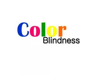
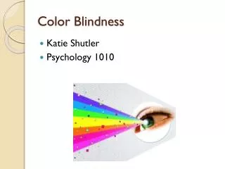
Chris Burfitt. Designing for Colour Blindness. What do we mean by ‘Colour Blind’?. Actual colour blindness (Monochromacy) is very rare We’re usually talking about ‘colour vision deficiency’ (dichromacy)

E N D
Chris Burfitt Designingfor Colour Blindness
What do we mean by ‘Colour Blind’? Actual colour blindness (Monochromacy) is very rare We’re usually talking about ‘colour vision deficiency’ (dichromacy) This type affects approximately 8-10% of the male population and 0.5% of the female population The most common form causes confusion between redand green The colour the words above may look very obvious to you, but to a colour blind person the difference is barely noticeable Additionally, even when a difference can be seen, red is often seen as green, and green is seen as red
Traffic Lights….. View this slide in ‘Grayscale’ to demonstrate….. The most common question asked of a colour blind person is “how do you manage at traffic lights?” The answer demonstrates how colour blindness can be overcome with good design • Position The red light is at the top, the green light is at the bottom This allows someone to recognise if the lights are red or green regardless of the colour • Hue (tone of colour) The red, green and amber lights are completely different ‘hue’ • Saturation (pureness of colour) Traffic lights are specifically designed with high intensity, high saturation (i.e. pure colour) light
Hue, Saturation and Brightness (HSB) To understand colour blindness better, it is helpful to be familiar with the ways in which colours differ from each other One standard way to discuss colour is to divide it into hue, saturation and brightness (HSB) Insert "Title, Author, Date"
Hue Hue is the element that distinguishes one colour of the rainbow from another. It is the quality that infuses an object with "orangeness" or "redness" or "blueness". Hue refers to a specific tone of colour. It is not another name for colour as colour can have saturation and brightness as well as a hue. Try to avoid using red and green hues for differentiation, as people who are colour blind struggle to differentiate between these hues Insert "Title, Author, Date"
Saturation Saturation is the "pureness" of the colour. High saturation equates to intense, "colourful" colour. Saturation is the intensity of a hue from grey. At maximum saturation a colour would contain no grey at all. At minimum saturation, a colour would contain mostly grey. The higher the saturation the easier it will be for the colour blind to distinguish Insert "Title, Author, Date"
Brightness Brightness refers to how much white, or black, is contained within a colour. Diluting a colour with white makes the colour become lighter Diluting a colour with black makes the colour become darker Colours with different brightness will be easier for the colour-blind to distinguish. Insert "Title, Author, Date"
Colour Blindness and the Software UI Colour blindness can cause confusion in a computer interface. The main area to be concerned with is the use of "colour-coding" or "colour-cueing." Designers frequently colour-code individual words, buttons, or areas of the screen to differentiate functions or to group similar items. Colour Codes present particular problems for those with colour deficiencies as they are often difficult or impossible for them to perceive Good graphic design avoids using colour coding or using colour contrasts alone to express information Insert "Title, Author, Date"
Colour Combinations Designers can use to their advantage the fact that no one is red-blue, green-blue, yellow-green, or yellow-red colour blind Using these colour combinations can lead to a much higher ability to use colour coding effectively This will still cause problems for those with monochromatic colour blindness, but it is still something worth considering. Good combinations: or Bad combinations: or Insert "Title, Author, Date"
Choosing Colours • In general, when colours need to be distinct and recognizably different: • Select the light colours from orange, yellow, green or blue-green • Select the darker colours from blue, violet, purple or red. (The colour blind already see blue, violet, purple and red as darker than normal) • Don’t pair colours similar in hue, in saturation, or in brightness. The biggest challenge is to maintain pleasing palettes while increasing colour contrast Insert "Title, Author, Date"
Text and Background Colour Red on black is very hard to read for someone who is red / green colour blind Green on white can also be problematic….. This colour, this colour andthis colour can all look the same to a colour blind person as their colour saturation is very similar However this colour can be seen as the saturation is noticeably different than the main text Be careful of certain combinations of background and text colour: Insert "Title, Author, Date"
PowerPoint • Do not rely on colour alone • Always use an additional cue • Using ‘View – Grayscale’ can give some idea of brightness and hue • The result does not represent what a colour-blind person sees, but does give you a chance to see how much colour contrast there is • If you can’t see the difference in grayscale, the chances are a colour blind person cannot see the difference either Insert "Title, Author, Date"
And finally….the affect of Mass and Materials • Consider the ‘mass’ of colour • For example, thin red lines might appear black while a thicker line of the same colour can be perceived as having colour. • Colour-blindness is highly sensitive to differences in material. • For example, a red–green colour blind person who is incapable of distinguishing colours on a map printed on paper may have no such difficulty when viewing the map on a computer screen • Some colour blind people find it easier to distinguish problem colours on artificial materials, such as plastic, than on natural materials, such as paper Insert "Title, Author, Date"