Download
1 / 20
200 likes | 370 Views
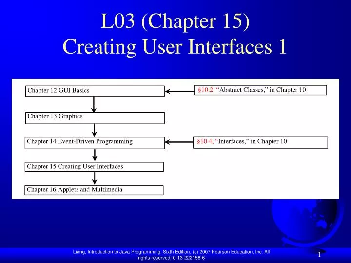
L03 (Chapter 15) Creating User Interfaces 1. Objectives. To create graphical user interfaces with various user-interface components: JButton , JCheckBox , JRadioButton , JLabel , JTextField , JTextArea , JComboBox , JList , JScrollBar , and JSlider (§15.2 – 15.12).

E N D
Objectives • To create graphical user interfaces with various user-interface components: JButton, JCheckBox, JRadioButton, JLabel, JTextField, JTextArea, JComboBox, JList, JScrollBar, and JSlider (§15.2 – 15.12). • To create listeners for various types of events (§15.2 – 15.12). • To use borders to visually group user-interface components (§15.2). • To create image icons using the ImageIcon class (§15.3). • To display multiple windows in an application (§15.14).
Components Covered in the Chapter • Introduces the frequently used GUI components • Uses borders and icons
Buttons A button is a component that triggers an action event when clicked. Swing provides regular buttons, toggle buttons, check box buttons, and radio buttons. The common features of these buttons are generalized in javax.swing.AbstractButton.
JButton JButton inherits AbstractButton and provides several constructors to create buttons.
JButton Constructors The following are JButton constructors: JButton() JButton(String text) JButton(String text, Icon icon) JButton(Icon icon)
JButton Properties • text • icon • mnemonic • horizontalAlignment • verticalAlignment • horizontalTextPosition • verticalTextPosition • iconTextGap
Default Icons, Pressed Icon, and Rollover Icon A regular button has a default icon, pressed icon, and rollover icon. Normally, you use the default icon. All other icons are for special effects. A pressed icon is displayed when a button is pressed and a rollover icon is displayed when the mouse is over the button but not pressed. (A) Default icon (B) Pressed icon (C) Rollover icon
Demo TestButtonIcons Run
Horizontal Alignments Horizontal alignment specifies how the icon and text are placed horizontally on a button. You can set the horizontal alignment using one of the five constants: LEADING, LEFT, CENTER, RIGHT, TRAILING. At present, LEADING and LEFT are the same and TRAILING and RIGHT are the same. Future implementation may distinguish them. The default horizontal alignment is SwingConstants.TRAILING.
Vertical Alignments Vertical alignment specifies how the icon and text are placed vertically on a button. You can set the vertical alignment using one of the three constants: TOP, CENTER, BOTTOM. The default vertical alignment is SwingConstants.CENTER.
Horizontal Text Positions Horizontal text position specifies the horizontal position of the text relative to the icon. You can set the horizontal text position using one of the five constants: LEADING, LEFT, CENTER, RIGHT, TRAILING. The default horizontal text position is SwingConstants.RIGHT.
Vertical Text Positions Vertical text position specifies the vertical position of the text relative to the icon. You can set the vertical text position using one of the three constants: TOP, CENTER. The default vertical text position is SwingConstants.CENTER.
Example: Using Buttons Write a program that displays a message on a panel and uses two buttons, <= and =>, to move the message on the panel to the left or right. ButtonDemo Run
JCheckBox JCheckBox inherits all the properties such as text, icon, mnemonic, verticalAlignment, horizontalAlignment, horizontalTextPosition, verticalTextPosition, and selected from AbstractButton, and provides several constructors to create check boxes.
Example: Using Check Boxes Add three check boxes named Centered, Bold, and Italic into Example 15.1 to let the user specify whether the message is centered, bold, or italic. ButtonDemo CheckBoxDemo CheckBoxDemo Run
JRadioButton Radio buttons are variations of check boxes. They are often used in the group, where only one button is checked at a time.
Grouping Radio Buttons ButtonGroup btg = new ButtonGroup(); btg.add(jrb1); btg.add(jrb2);
Example: Using Radio Buttons Add three radio buttons named Red, Green, and Blue into the preceding example to let the user choose the color of the message. ButtonDemo CheckBoxDemo RadioButtonDemo RadioButtonDemo Run