Download
1 / 6
100 likes | 296 Views
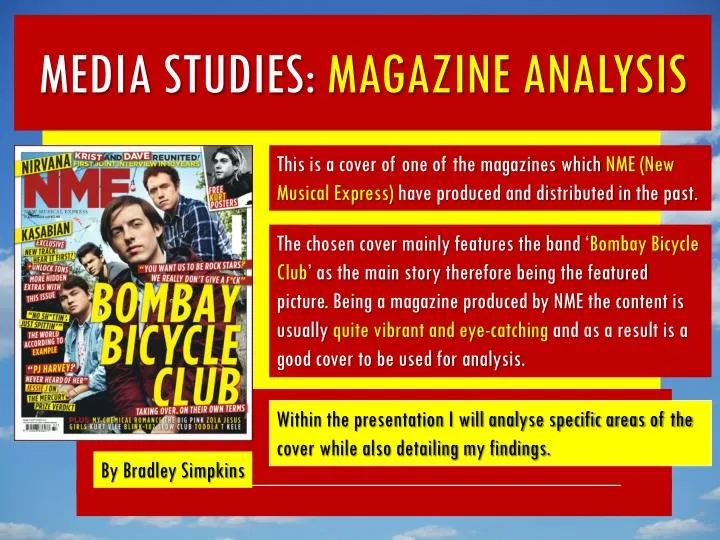
This is a cover of one of the magazines which NME (New Musical Express) have produced and distributed in the past. MEDIA STUDIES: MAGAZINE ANALYSIS.

E N D
This is a cover of one of the magazines which NME (New Musical Express) have produced and distributed in the past. MEDIA STUDIES: MAGAZINE ANALYSIS The chosen cover mainly features the band ‘Bombay Bicycle Club’ as the main story therefore being the featured picture. Being a magazine produced by NME the content is usually quite vibrant and eye-catching and as a result is a good cover to be used for analysis. Within the presentation I will analyse specific areas of the cover while also detailing my findings. By Bradley Simpkins
MAGAZINE ANALYSIS: LAYOUT/TECHNIQUES ‘Bombay Bicycle Club’s band name has been capitalized and enlarged to the point where it is a lot bigger than the other stories text therefore becoming eye-catching for any fans of the band almost enticing them to buy the magazine. On this particular magazine there does not appear to be a headline, but the magazine does, however, feature plugs which have been used to give the audience an insight into the other articles covered within the magazine as Bombay Bicycle Club may not appeal to all readers. These plugs are also laid out conventionally around the featured band’s faces so that it does not obscure the featured image to the extent that the band’s faces are unrecognisable. The plugs are accompanied by red and yellow boxes which help them to stand out. However these colours have not been picked randomly, they were picked as they match both: each other and the company’s (NME) logo. Having random colours that don’t match would make the cover unappealing to the audience. Generally the layout of the cover is quite messy and pretty much all of the text boxes are at a different angle to one another. This makes it look less formal and more casual yet eye-catching.
MAGAZINE ANALYSIS: USE OF IMAGES The featured image on this cover is Bombay Bicycle Club and fills nearly the entire cover, and while it is covered by a lot of text and other images (text boxes etc.) it has been left visible enough for viewers to recognise the band. The featured picture includes each band member and obviously is accompanied by large text (‘BOMBAY BICYCLE CLUB’) to assure readers it really is the band presented on the cover. This captivates the audience which of course is the fans of the band’s music for this particular cover. For the NME magazine the feature image changes for every issue and therefore entices a new audience every issue. The boxes in which some of the text is positioned, in some places, is used to make specific parts of text stand out; for example where it says ‘KRIST and DAVE’ at the top of the cover. ‘Krist’ and ‘Dave’ are the main bulk of the story which its presenting and are therefore positioned in a red box instead of just being formatted ‘bold’ so that it makes it stand out a lot more than it normally would. Its similar to when you analyse a text and you highlight crucial points within it.
MAGAZINE ANALYSIS: USE OF TEXT Most of the text presented on this cover consists of plugs which are used to very briefly explain stories within the magazine like a mini-headline. Plugs are mostly used to give the viewer an insight in to all of the stories rather than just the featured one (which in this case is Bombay Bicycle Club). Plugs are used on nearly all magazine covers, as obviously they don't or, more so, cant just cover one story throughout the entirety of the magazine as that would result in the audience being too small to gain any real profit from sales of the magazine. Some of the text is larger in some places than others, for example ‘BOMBAY BICYCLE CLUB’ is huge and fills a large portion of the cover to exemplify the fact that that is the main article within the magazine. Other smaller text has been placed around the outside as these are also important stories and are therefore put onto the cover, however are just a little smaller than that of the featured story or maybe not as important.
MAGAZINE ANALYSIS: COLOUR AND FONT CHOICE Much like I discussed on one of the previous slides the colouring is crucial and on this cover the colour scheme of the featured image (Bombay Bicycle Club) is generally a red and yellow colour. This would explain the chosen colours of the other images, (text) boxes, and the text itself. As I’ve already said, going away from the selected colour scheme would cause the cover to look almost ugly and therefore unappealing. The font on every magazine always needs to be easy to read; on this specific cover the font is fairly spacious and none of the letters are overlapping one another. To also help in keeping the text clear to the viewer the text has always been placed in front of a opposite coloured backing to that of the text – to put it simply, for example, the text is black and put against a yellow background – this allows the text to be easily visible. Whereas, if the text was white and put against a yellow background it would be very difficult to read. EXAMPLE EXAMPLE
MAGAZINE ANALYSIS: HOW THE COVER ATTRACTS THE TARGET AUDIENCE There are many techniques and features on the cover that entice people, the featured picture is one of these enticements. It fills the entire cover and shows the band Bombay Bicycle Club which some people may be fans of and therefore will more than likely be persuaded to purchase a copy of the magazine. Another one of these is the colour, all of the colours on the cover are quite warm, block colours that are very eye-catching, on top of this, all of the colours compliment one another therefore keeping the design enticingand disallowing it to become almost displacant if a colour from a different scheme were used. Other techniques include a messy trend with the layout making it unique from some of the other more formal magazines like EMPIRE.