Download
1 / 19
190 likes | 540 Views
Graphic Design. Shashank Deshpande VERITAS Software July, 2003. Graphic Design. A primary technique to achieve improved user-interface is to clear, distinct, consistent visible language Components of visual language visual consistency visual relationships visual organization

E N D
Graphic Design Shashank Deshpande VERITAS Software July, 2003
Graphic Design • A primary technique to achieve improved user-interface is to clear, distinct, consistent visible language • Components of visual language • visual consistency • visual relationships • visual organization • legibility and readability • navigational cues • familiar idioms
Visual language • Must account for: • a comprehensible mental image • metaphor • appropriate organization of information based on its characteristics • cognitive model • quality appearance characteristics • the “look”
Graphic Design • Graphic design aspects of Information design • Layout: • Format • Proportions & Grids, • Shape • Typography • Color, texture & light • Symbolism – Signs, Icons, symbols to represent reality • Visualizing knowledge – Charts, diagrams and maps • Windows GUI elements
Layouts • Proportions and grid are key to successful layout • Cultural associations to Proportions - natural objects around influence the proportional sense of an individual • Classical and Modern proportions: • Square 1 : 1 • Square root 1 : 1.414 • Golden rectangle 1 : 1.618 • US letter 1 : 1.29 • CRT Video 1 : 1.33 • High defn video 1 : 1.6
Grids • Horizontal and vertical lines to locate window components • aligns related components • Organization • contrast to bring out dominant elements • grouping of elements by proximity • show organizational structure • alignment • Consistency • location • format • repetition • organization
Layouts • Grids
Layouts • Size & placement
Typography • Legibility & Readability • Type faces: • Serif and sans-serif • Variable width and fixed width • Line justification and line spacing • First letter Upper case and rest lower case for buttons, menus, labels etc. • Avoid capital letters • Avoid long text lines on CRT monitors more than 60 to 70 characters
Legibility and readability • Too much of text decoration – difficult to read
Legibility and readability • Use of capital letters
Legibility and readability • Characters, symbols, graphical elements should be easily noticable and distinguishable Text set in Helvetica TEXT SET INCAPITOLS Text set in Times Roman Text set in Braggadocio Text set in Courier
Legibility and readability • Proper use of typography • 1-2 typefaces (3 max) • normal, italics, bold • 1-3 sizes max • Typesetting • point size • word and line spacing • line length • Indentation • color
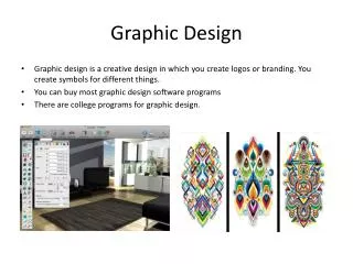
Imagery • Signs, icons, symbols • right choice within spectrum from concrete to abstract • Icon design very hard • except for most familiar, always label them • Image position and type should be related • image “family” • don’t mix metaphors • Consistent and relevant image use • not gratuitous • identifies situations, offerings...
Symbolism • Icons • Icons and other graphics should strictly adhere to overall grid • Standardization and consistency of icons in terms of: • Size & shape • Background and foreground colors • Thematic treatment, etc.
Colors • Hue, Value (intensity) & Chroma (Saturation) • Color wheel • Primary(RBY) colors & secondary colors(VGO) • Complimentary colors • Warm & cool colors • Foveal (central) and peripheral colors • Spectrally extreme colors
Color • Layering with colors is often effective • Pure bright colors should be reserved for small highlight areas • Colors can be used as labels, as measures, and to imitate reality (e.g., blue lakes in maps). • Don't place bright colors mixed with White next to each other. • Color spots against a neutral background are effective • Colors can convey multi-dimensional values • Note that surrounding colors can make two different colors look alike, and two similar colors look very different • Be aware that 5-10% of people are color blind to some degree (red-green is the most common type followed by blue-yellow, which usually includes blue-green)
Colors • Guidelines • Use a maximum of five plus or minus two colors – not more than two large patches of colors • Avoid large patches of complimentary colors or high chroma colors. • Use standard color coding • Use the same color code for training, testing, application, and publication. • Use high-value, high-chroma colors to attract attention • Use redundant coding of shape, as well as color, if possible
Information Visualization • Information visualization tools - Charts, Graphs & maps