Download
1 / 22
220 likes | 227 Views
# GCDigital Design System. Update for January 10, 2018. Mission Statement. Make a design system for the Government of Canada’s digital collaboration tools that can also be reused and applied to other public or internal digital services and products.

E N D
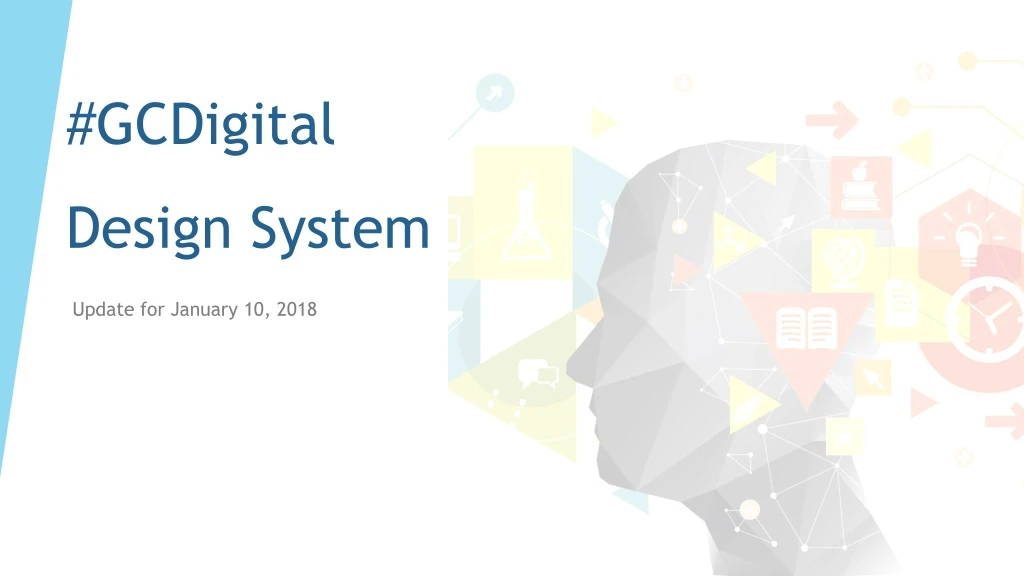
#GCDigitalDesign System Update for January 10, 2018
Mission Statement Make a design system for the Government of Canada’s digital collaboration tools that can also be reused and applied to other public or internal digital services and products. This system will help to ensure a seamless experience for users across platforms, will be easy to use, and quick for developers and designers to implement. The design system will provide a basic framework with guiding principles and components, with the ability to be adapted to other brands and needs.
Guiding Principles • Simple and flexible • Fun to use • Re-usable • Diverse • Technology agnostic • Open
What we’ve done so far • Extensive research on process, examples • UI inventory to identify key priorities for Phase I • Established partnerships, developed concept and requirements for the system • Built GCpedia page for resources, updates and key information • All design files and code held in Github repo • Determined elements required for different phases • Mood boards, typography mock-ups, sample documentation
Phase I: Key Pieces • Visual Language (colour, typography, iconography, motion, space) • UI Elements (paragraph, headers, lists, links) • Resources (PSD, Illustrator and Sketch files) • UI Components (breadcrumbs, footers, headers, navigation, menus, etc.) • Key Items • Buttons • Cards • Forms • Notifications
https://s-duffey.gitbooks.io/-gcdigital-design-system/content/typography.htmlhttps://s-duffey.gitbooks.io/-gcdigital-design-system/content/typography.html
Examples • Google Material Design: Typography • Microsoft Typography • Shopify Polaris: Typography • Semantic.ui: Typography
What’s next? • Will be considering feedback and applying to any new mock-ups and elements we make. • Writing documentation, research on what needs to go in documentation. • Sprint launch this afternoon with partners. We are going to start building elements based on a theme (i.e. forms) • Official updates and presentations are going on GCpedia, mock-up files and documentation will be available on Github. • Subtle promotion via partners, Sierra’s blog post, Twitter etc.