Download
1 / 35
350 likes | 517 Views
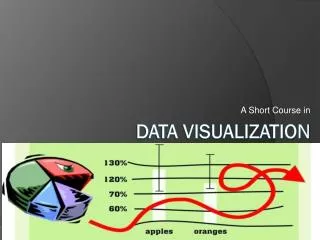
Data Visualization. The commonality between science and art is in trying to see profoundly - to develop strategies of seeing and showing Edward Tufte. Visualization skills. Humans are particularly skilled at processing visual information An innate capability compared

E N D
Data Visualization The commonality between science and art is in trying to see profoundly - to develop strategies of seeing and showing Edward Tufte
Visualization skills Humans are particularly skilled at processing visual information An innate capability compared Our ancestors were those who were efficient visual processors and quickly detected threats and used this information to make effective decisions
A graphical representation of Napoleon Bonaparte's invasion of and subsequent retreat from Russia during 1812. The graph shows the size of the army, its location and the direction of its movement. The temperature during the retreat is drawn at the bottom of figure, which was drawn by Charles Joseph Minard in 1861 and is generally considered to be one of the finest graphs ever produced.
Wilkinson’s grammar of graphics • Data • A set of data operations that create variables from datasets • Trans • Variable transformations • Scale • Scale transformations • Coord • Acoordinate system • Element • Graph and its aesthetic attributes • Guide • One or more guides
ggplot An implementation of the grammar of graphics in R The grammar describes the structure of a graphic A graphic is a mapping of data to a visual representation ggplot2.org
Data • Spreadsheet approach • Use an existing spreadsheet or create a new one • Export as CSV file • Database • Execute SQL query
Transformation # compute a new column in carbon containing the relative change in CO2 carbon$relCO2 = (carbon$CO2-280)/280 A transformation converts data into a format suitable for the intended visualization
Coord A coordinate system describes where things are located Most graphs are plotted on a two-dimensional (2D) grid with x (horizontal) and y (vertical) coordinates ggplot2 currently supports six 2D coordinate systems The default coordinate system is Cartesian.
Element require(ggplot2) carbon <- read.table('http://dl.dropbox.com/u/6960256/data/carbon1959-2011.txt', sep=',', header=T) # Select year(x) and CO2(y) to create a x-y point plot # Specify red points, as you find that aesthetically pleasing ggplot(carbon,aes(year,CO2)) + geom_point(color='red') # Add some axes labels # Notice how ‘+’ is used for commands that extend over one line ggplot(carbon,aes(year,CO2)) + geom_point(color='red') + xlab('Year') + ylab('CO2 ppm of the atmosphere') An element is a graph and its aesthetic attributes Build a graph by adding layers
Element ggplot(carbon,aes(year,CO2)) + geom_point(color='red') + xlab('Year') + ylab('CO2 ppm of the atmosphere') + ylim(0,400)
Element # compute a new column in carbon containing the relative change in CO2 carbon$relCO2 = (carbon$CO2-280)/280 ggplot(carbon,aes(year,relCO2)) + geom_line(color='salmon') + xlab('Year') + ylab('Relative change of atmospheric CO2') + ylim(0,.5)
Guides Axes and legends are both forms of guides Helps the viewer to understand a graphic
Exercise Create a line plot using the data in the following table.
Histogram require(weathermetrics) t <- read.table("http://dl.dropbox.com/u/6960256/data/centralparktemps.txt", header=T, sep=",") t$C <- fahrenheit.to.celsius(t$temperature,0) ggplot(t,aes(x=t$C)) + geom_histogram(fill='light blue') + xlab('Celsius')
Histogram require(RJDBC) # Load the driver drv <- JDBC("com.mysql.jdbc.Driver", "Macintosh HD/Library/Java/Extensions/mysql-connector-java-5.1.26-bin.jar") # connect to the database conn <- dbConnect(drv, "jdbc:mysql://richardtwatson.com:3306/ClassicModels", "db1", "student") # Query the database and create file for use with R d <- dbGetQuery(conn,"SELECTproductLine from Products;") # Plot the number of product lines by specifying the appropriate column name # Internal fill color is red ggplot(d,aes(x=productLine)) + geom_histogram(fill='red')
Bar chart d <- dbGetQuery(conn,"SELECTproductLine from Products;") # Plot the number of product lines by specifying the appropriate column ggplot(d,aes(x=productLine)) + geom_histogram(fill='gold') + coord_flip()
Radar plot d <- dbGetQuery(conn,"SELECTproductLine from Products;") ggplot(d,aes(x=productLine)) + geom_histogram(fill='bisque') + coord_polar() + ggtitle("Number of products in each product line") + expand_limits(x=c(0,10))
Exercise • Create a bar chart using the data in the following table • Use population as the weight value rather than y coordinate
Scatterplot # Get the monthly value of orders d <- dbGetQuery(conn,"SELECT MONTH(orderDate) AS orderMonth, sum(quantityOrdered*priceEach) AS orderValue FROM Orders, OrderDetails WHERE Orders.orderNumber = OrderDetails.orderNumber GROUP BY orderMonth;") # Plot data orders by month # Show the points and the line ggplot(d,aes(x=orderMonth,y=orderValue)) + geom_point(color='red') + geom_line(color='blue')
Scatterplot # Get the value of orders by year and month d <- dbGetQuery(conn,"SELECT YEAR(orderDate) AS orderYear, MONTH(orderDate) AS Month, sum((quantityOrdered*priceEach)) AS Value FROM Orders, OrderDetails WHERE Orders.orderNumber = OrderDetails.orderNumber GROUP BY orderYear, Month;") # Plot data orders by month and grouped by year # ggplot expects grouping variables to be character, so convert # load scales package for formatting as dollars require(scales) d$Year <- as.character(d$orderYear) ggplot(d,aes(x=Month,y=Value,group=Year)) + geom_line(aes(color=Year)) + # Format as dollars scale_y_continuous(label = dollar)
Scatterplot require(scales) require(ggplot2) orders <- dbGetQuery(conn,"SELECT MONTH(orderDate) AS month, sum((quantityOrdered*priceEach)) AS orderValue FROM Orders, OrderDetails WHERE Orders.orderNumber = OrderDetails.orderNumber and YEAR(orderDate) = 2004 GROUP BY Month;") payments <- dbGetQuery(conn,"SELECT MONTH(paymentDate) AS month, SUM(amount) AS payValue FROM Payments WHERE YEAR(paymentDate) = 2004 GROUP BY MONTH;") ggplot(orders,aes(x=month)) + geom_line(aes(y=orders$orderValue, color='Orders')) + geom_line(aes(y=payments$payValue, color='Payments')) + xlab('Month') + ylab('') + # Format as dollars and show eachmonth scale_y_continuous(label = dollar) + scale_x_continuous(breaks=c(1:12)) + # Remove the legend theme(legend.title=element_blank())
Scatterplot conn <- dbConnect(drv, "jdbc:mysql://wallaby.terry.uga.edu/Weather", "student", "student") t <- dbGetQuery(conn,"SELECT timestamp, airTemp from record WHERE year(timestamp)=2011 and hour(timestamp)=17;") ggplot(t,aes(x=timestamp, y=airTemp)) + geom_point(color='blue')
Scatterplot t <- read.table("http://dl.dropbox.com/u/6960256/data/centralparktemps.txt", header=T, sep=" ,") ggplot(t,aes(x=year,y=temperature,color=factor(month))) + geom_point()
Smooth t <- read.table("http://dl.dropbox.com/u/6960256/data/centralparktemps.txt", header=T, sep=" ,") # select the August data t1 <- t[t$month==8,] ggplot(t1,aes(x=year,y=temperature)) + geom_line(color="red") + geom_smooth()
Exercise National GDP and fertility data have been extracted from a web site and saved as a CSV file Compute the correlation between GDP and fertility Do a scatterplot of GDP versus fertility with a smoother Log transform both GDP and fertility and repeat the scatterplot
Box plot d <- dbGetQuery(conn,"SELECT * from Payments;") # Boxplot of amounts paid ggplot(d,aes(factor(0),amount)) + geom_boxplot(outlier.colour='red') + xlab("") + ylab("Check")
Fluctuation plot # Get product data d <- dbGetQuery(conn,"SELECT * from Products;") # Plot product lines ggfluctuation(table(d$productLine,d$productScale)) + xlab("Scale") + ylab("Line")
Heatmap # Get product data d <- dbGetQuery(conn,"SELECT * from Products;") # Plot product lines ggfluctuation(table(d$productLine,d$productScale),type="color") + xlab("Scale") + ylab("Line")
Parallel coordinates require(lattice) d <- dbGetQuery(conn,"SELECTquantityOrdered*priceEach AS orderValue, YEAR(orderDate) AS year, productLine FROM Orders, OrderDetails, Products WHERE Orders.orderNumber = OrderDetails. orderNumber AND Products.productCode = OrderDetails.productCode AND YEAR(orderDate) IN (2003,2004);") # convert productLine to a factor for plotting d$productLine <- as.factor(d$productLine) parallelplot(d)
Geographic data require(ggplot2) require(ggmap) require(mapproj) require(RJDBC) # Load the driver drv <- JDBC("com.mysql.jdbc.Driver", "Macintosh HD/Library/Java/Extensions/mysql-connector-java-5.1.26-bin.jar") # connect to the database conn <- dbConnect(drv, "jdbc:mysql://richardtwatson.com:3306/ClassicModels", "db1", "student") # Google maps requires lon and lat, in that order, to create markers d <- dbGetQuery(conn,"SELECT y(officeLocation) AS lon, x(officeLocation) AS lat FROM Offices;") # show offices in the United States # vary zoom to change the size of the map map <- get_googlemap('united states',marker=d,zoom=4) ggmap(map) + labs(x = 'Longitude', y = 'Latitude') + ggtitle('US offices') ggmap supports multiple mapping systems, including Google maps
John Snow1854 Broad Street cholera map Water pump
Cholera map(now Broadwick Street) require(ggplot2) require(ggmap) require(mapproj) pumps <- read.table("http://dl.dropbox.com/u/6960256/data/pumps.csv",header=T,sep=',') deaths <- read.table("http://dl.dropbox.com/u/6960256/data/deaths.csv",header=T,sep=',') map <- get_googlemap('broadwick street, london, united kingdom',markers=pumps,zoom=15) ggmap(map) + labs(x = 'Longitude', y = 'Latitude') + ggtitle('Pumps and deaths') + geom_point(aes(x=longitude,y=latitude,size=count),color='blue',data=deaths) + xlim(-.14,-.13) + ylim(51.51,51.516)
Key points • ggplot is based on a grammar of graphics • Very powerful and logical • You can visualize the results of SQL queries using R • The combination of MySQL and R provides a strong platform for data reporting