Download
1 / 44
440 likes | 604 Views
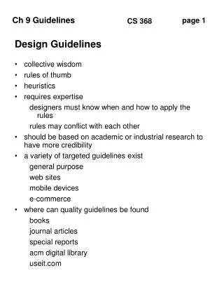
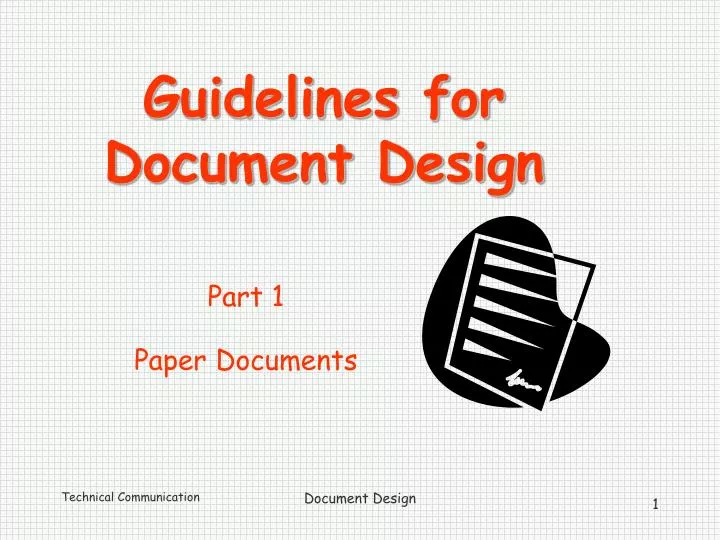
Guidelines for Document Design. Part 1 Paper Documents. Guidelines for Document Design. 1. Use white space 2. Use headings 3. Limit use of all capital letters 4. Limit number of typefaces 5. Justify margins based on situation and audience 6. Place elements strategically

E N D
Guidelines for Document Design Part 1 Paper Documents Document Design
Guidelines for Document Design 1. Use white space 2. Use headings 3. Limit use of all capital letters 4. Limit number of typefaces 5. Justify margins based on situation and audience 6. Place elements strategically 7. Use a grid to unify elements • Use highlighting, color, and decorative devices in moderation Document Design
Guidelines for Document Design • Use white space • - the portions of the page that are blank • Create white space with • headings • margins • line and paragraph spacing • multiple columns • lists • tabs or indents • bullets & numbering Document Design
Would you like to read this document? Document Design
Guidelines for Document Design 1. Use white space • . Use headings (also called level heads) • Refers to titles, subtitles, headings, and subheadings of all kinds • Differs from “body text” which is the text of the document’s paragraphs and bulleted or numbered lists. Document Design
Headings Document Design
Guidelines for Document Design 1. Use white space 2. Use headings • . Limit use of all capital letters Document Design
If this were an email, using all capital letters means you’re yelling. Document Design
All lower-case letters Document Design
All lower-case letters ALL CAPITAL LETTERS Document Design
All lower-case letters ALL CAPITAL LETTERS HARDER TO READ AND REMEMBER ELEPHANT elephant Easier to read and remember Document Design
Guidelines for Document Design 1. Use white space 2. Use headings 3. Limit use of all capital letters • . Limit number of typefaces Document Design
4. Typefaces (for IBM computers & clones) • Fixed Typefaces • Proportional Typefaces • Serif • Sans serif Document Design
a) Fixed typefaces • Courier This is the standard “pica” typewriter typeface. • Prestige Elite This is the standard “elite” typewriter typeface. Document Design
a) Fixed typefaces • Courier • Prestige Elite Each letter takes up the same horizontal space (width) Document Design
b) Proportional typefaces • Times New Roman • This standard business typeface is used for letters, memos, and reports. • Arial This standard business typeface is often used for titles, graphs, and charts as well as for letters, memos, and reports Document Design
b) Proportional typefaces • Times New Roman • Arial M’s and W’s take up more horizontal space than I’s and t’s. Document Design
b) Other proportional typefaces Impact • This typeface is appropriate for signs and ads, but too much is hard to read. Lucida Handwriting This typeface imitates script. It is appropriate for personal but not for business letters. It may also be used for signs, ads, and invitations. Document Design
c) Serif typefaces - Little extensions from main strokes - Easier to read Examples: Times New Roman,Courier New d) Sans Serif typefaces Lack extensions from main strokes Good for titles and tables Examples: Arial,Futura, Comic Sans MS (used in this slide show) Document Design
c) Serif typefaces • - Find the serifs - Little extensions (some call them “tails,” the French call them “feet”) from main strokes Document Design
One typeface (Font)--many looks Times New Roman Bold (28 pt) Times New Roman Italic Times New Roman Underlined TIMES NEW ROMAN UPPERCASE Times New Roman Shadowed Times New Roman 16 pt Times New Roman 40 pt Document Design
Guidelines for Document Design 1. Use white space 2. Use headings 3. Limit use of all capital letters 4. Limit number of typefaces • Justify margins or use ragged right based on situation and audience Document Design
Justification refers to how • lines of text align with each other • on the left and the right margins • Full justification • Ragged left • Centered • Ragged right Document Design
Examples of justification Document Design
5. Use fully justified margins when you • Can use proportional typefaces. • Want document to look very formal and professional. • Want as few pages as possible. • Write to skilled readers. Document Design
5. Use ragged right margins when you • Do not have proportional typefaces. • Want an informal look. • Want to be able to revise without reprinting the whole document. • Use very short line lengths. • Write to readers with poor eyesight. Document Design
Guidelines for Document Design 1. Use white space 2. Use headings 3. Limit use of all capital letters 4. Limit number of typefaces 5. Justify margins based on situation & audience • . Place elements strategically • - follow the reader’s eye movement Document Design
Eye movement on the page for most countries using our alphabet Document Design
Eye movement on the page for Hebrew and Arabic Document Design
Eye movement on the page for Chinese and Japanese Document Design
Guidelines for Document Design 1. Use white space 2. Use headings 3. Limit use of all capital letters 4. Limit number of typefaces 5. Justify margins based on situation and audience 6. Place elements strategically • . Use a grid to unify elements Document Design
7. Use a grid to unify elements • Help the reader find useful information quickly • align similar information • use columns and rows • use a chart or table Document Design
7. Use a grid to unify elements Can you find your dream tour? Document Design
7. Use a grid to unify elements Can you find your dream tour? Column 1 Dates Column 2 Name of Tour Column 3 Destinations Column 4 Price Document Design
Guidelines for Document Design 1. Use white space 2. Use headings 3. Limit use of all capital letters 4. Limit number of typefaces 5. Justify margins based on situation and audience 6. Place elements strategically 7. Use a grid to unify elements • Use highlighting, color, and decorative devices in moderation Document Design
8. Use color effectively • Limit the number of colors you use in a document, slide, or screen. • Use color for main points, not details. • Be consistent. All points at the same level should use the same color. Document Design
8. Use Color Effectively(continued) • d) Create a unified look: • Repeat text color in numbers, bullets, and lines. • Use the same color scheme for your whole presentation or in a series or related documents. Document Design
8. Use Color Effectively (continued) • e) Make sure that colors contrast with the background. • f) Use colors that work with the cultural expectations of your audience. Document Design
8. Use Color Effectively (continued) • e) Make sure that colors contrast with the background. • f) Use colors that work with the cultural expectations of your audience. Document Design
Don’tOverdo Your Design!! • Just because it’s available doesn’t mean youshould use it. • Too much is too much. • CONSIDER your reader. • Look professional. Document Design