Download
1 / 49
490 likes | 667 Views
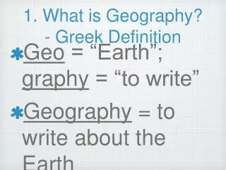
Defining Geography. Word coined by Eratosthenes Geo = Earth Graphia = writing Geography thus means “earth writing”. Contemporary Geography. Geographers ask where and why Location and distribution are important terms

E N D
Defining Geography • Word coined by Eratosthenes • Geo = Earth • Graphia = writing • Geography thus means “earth writing”
Contemporary Geography • Geographers ask where and why • Location and distribution are important terms • Geographers are concerned with the tension between globalization and local diversity • A division: physical geography and human geography
Geography’s Vocabulary Place Region Scale Space Connections
A map serves two purposes: A tool for storing reference material and a tool for communicating geographic information.
Map Projections and Map Scale
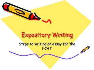
These mushroom spores are to small to see, so we put them under a MICROSCOPE When we see them, we can study them.
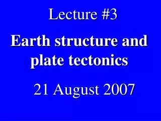
This planet it too big to see, so we put it under a MACROSCOPE When we see it, we can study it.
“Some things are very tiny, and we must use complex electric and optical means (e.g., a microscope) to enlarge them so as to understand their configuration and structural relationships. In contrast, geographical things are so extensive that we must somehow reduce them to bring them into view.” -Arthur Robinson, cartographer
We need to use our . . . MAPS as MACROSCOPES. . . to help us think critically about problems and “problem spots” on the world stage.
All Maps Lie.... Because the world is a sphere and maps are flat, there will always be some degree of distortion. The next several slides will display some of the more popular distortions.
Key Facts about Mercator: • All compass bearings are correct • Projection grossly exaggerates area as you move from the equator
There is distortion at the poles- Stretches the poles into long lines instead of leaving them as points. • Quickly dissipates as you move toward the equator
Types of Thematic Maps
Proportional Symbol US Population
Scale Displaying the same geographical features at various scales may also depict misleading results.
ETHNIC CONFLICT AND THE CONCEPT OF SCALE • Ethnic conflicts abound on the world political map. To understand them, we use a set of concepts: • minorities • majorities • We count and we quantify. • Because we quantify we think our analysis is objective. • Because we are objective, we reach unbiased conclusions.
What is a minority? “the smaller in number of two groups constituting a whole” - Merriam-Webster OnLine Djibouti’s Ethnic Composition: Somali 60% Afar 35%
This map shows the total number of African-Americans per state. Examine Georgia.
In the previous slide, Georgia had one of the highest number of African-Americans, but a closer look tells a different picture. The dark red is the Atlanta metropolitan area.
Using Census Tracts of the Atlanta Metropolitan Area, a different scale gives different results.
Manipulating Data Data may also distort desired results. The following slides show how population of a particular cohort may be misleading.
This map shows the percentage of African-Americans living within counties across the US.
This map shows the total number of African-Americans living in each county across the US.
These four New York counties (New York, Kings, Queens, and Bronx) have a combined African-American population of 2,121,882 and outnumbers the total number of African-Americans in the entire state of Texas 2,021,632
A similar comparison can be made with Hispanics living in the US. This map shows the total percentage of Hispanics in each county.
This map displays the total number of Hispanics in each US county.
These three Southern California counties (Los Angeles, Orange, and San Diego) have a total Hispanic population of 5,045,726 which is greater than the total Hispanic population of Texas at 4,339,905. New Mexico has the greatest percentage of Hispanics (33%), it’s total Hispanic population is 579,224.
US Population The map below shows the US population divided into Natural Breaks. In this case, the natural breaks are near the 7,000,000 mark.
US Population This map shows US population in Quintiles. In this map, states are classified into five separate categories based on population. The dark red represents the states in the top one-fifth. The total population in each state has not changed; however, the way that it is classified has changed.
Natural Breaks Quintile