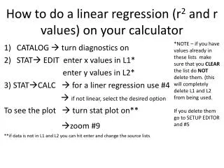
Download
1 / 5
50 likes | 248 Views
Diagrams for R 2 Values and MR. We began MR with an introduction to the regression model and the kind of output SPSS will produce. However we have many tools to help us plan for and understand regressions.

E N D
Diagrams for R2 Values and MR • We began MR with an introduction to the regression model and the kind of output SPSS will produce. However we have many tools to help us plan for and understand regressions. • One topic is the use of diagrams to represent our MR analyses. We will cover two types of diagrams: • Path or trace diagrams • Venn diagrams • These two types of diagram show different aspects of what the MR models/variables reveal. We start with the path diagrams.
Path Diagrams for MR Models First we will discuss the use of diagrams to plan for and represent our MR analyses. We will use what are called path or trace diagrams to show the predictors in our model and the slopes that go with each one. In more complex analyses (like structural equation models) these diagrams play a key role. In path modeling, the variables may be interconnected in complicated networks and the slopes are typically a form of standardized slope called path coefficients. In MR modeling we can just use these diagrams to keep track of our thinking about how variables are related to one another. Also we can draw these diagrams for either standardized or raw slopes.
Path Diagrams for MR Models Here is a very simple path diagram showing the two predictors of student morale (f1stumor). The predictors in our model will be locus of control (f1locus2) and SES (f1ses). We will draw the diagram for the unstandardized variables and use bs for the slopes. f1ses If we have estimated the values of the bs (i.e., we have the bs) we can show the values of the estimated slopes here. bf1ses f1stumor f1locus2 bf1locus2 Also we can use the diagram to see what the equation is, by tracing the paths and multiplying the predictor name in each box by the slope along the path that goes from the box to the outcome (but don’t forget the intercept). Here we get b0 + bf1ses f1sesi + bf1locus2 f1locus2i + ei = f1stumori
Path Diagrams for MR Models We have not talked much about standardized variables but we can draw the same diagram for standardized variables and use b* for the slopes. Standardized regression slopes are the slopes that would apply if we had created Z scores for each of the predictors and the outcome. SPSS calls them “BETA”s. Zf1ses We show the standardized slopes b*'s (the beta weights) here. This equation has no intercept. b*f1ses Zf1stumor b*f1locus2 Zf1locus2 Again the diagram shows what the equation should be, by multiplying the predictor name in each box by the slope along the path that goes from the box to the outcome. Here we get b*f1ses Zf1sesi + b*f1locus2 Zf1locus2 i + ei = Zf1stumori
Path Diagrams for MR Models If we add more predictors we just add more boxes and lines - for instance suppose we add parental control (f1ctrl1) and gender (f1sex). Interactions can be added by using more boxes and paths. Note, though, that the path or trace diagrams don't distinguish which variables are dummy variables. Also they give us no idea how much multicollinearity exists among the predictors. Zf1ses b*f1ses Zf1stumor b*f1locus2 Zf1locus2 b*f1ctrl1 b*f1sex Zf1ctrl1 Zf1sex