Download
1 / 33
330 likes | 502 Views
Normal Plot. Check normality assumption of the data Steps of constructing a normal plot (Example: 4.8 on page 124 of the textbook) Order the data increasing, Calculate the sample percentiles for the i-th ordered data: ,

E N D
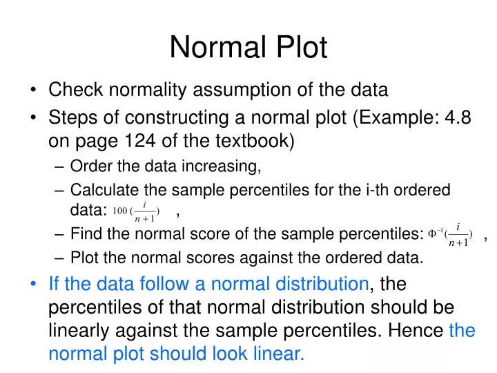
Normal Plot • Check normality assumption of the data • Steps of constructing a normal plot (Example: 4.8 on page 124 of the textbook) • Order the data increasing, • Calculate the sample percentiles for the i-th ordered data: , • Find the normal score of the sample percentiles: , • Plot the normal scores against the ordered data. • If the data follow a normal distribution, the percentiles of that normal distribution should be linearly against the sample percentiles. Hence the normal plot should look linear.
Comments on Normal Plot • Need a reasonable sample size (Figure 4.9 on page 125) • Departure from normality assumption (Figure 4.10 on Page 126) • Right skewed (Positively skewed) • Left skewed (Negatively skewed) • Heave tailed • Light tailed • May exchange x- and y-axes, for example, in SAS • Often referred as Q-Q plot
An example in SAS data Measures; input Diameter @@; label Diameter='Diameter in mm'; datalines; 5.501 5.251 5.404 5.366 5.445 5.576 5.607 5.200 5.977 5.177 5.332 5.399 5.661 5.512 5.252 5.404 5.739 5.525 5.160 5.410 5.823 5.376 5.202 5.470 5.410 5.394 5.146 5.244 5.309 5.480 5.388 5.399 5.360 5.368 5.394 5.248 5.409 5.304 6.239 5.781 5.247 5.907 5.208 5.143 5.304 5.603 5.164 5.209 5.475 5.223 ; run; symbol v=plus; title 'Normal Q-Q Plot for Diameters'; proc capability data=Measures noprint; qqplot Diameter / normal square; run;
Normalizing Transformations • Symmetrization • Positively skewed • Logarithm (Example 4.9 on Page 127) • Square root • Negatively skewed • Exponential • Square
Simpson’s Paradox • Even though the mortality rates of Happy city is higher than those of Sunny city at all age ranges, the overall mortality rate of Happy city is lower than that of Sunny city. • This is an example of so called Simpson’s Paradox. • In fact, this is because there are more young people in Happy city, who are at lower risk of death. • The 2 X 2 two-way table which combines all age groups is misleading. • Another example: Table 4.10 and 4.11 on P131.
Scatter plots • A scatter plot is a plot of pairs of observed values (both quantitative) of two different variables. When one of the variables is considered to be a response variable (y) and the other an explanatory variable (x). The explanatory variable is usually plotted on the x axis.
Example A sample of one-way Greyhound bus fares from Rochester, NY to cities less than 750 miles was taken by going to Greyhound’s website. The following table gives the destination city, the distance and the one-way fare. Distance should be the x axis and the Fare should be the y axis.
Comments • It is possible that two points might have the same x value with different y values. Notice that Potsdam (239) and Albany (240) come very close to having the same x value but the y values are $8 apart. Clearly, the value of y is not determined solely by the x value (there are factors other than distance that affect the fare. • In this example, the y value tends to increase a x increases. We say that there is a positive relationship between the variables distance and fare. • It appears that the y value (fare) could be predicted reasonably well from the x value (distance) by finding a line that is close to the points in the plot. • For stratified bivariate dataset, one may over lay scatter plots of each stratum using different labels. (Example 4.12, P134)
Association • Positive Association - Two variables are positively associated when above-average values of one tend to accompany above-average values of the other and below-average values tend similarly to occur together. (I.e., Generally speaking, the y values tend to increase as the x values increase.) • Negative Association - Two variables are negatively associated when above-average values of one accompany below-average values of the other, and vice versa. (I.e., Generally speaking, the y values tend to decrease as the x values increase.)
The Pearson Correlation Coefficient • Recall: Pearson correlation coefficient -- A measure of the strength of the linear relationship between the two variables. • The Pearson sample correlation coefficient is defined by
Properties of r • The value of r does not depend on the unit of measurement for each variable. • The value of r does not depend on which of the two variables is labeled x. • The value of r is between –1 and +1. • The correlation coefficient is • –1 only when all the points lie on a downward-sloping line, and • +1 only when all the points lie on an upward-sloping line. • The value of r is a measure of the extent to which x and y are linearly related.
Comments about r • r is only used to describe linear association. (Figure 4.6 (a) P137) • The influence of outliers, especially for small samples. (Figure 4.6 (b)) • Correlation measures association but but causation (Figure 4.6 (c) (d)) • Ecological correlations: r based on rates or averages should be watched out (Figure 4.17 P138, handout examples)
y 15 y = 7 + 3x y increases by b = 3 10 x increases by 1 5 a = 7 0 x 0 2 4 6 8 Preparation for Linear Regression • The relationship y = a + bx is the equation of a straight line. The value b, called the slope of the line, is the amount by which y increases when x increase by 1 unit. The value of a, called the intercept (or sometimes the vertical intercept) of the line, is the height of the line above the value x = 0.
Motivation: • Consider the bus fare example: • Goal: use x (distance) to predict y (fare) • Distance and fare exhibit a linear pattern • Use a line to summarize the relationship between two variables • It should be as close as possible to all points in the scatter plot.
Least Squares Line • We assume the underlying relationship between x and y is linear but with a small error (perturbation), so • Without knowing true and , we need to use sample to estimate them: a, b (coefficients), so we predict: • The most widely used criterion for measuring the goodness of fit of a line to bivariate data (x1, y1), (x2, y2),, (xn, yn) is the sum of the of the squared deviations about the line: • Least squares line (sample regression line) : The line that gives the best fit to the data is the one that minimizes this sum.
Calculations From the previous slide, we have
Greyhound Example Revisited Using the calculation formula we have: Notice that we get the same result.
Regression Effect • Regression Toward the Mean • Figure 4.18 on Page 141