Download
1 / 17
170 likes | 178 Views
Ch. 4 – Displaying Quantitative Data (Day 1). Part I – Exploring and Understanding Data. Here are the record high temperatures for each of the 50 states. What can we learn about temperature in the U.S. from this data? 112 110 107 116 120 100 118 112 108 113 127 117 114 110 120

E N D
Ch. 4 – Displaying Quantitative Data (Day 1) Part I – Exploring and Understanding Data
Here are the record high temperatures for each of the 50 states. What can we learn about temperature in the U.S. from this data? 112 110 107 116 120 100 118 112 108 113 127 117 114 110 120 120 116 115 121 117 134 118 118 113 105 118 122 117 120 110 105 114 118 119 118 110 114 122 111 112 109 105 106 104 114 112 109 110 111 114
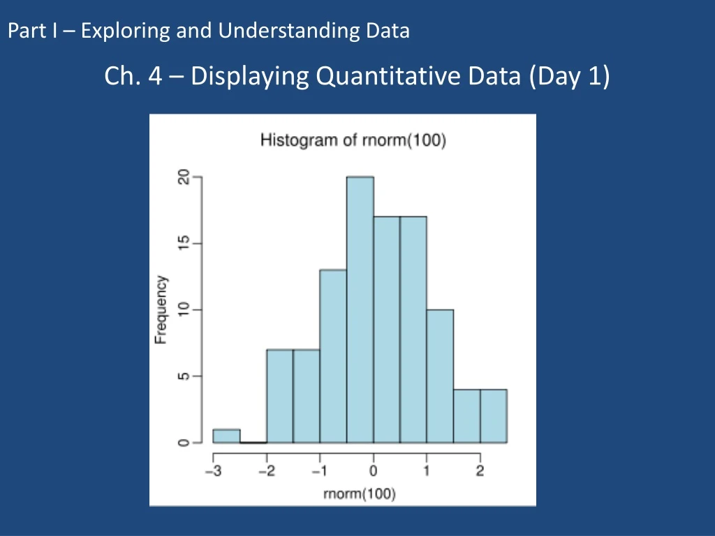
Make a Picture • Remember your first rule of data analysis – Make a Picture! • Can we use a bar graph or a pie chart? • No! These are quantitative data, not categorical, so we need a new kind of graph
Histograms • A histogram looks similar to a bar graph • First, we have to divide our data into piles of equal width, called bins or classes • Then we count the number of values that fall into each bin, and those numbers make up the heights of the bars • We have some freedom in deciding how wide our bins are – this can change the look of the histogram
So let’s try it… • Before we divide up our data into bins, we should first figure out the range of the data (largest value – smallest value) • In this set of data, the range is ____________ • Now we can decide how many bins we want, based on a width that would be easy to draw • Normally we want somewhere between 5 and 20 bins in our graph
Too few Just Right Too many Choosing the number of bins This is subjective, and depends on the data set.
For this data set… • Since we have a range of 34 degrees, bins with a width of 5 degrees would give us 7 bars, which is a good starting place to try • You can start your first bin with your lowest number, or a number that makes sense and is near that value • In this problem, we’ll start with our lowest number: 100 degrees
Frequency (# of states) 100 105 110 115 120 125 130 135 Temperature Putting the values in bins • We know we want our graph to look like this: • We just need to figure out how many values fall in each bin
Putting the values in bins • Placing our data in bins should be easy – if a state had a high temperature of 102 degrees, this would fall in the first bin, since it’s between 100 and 105 • The only problem we have is what to do with the numbers on the border between two bins • The standard way to do this is to put numbers on the border into the next highest bin • For example, a record temperature of 105 degrees would go into the second bin
Putting the values in bins Tally the number of values for each bin… 100 – 104 (really 104.999…): 105 – 109: 110 – 114: 115 – 119: 120 – 124: 125 – 129: 130 – 134:
Frequency (# of states) 100 105 110 115 120 125 130 135 Temperature Now draw the graph… This is a picture of the distribution of U.S. record high temperatures.
Use the STAT menu Enter the data into a list These lists can be sorted (ascending or descending), used for graphs & other calculations, copied, and manipulated with mathematical operators Using your calculator
Using your calculator • Use the STAT PLOT menu (above Y=) • Choose a histogram and the list to use • Leave the frequency at 1
Using your calculator • ZOOM #9 (ZoomStat) for your calculator to set the bin widths automatically
Using your calculator • If you want to set the widths yourself, adjust the XScl in the Window menu
Using your calculator • Hit “Trace” to see the boundaries and heights of the bars • Remember – your graph still needs labels and scale, just like when you create it by hand!
Homework 4-1 • For the following problems, make a histogram • You may create the histogram on your calculator and then sketch the histogram onto your hw paper. • Remember to label when you transfer your histograms to your hw. • Pg. 72 # 42, 49, 50