Download
1 / 13
130 likes | 248 Views
The ABB brand: visual identity. GF-CC Creative Services Corporate Communications. The ABB look- Basic elements. What words come to your mind when you see these materials? Keep in mind, they all come from the same company. ?!?!?!. Chaotic Disorganized Unreliable Confused

E N D
The ABB brand: visual identity GF-CC Creative ServicesCorporate Communications
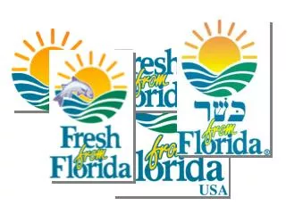
What words come to your mind when you see these materials? Keep in mind, they all come from the same company.
?!?!?! • Chaotic • Disorganized • Unreliable • Confused • Would you want to buy a product from this company? • All of the materials shown on the previous slide are actually ABB materials that do not follow the visual identity rules.
ABB Visual Identity • The brand visual identity is the packaging that makes the message stand out. A consistant visual identity makes our materials and products easy to identify and relate to, no matter what country or culture the customer is in • Studies show that strong visual branding decreases price sensitivity, increases bargaining leverage, and raises customer loyalty A strong visual identity is: • Unique. Every market sector uses a distinct visual language. To stand-out and be remembered, learn the rules of your target's visual language; speak the language unexpectedly but intelligently. • Pertinent. Know what your target market needs and address those needs with what you offer. • Unified. A stop sign is a stop sign is a stop sign. If it were purple and round on one street corner, triangular and green on another, its message would diffuse and be confusing. Likewise with visual branding. Keep its look and message unified across all media. • Visual branding is powerful when it is uniquely memorable, relevant to the needs of its target, and maintains a unified look on every corner.
ABB Basic elements- 5 basic rules • To get the ABB look right, you only need to remember 5 key rules! With these rules, your project is sure to accurately reflect “ABB” • To create a visual language that spurs purchases, you must understand how the mind retains visual information • Color is the first thing you see. • Shape is second. • Symbols are third. • Words are absolutely last • Colors, symbols and cues have to "speak volumes." • Getting the visual identity of ABB material correct is fundamental to our message and protecting the brand
The logo • The logo is the only element that is allowed to be red. No other text, graphs, charts, elements are to use the color red • There are 2 versions of the logo- bold and standard • The logo must have free space around it, that is at least half the height of the logo. No colored or photographic backgrounds are permitted • The look of ABB is predominantly white- A page with a logo should not have a picture or other color competing with or over-powering the logo • For more information see the Basic elements section www.abb.com/visualidentity Bold Standard
The typefaces • Neue Helvetica – primary typeface for headlines, lead paragraphs, technical text • ITC Garramond – secondary typeface for body copy • No other typefaces are to be used- plain and simple. There are no exceptions.
The wordmark • When in text, ABB should be referred to as three capital letters in the font you are using for the body copy - ABB • Altering the color of the text to make the company name stand out is not permitted. • Using the quadrant initials in text is not permitted • Using lower case letters or alternate case letters are not permitted
The corporate color palette – printed materials • 12 colors that can be used for accent in all print applications. You are free to use any combination of these colors to accent materials • The colors are not to be used for the logo • There is a different color palette for the web. Please refer to the Visual identity system for more information
Templates • Various templates for different applications exist to guide you in creating the best materials possible • The templates are required and must be used for the applications they exist for For the complete template list, go to: www.abb.com/visualidentity