Download
1 / 41
410 likes | 434 Views
This paper explores the power of visualization in data mining, with a focus on adjacency data. It demonstrates how visualization techniques can be used to uncover meaningful patterns and insights in large datasets. The paper also discusses the process of obtaining distances from adjacency data and ensuring finite and symmetric distances for visualization purposes.

E N D
Some Examples of Visualization in Data Mining by Bruce Golden R. H. Smith School of Business University of Maryland Presented at CORS 2002, Toronto, June 2002
Collaborators • Ed Condon, University of Maryland • S. Lele, University of Maryland • S. Raghavan, University of Maryland • Edward Wasil, American University 1
Data Mining Overview • Data mining involves the exploration and analysis • of large amounts of data in order to discover • meaningful patterns • The field dates back to a 1989 workshop • The field has grown dramatically since 1989 • Data mining software tools ( > 200 ) • KDnuggets News, the major e-newsletter in the field, has > 11,000 subscribers • Many conferences, courses, and successful applications 2
Focus of Paper A primary focus of this paper will be on a visualization project based on adjacency data (Fiske data) A secondary focus will be on a visualization project based on group decision making data (AHP) The paper illustrates the power of visualization Visualization generates insights and impact 3
Motivation Typically, data are provided in multidimensional format A large table where the rows represent countries and the columns represent socio-economic variables Alternatively, data may be provided in adjacency format Consumers who buy item a are likely to buy or consider buying items b, c, and d also Students who apply to college a are likely to apply to colleges b, c, and d also 4
Motivation -- continued More on adjacency If the purchase of item i results in the recommendation of item j, then item j is adjacent to item i Adjacency data for n alternatives can be summarized in an n x n adjacency matrix, A = (aij), where 1 if item j is adjacent to item i, and 0 otherwise Adjacency is not necessarily symmetric 5
Motivation -- continued Adjacency indicates a notion of similarity Given adjacency data w.r.t. n items or alternatives, can we display the items in a two-dimensional map? Traditional tools such as multidimensional scaling and Sammon maps work well with data in multidimensional format Can these tools work well with adjacency data? 6
Optimization & Sammon Maps • Given distance dijbetween i and j (for all i, j) in • n dimensions (input) • Let fij be the distance between i and j (for all i, j) in • two dimensions (output) • We seek to minimize • Solution techniques include gradient descent, • smoothing, and simulated annealing 8
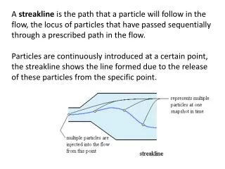
a b c d e Obtaining Distances from Adjacency Data items adjacent to a items adjacent to b items adjacent to c items adjacent to d How can we use linkage information to determine distances ? 9
Obtaining Distances from Adjacency Data -- continued Start with the n x n 0-1 asymmetric adjacency matrix Convert the adjacency matrix to a directed graph Create a node for each item (n nodes) Create a directed arc from node i to node j if aij = 1 Compute distance measures Each arc has a length of 1 Compute the all-pairs shortest path distance matrix D The distance from node i to node j is dij 10
Obtaining Distances from Adjacency Data -- continued Modify the distance matrix D, to obtain a final distance matrix X Symmetry Disconnected components Example 1 5 6 3 4 A = 1 2 11
Example 1 -- continued Find shortest paths between all pairs of nodes to obtain D Average dij and dji to arrive at a symmetric distance matrix X 12
Example 2 A and B are strongly connected components The graph below is weakly connected There are paths from A to B, but none from B to A MDS and Sammon maps require that distances be finite 13
Ensuring Finite and Symmetric Distances Basic idea: simply replace all infinite distances with a large finite value, say R If R is too large The points within each strongly connected component will be pushed together in the map Within-component relationships will be difficult to see If R is too small Distinct components (e.g., A and B) may blend together in the map 14
Ensuring Finite and Symmetric Distances -- continued R must be chosen carefully (see Technical Report) This leads to a finite distance matrix D Next, we obtain the final distance matrix X where X becomes input to a Sammon map or MDS procedure 15
Application: College Selection Data source: The Fiske Guide to Colleges, 2000 edition Contains information on 300 colleges Approx. 750 pages Loaded with statistics and ratings For each school, its biggest overlaps are listed Overlaps: “the colleges and universities to which its applicants are also applying in greatest numbers and which thus represent its major competitors” 16
Overlaps and the Adjacency Matrix Penn’s overlaps are Harvard, Princeton, Yale, Cornell, and Brown Harvard’s overlaps are Princeton, Yale, Stanford, M.I.T., and Brown Note the lack of symmetry Harvard is adjacent to Penn, but not vice versa 17
Proof of Concept Start with 300 colleges and the associated adjacency matrix From the directed graph, several strongly connected components emerge We focus on the four largest to test the concept (100 schools) Component A has 74 schools Component B has 11 southern colleges Component C has 8 mainly Ivy League colleges Component D has 7 California universities 18
Sammon Map with Each School Labeled by its Component Identifier 19
Sammon Map with Each School Labeled by its Geographical Location 20
Sammon Map with Each School Labeled by its Designation ( Public (U) or Private (R) ) 21
Sammon Map with Each School Labeled by its Academic Quality 23
Six Panels Showing Zoomed Views of Schools that are Neighbors of Tufts University (a) Identifier (b) State (c) Public or private (d) Cost (e) Academics (f) School name 24
Benefits of Visualization Adjacency (overlap) data provides “local” information only E.g., which schools are Maryland’s overlaps ? With visualization, “global” information is more easily conveyed E.g., which schools are similar to Maryland ? 25
Benefits of Visualization -- continued Within group (strongly connected component) and between group relationships are displayed at same time A variety of what-if questions can be asked and answered using maps Based on this concept, a web-based DSS for college selection is easy to envision 26
Conclusions: Part One The approach represents a nice application of shortest paths to data visualization The resulting maps convey more information than is immediately available in The Fiske Guide Visualization encourages what-if analysis of the data Can be applied in other settings (e.g., web-based recommender systems) 27
Select Best College Cost Distance Academics Compatibility Other AHP at a Glance Goal: Criteria: Output: with Subcriteria: Output: with 28
AHP at a Glance -- continued • The vector of weights W indicates the relative importance of criteria with respect to the goal • The vector of weights V indicates the relative importance of subcriteria with respect to the criteria • In group AHP, some decision makers may distort preferences in order to enhance a hidden agenda • Visualization makes this more difficult 29
Group Decision Making with AHP • Find examples of group decision making with AHP in the research literature • Address the question: Is it possible to visualize the priorities of the various decision makers ? • Demonstrate this connection between data mining and AHP on several data sets • What insights are provided by visualization ? 30
The Challenge: Getting the Group to Agree • Alternative approaches (first two due to Saaty) • consensus agreement on each matrix entry • combine individual judgments using the geometric • mean, e.g., • apply the geometric mean to eigenvectors (see Willett • and Sharda, 1991) 31
Two Data Sets • Water resource planning: selection of flood control projects • authors: Willett, Sharda • source: Socio – Economic Planning Sciences (1991) • 7 decision makers • 4 comparison matrices plus overall ratings • Selection of alternatives in a U.S. Governmental Agency • project director: Daniel Saaty • source: personal communication • 8 decision makers • 6 comparison matrices 32
Select Best Flood Control Project National Economic Development Risk Perception Political Acceptability Project Benefit Project Cost State & Local Federal Local State & Federal Alternatives 50 yr. levee 100 yr. levee acquisition plan status quo Data Set # 1 33
Eigenvectors and Geometric Means Flood Control Criteria Ratings Flood Control Subcriteria Ratings Flood Control Alternatives 34
Data Set # 2 Select the Best Policy Fit with Strategic Plan Minimize Risks ROI External Drivers Funding Alternatives 35
Visualizing the Judgments of the Decision Makers • In the tables presented, an eigenvector (row) is associated with an individual decision maker • Each eigenvector (row) can be thought of as a point in n-dimensional space • We can build a Sammon map to visualize the judgments of the decision makers and the geometric mean in 2 dimensions • It is easy to spot clusters, outliers, and decision makers whose judgments merit questioning 37
Conclusions: Part Two • AHP is a powerful and well-established decision-making tool • High-quality commercial AHP software exists and is widely used (e.g., Expert Choice and Criterium) • Sammon maps add value by allowing users to see clusters, outliers, and suspicious judgments that are not easily discernible from a table of eigenvectors 46