Download
1 / 10
100 likes | 103 Views
Graphic designers rely on trend and colour prediction agencies to stay updated on key graphic trends. Choosing the right colours is crucial for product success, and designers often test various colourways before finalizing their choices. Researching graphic trends can be challenging due to fees charged by prediction agencies, but there are occasional free resources available. This article explores the importance of colours, mixing colourways and patterns, layout design, and typeface selection in graphic design.

E N D
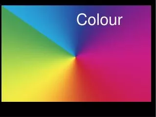
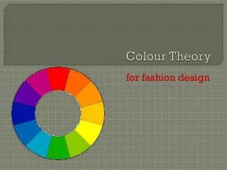
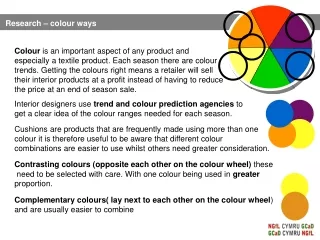
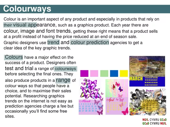
Graphic designers use trend and colour prediction agencies to get a clear idea of the key graphic trends. Colours have a major effect on the success of a product. Designers often test and trial a range of colourways before selecting the final ones. They also produce products in a range of colour ways so that people have a choice, and to maximise their sales potential. Researching graphics trends on the internet is not easy as prediction agencies charge a fee but occasionally you’ll find some free sites. Colourways Colour ways Colour is an important aspect of any product and especially in products that rely on their visual appearance, such as a graphics product. Each year there are colour, image and font trends, getting these right means that a product sells at a profit instead of having the price reduced at an end of season sale.
Colourways Mixing colours and patterns: Mixing colours and patterns can be an ideal way to add interest to a calendar design. However considerable care needs to be taken to achieve an aesthetically pleasing product. You need to take note of the following: • the sizes of the print or the pattern you are attempting to mix. • how you combine print/pattern colours with other colours. Look at the graphical work below. Which are aesthetically successful and why?
Layout design For some good examples of designers that layer up their work to create interesting pieces have a look at: www.davidcarsondesign.com Over the next few slides we’re going to look at why effective layout and layering are important. There are no real design rules but following some of the suggestions could help with setting out text and images.
Horizontal divisions Vertical divisions Diagonal divisions Layout design Division of three – dividing the pages of the calendar into thirds will help you to achieve a more pleasing appearance. Study the layout of the calendar pages below and decide which ones you prefer.
Layout design Can you identify the layout divisions in these calendar pages?
Layout design Can you identify the layout divisions in these calendar pages?
Layout design – layering, texturing & tones • You can develop • your design work • further by adding : • layers • images • textures • typeface (fonts) • varying tones of colours. Add images of work you have created yourself using scanners or photographs you have taken.
Layout design Study the calendars opposite, which layout do prefer and why?, which do you like the least and why? Do they follow any of the guidelines previously discussed?
Typeface? Typeface is the font you choose i.e. Arial, Impact, Algerian, Cairo, Bauhaus, etc etc….. Typeface is all important as it’s what attracts your eye to the text. It enables you to read text. It creates an identity. Think of examples of typeface such as on menus, books, information Layout design The typeface or a font style can make a considerable impact on the appearance of calendar. There are a wide range of typefaces to select from. Choose a typeface that suits your calendar. As an example, the calendars opposite have a typeface that is bold and give the impression of speed. They compliment the image.
Layout design – layering and transparency Select your images and begin layering them up. Place your text by either creating a transparent layer (e.g. the yellow on the first calendar page.) to bring the text forward so that it is the prominent part of the calendar. Or you may want to place the dates to the side or to the bottom of the pages.