Download
1 / 11
160 likes | 428 Views
Color Harmony. Presented by Heidi Redfield Advanced Digital Photography Media 203 May 07, 2013. Color Harmony.

E N D
Color Harmony Presented by Heidi Redfield Advanced Digital Photography Media 203 May 07, 2013
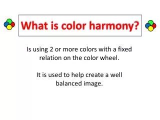
Color Harmony • Once you understand the basics of color theory, you can start learning how to combine those colors into a harmonious whole. There are certain colors that look good together, while other colors look so painful you have to click away before they burn your eyes. And while you might recognize these combinations when you see them, there is a theory based on the color wheel as to which colors will look nicest together.
Historical Background • Color theory was originally formulated in terms of three "primary" or "primitive" colors—red, yellow and blue (RYB)—because these colors were believed capable of mixing all other colors. This color mixing behavior had long been known to printers, dyers and painters, but these trades preferred pure pigments to primary color mixtures, because the mixtures were too dull (unsaturated). • Goethe's color wheel from his 1810 Theory of Colours • The RYB primary colors became the foundation of 18th century theories of color vision, as the fundamental sensory qualities that are blended in the perception of all physical colors and equally in the physical mixture of pigments or dyes. These theories were enhanced by 18th-century investigations of a variety of purely psychological color effects, in particular the contrast between "complementary" or opposing hues that are produced by color afterimages and in the contrasting shadows in colored light. These ideas and many personal color observations were summarized in two founding documents in color theory: the Theory of Colours (1810) by the German poet and government minister Johann Wolfgang von Goethe, and The Law of Simultaneous Color Contrast (1839) by the French industrial chemist Michel Eugène Chevreul.
Analogous Colors • These are the colors that sit next to each other on the color wheel. For example: green, yellow-green, and yellow; or red, red-orange, and orange. Play with the hues and saturation of analogous colors to create a harmonious color scheme.
Color Triads • By placing an equilateral triangle on the color wheel, you can create color schemes that have a lot of life to them. The most basic color triad is the three primary colors: red, yellow, and blue. But others are: green, purple and orange, or yellow-orange, blue-green, and red-purple.
References and Interesting Links http://en.wikipedia.org/wiki/Color_theory http://webdesign.about.com/cs/color/a/aacolorharmony.htm http://luminous-landscape.com/columns/briots-view/color_harmonies_4_cool_and_warm_dominance.shtml http://thelandofcolor.com/color-relationships-and-harmony/ http://color-harmony.edelweis-art.com/ http://www.tigercolor.com/color-lab/color-theory/color-harmonies.htm http://www.colormatters.com/color-and-design/basic-color-theory The Color Strata is by: Stephen Von Worley