Download
1 / 23
230 likes | 397 Views
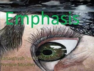
Emphasis. The Most important element on a page should be the most prominent. Emphasis. People in media have decided that the public needs help to decide what’s most important in a publication. Editors determine relative importance, and then instruct designers to emphasize this visually.

E N D
Emphasis The Most important element on a page should be the most prominent.
Emphasis People in media have decided that the public needs help to decide what’s most important in a publication. Editors determine relative importance, and then instruct designers to emphasize this visually.
Emphasis The newspaper is the most obvious example of this visual hierarchy. How has the newspaper design at right emphasized a visual hierarchy?
Emphasis Web design emphasis is not as striking, unless a publication is presented as a pdf. A table of contents style does not convey emphasis in as obvious a way. An obvious point of entry is not as clear.
Emphasis Google news emphasizes important stories with slightly larger heading. But it is basically a list.
Emphasis Graphic artists in print usually don’t work this way. Page design tries to orient a reader to visual information. This helps attract a reader to a publication, and helps him or her move through the pages. Of course, it also takes some decisions away from readers, making choices for him or her.
Emphasis We create emphasis in many areas of life. If you are talking to a friend, that person is emphasized. Other conversations in the background, lights, other activity is secondary or even distracting. Designers use many elements to give emphasis. The Gestalt principles of visual perception also can help us to create emphasis.
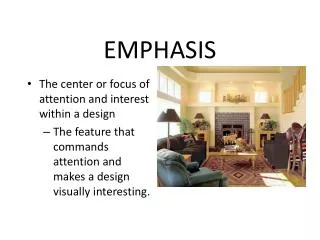
Emphasis: what is most important? Consider your elements to form a visual hierarchy. What is most important? Second? Third?
Emphasis Emphasis suggests some things must be subordinate. If we emphasize everything, nothing is emphasized.
Emphasis: techniques Look for a focal point. Add accents. (Photo: San Miguel de Allende, Mexico, 2008.)
Emphasis: more techniques Bold type. Big type. Bright colors. Texture. Make it look different. Surround by white space. Use continuity: other elements bring the eye to the focal point. Tilt at an angle.
Emphasis Type
Emphasis Use of white space.
Emphasis Bright colors, tilt at an angle.
Emphasis Make it look different. (Photo: Canterbury, UK, 2008)
Emphasis Use continuity to emphasize a strong focal point. (Photo by Lewis Hine.)
Emphasis More ideas for emphasis in graphic design. [http://www.youtube.com/watch?v=MwsDTvLVpm8]
Emphasis What catches your eye and makes you look at this ad? That is, what is emphasized?
Emphasis What catches your eye in this ad? How is emphasis used?
Emphasis Before the U.S. Civil War, newspapers did not consider design elements to be important. (First issue of the New York Times, Sept. 15, 1851.)
Emphasis By the 1890s, emphasis became a central aspect of newspaper design. (New York World, Feb. 18, 1898.)
Emphasis How could you add emphasis to improve the advertisement below?
Emphasis Let’s review. Which of the visual tools we’ve discussed can we find in the photo below (by former student Travis Kroh)? Similarity. Proximity. Continuity. Closure. Emphasis.