Download
1 / 9
90 likes | 270 Views
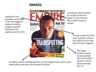
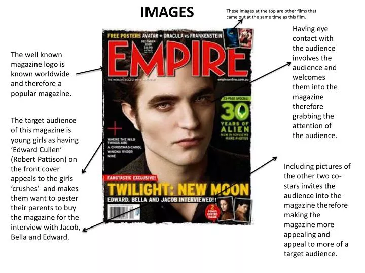
IMAGES. These images at the top are other films that came out at the same time as this film. Having eye contact with the audience involves the audience and welcomes them into the magazine therefore grabbing the attention of the audience.

E N D
IMAGES These images at the top are other films that came out at the same time as this film. Having eye contact with the audience involves the audience and welcomes them into the magazine therefore grabbing the attention of the audience. The well known magazine logo is known worldwide and therefore a popular magazine. The target audience of this magazine is young girls as having ‘Edward Cullen’ (Robert Pattison) on the front cover appeals to the girls ‘crushes’ and makes them want to pester their parents to buy the magazine for the interview with Jacob, Bella and Edward. Including pictures of the other two co-stars invites the audience into the magazine therefore making the magazine more appealing and appeal to more of a target audience.
COLOURS The red colour could signify the vampire effect of ‘blood’ resembling the red colour. Having a bold red colour straight away attracts the audiences’ eyes and the title stands out. Having the yellow colour could signify the stereotypical colour of the moon being yellow when drawn in pictures done by young children. Green is usually associated with aliens so to have a 12 page article on aliens having the green colour suits the advertising the best.
LAYOUT Having the title so prominent in the magazine allows the audience to recognise what the magazine is. Having the main image in the middle of the magazine attracts the audience straight away as the eye contact draws the audiences’ eyes to his eyes-therefore involving the audience in the magazine. Having the title of the film near the bottom of the film relates to the main image and positioning the title underneath the main image ties the magazine together. Including pictures of the other two co-stars invites the audience into the magazine therefore making the magazine more appealing and appeal to more of a target audience. The barcode being at the bottom of the magazine blends in well as you hardly notice the barcode therefore not taking the attention away from the detail of the magazine.
WRITTEN TEXT Having the title below the main image relates the image and film title together-this is vital so audiences recognise what film it is as there are a trilogy. Having an advertisement at the top of the magazine including free film posters in the magazine is a technique that invites the audience in and makes the audience want to buy the magazine. Including pictures of the other two co-stars invites the audience into the magazine therefore making the magazine more appealing and appeal to more of a target audience. Including an interview with the three main characters has attracted the audience into buying the magazine to read about the ‘love triangle’ and all the gossip behind the film.
IMAGE By choosing to have trees behind the main characters it adds a sense of mystery to the film. Instantly by the positioning of the main characters it shows who’s starring in the film. By placing the characters in this position it shows that there is a ‘love triangle’ going on. The title of the film is shown here. The main colours in this film poster are dark this could foreshadow the film. The positioning of the body language between two of the main characters gives the sense that there are complications in this film. Here is the starring roles in the credit block showing all the big names in the film and saying who done what.
NARRATIVE The clues in this film poster about narrative are that there is a ‘love triangle’ by the positioning of the three main characters. By the facial expressions you can see that one of the main characters doesn’t look happy with the other two people so the audience could guess something is happening there. The main female character seems like she is uncomfortable with what is happening. The costumes of the characters seem really simple. Thenarrative can be told by the title of the film.
COLOURS The colours appear to be dark-this could foreshadow the film. The dark clothing could symbolise how vampires cant be out in sunlight so wearing dark clothing could foreshadow that idea. Having the yellow colour could signify the stereotypical colour of the moon being yellow when drawn in pictures done by young children. The brown colour could symbolize Jacob’s brown coat of fur showing that he owns the woods and is the dominant male.
LAYOUT Having the woods in the background gives the film poster an eerie feeling. Having the main characters in the middle of the film poster-draws the audiences’ attention and makes them notice the characters first. The positioning of the main characters shows you that something is vital to know between these characters otherwise they wouldn’t be positioned in that way. Having the title below the characters was clever because the characters draw the audiences’ eyes then the title is below so its the next thing they’ll see. The layout of this film poster is portrait.
WRITTEN TEXT The target audience for this film are young girls as it stars Robert Pattison and Taylor Lautner- who are both girls’ crushes. The slogan ‘the next chapter begins’ shows its part of a sequel. Having the title so bold is vital so the film can be recognised worldwide. The text saying ‘the twilight saga’ also shows its not a new film its part of the previous film. The credit block contains all the film details about who starred in it and who directed, produced and paid for the film.