Download
1 / 1
10 likes | 125 Views
Hulse Team Pulsar Research. Adam Kelsey, Consuela Hancock, Magaly Rosales, Cameron Deem , . What Exactly Is A Pulsar?

E N D
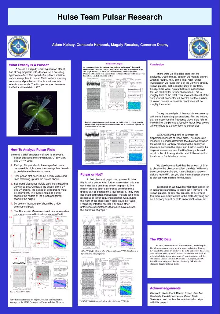
Hulse Team Pulsar Research Adam Kelsey, Consuela Hancock, Magaly Rosales, Cameron Deem, What Exactly Is A Pulsar? A pulsar is a rapidly spinning neutron star. It has strong magnetic fields that cause a pulsating lighthouse effect. The speed of a pulsar’s rotation varies from pulsar to pulsar. Their motions are very constant and precise and that is what interests scientists so much. The first pulsar was discovered by Bell and Hewish in 1967. Conclusion There were 28 total data plots that we analysed. Out of the 28, thirteen we marked as RFI, which is roughly 46% of the total. After further investigation we found that 8 of the 28 were already known pulsars, that is roughly 29% of our total. Finally, there were 7 plots that were inconclusive that we marked for further observation. This is roughly 25% of the total. This shows that most of the data you will encounter will be RFI, but the number of known pulsars to possible candidates will be roughly the same. During the analysis of these plots we came up with some interesting observations. First we noticed that the observational frequency plays a big role in how distinct the plots are. Usually, lower frequencies will contribute to a better looking pulsar plot. Also, we learned how to interpret the dispersion measure of these plots. The dispersion measure is used to determine the distance between the object and Earth by measuring the density of electrons between the object and Earth. Usually if a dispersion measure is in the 0 to 5 range this will result in the plot being labelled as RFI because it is too close to Earth to be a pulsar. We also have noticed that the amount of time to observe the object can affect the data. With more time spent observing you have a better chance to pick up more RFI, but you also have a better chance to pick up more signals from pulsars. In conclusion we have learned what to look for in pulsar plots and how to figure out if they are RFI, known pulsars, or potential pulsars. To determine this there are many factors in the plots. Anything can be a pulsar you just need to know what to look for. Indistinct Graphs As you can see below the pulses are not definite, and you can’t distinguish between pulse and noise. Graph 2 and 3 do not match up with the pulse graph, and graph 3 has RFI in one of the sub-bands (dark spots). Finally the Dispersion Measure is very asymmetrical and doesn’t have a visible peak. From this info we concluded that this is RFI. Even though the lines do match up and are visible in the 2nd graph, this plot has too much noise in its sub-band and would not be considered a pulsar. We concluded that this is RFI. How To Analyze Pulsar Plots Below is a brief description of how to analyse a pulsar plot using the known pulsar J1807-0847 and J1741-0840. Peak profile plot should have a perfect pulse because it is high above the average line. Needs to be definite with minimal noise. Time phase plot needs to be clearly visible dark lines matching up with the pulses above. Sub-band plot needs visible dark lines matching up with pulses. Compare the phase of the 2nd and 3rd graphs, the pulses of both graphs must be equivalent. The pulse should be darker towards the middle of the graph and fainter towards the edges. Dispersion measure plot should be a nice symmetrical peak. The Dispersion Measure should be a reasonable number compared to its distance from Earth. Pulsar or Not? At first glance at graph one, you would think this is not a pulsar. After further observation this was confirmed as a pulsar as shown in graph 1. The reason there is such a difference between the 2 graphs can be blamed on a few things: 1. They were observed at different frequencies. Pulsars tend to be picked up at lower frequencies better. Also, during the night of the observation there could be Radio Frequency Interference (RFI) or some other unforseen circumstances that could have caused the distortion of graph 2. 1.► ◄5. The PSC Data 3.► ► 2.► 4.► In 2007, the Green Bank Telescope (GBT) needed repairs. The telescope needed a new track to move, and during this time they decided to let the sky drift over the GBT and collect data. They collected over 30 terabytes of data and decided to distribute it to high school students and astronomers. The astronomers with the PSC are Dr. Duncan Lorimer, Dr. Maura McLaughlin, and Dr. Rachel Rosen, along with Sue Ann Heatherly (NRAO), the education director at Green Bank. Known Pulsar J1807-0847 (GRAPH ONE) Clearer plot of known Pulsar J1738-08 taken at a different time and frequency. 1.► ◄5. 2.► 3.► ► 4.► Acknowledgements We would like to thank Rachel Rosen, Sue Ann Heatherly, the Astronomers at Green Bank Telescope, and our teacher mentors who helped with this project. Known Pulsar J1741-0840 For other resources use the Right Ascension and Declination look ups on the ATNF Catalogue or European Pulsar Network. (GRAPH TWO) Distorted pulsar plot of Pulsar J1738-08.