Download
1 / 18
180 likes | 186 Views
Data Management. Grade 7. What’s the Story?. Secondary data is information that was collected by someone else. Referring to information that was published in a book or made available online is an example of secondary data.

E N D
Data Management Grade 7
What’s the Story? Secondary data is information that was collected by someone else. Referring to information that was published in a book or made available online is an example of secondary data. Primary data is data that is collected directly. If YOU design, distribute and record the results of a survey, the information you gather is called primary data.
Examine Graphs, data and statistics are a math tool for organizing and analyzing large amounts of information, i.e., data helps to tell a story.
Men vs. Women Is the “women and children first” rule fair?
Census vs. Sample Census Sample • First I asked the whole class • The whole • Everyone • Next I asked just the girls • A portion • A small amount of people that fit a certain category
Bias Checking for bias in data collection • Data from experiments, survey questionnaires and interviews can be influenced by either the context of the study, the respondents themselves, or the researcher. The term "bias,” technically meaning "leaning" in one direction, it is often used to refer to respondents or researchers having pre-conceived ideas or an ideological disposition. What we mean here by bias is anything that can "contaminate" the picture you are trying to get of either subjects' behaviour or their attitudes and beliefs. To influence in an unfair way; "you are biasing my choice by telling me yours.” A partiality that prevents objective consideration of an issue or situation or cause to be biased.
Your Task: • Think about why you want to collect data, e.g., music at a dance, fundraising, school uniforms… • In groups of 2-3, decide on a topic for which you would like to collect data and design a survey. • You must consider bias, sample size, phrasing of the question and method of data collection when designing your survey.
Answer the Following Questions before Surveying: • How will the information collected be used? • How and why is this important? • What collection methods will be used? • What is an appropriate sample size? • Are questions appropriately phrased? • How does data management help you become an informed decision maker?
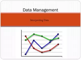
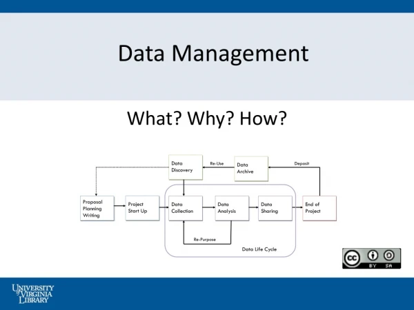
Organizing, Displaying and Presenting Data Interpret, display, graph and draw conclusions from primary data.
Frequency Table A frequency table is a table that lists items and uses tally marks to record and show the number of times they occur. This frequency table shows the number of grade 2 students who chose Taco or Burger as their favorite bakery food.
Stem and Leaf Plot -suppose you have the following list of values: 12, 13, 21, 27, 33, 34, 35, 37, 40, 40, 41. -The "stem" is the left-hand column which contains the tens digits. -The "leaves" are the lists in the right-hand column, showing all the ones digits for each of the tens, twenties, thirties, and forties. As you can see, the original values can still be determined; you can tell, from that bottom leaf, that the three values in the forties were 40, 40, and 41.
Bar Graphs • Bar graphs are an excellent way to show results that are one time, that aren't continuous - especially samplings such as surveys, inventories, etc. • This is a typical survey asking students about their favorite after school activity. Notice that in this graph each column is labeled.
Line Graphs • A line graph is most useful in displaying data or information that changes continuously over time. • The example here shows the changes in the temperature over a week in January. Notice that the title of the graph is "Average Daily Temperature for January 1-7 in degrees Fahrenheit".
Circle/Pie Graphs • Circle or pie graphs are particularly good illustrations when considering the parts of a whole. • In the example, both the number of hours in a whole day devoted to certain activities is listed as well as the percent of time for each of these activities.
Presentation of Primary Data Share the results of your survey with the class. Create a presentation of chart paper that includes a frequency table, an appropriate graph, an a clear survey question.
Criteria • Question and purpose of the survey is clearly stated • You can explain how you attempted to eliminate bias • Frequency table is clearly displayed • All parts of the graph are clearly labeled • The graph summarizes the results • Presentation should be 2-3 minutes in length