Download
1 / 8
80 likes | 218 Views
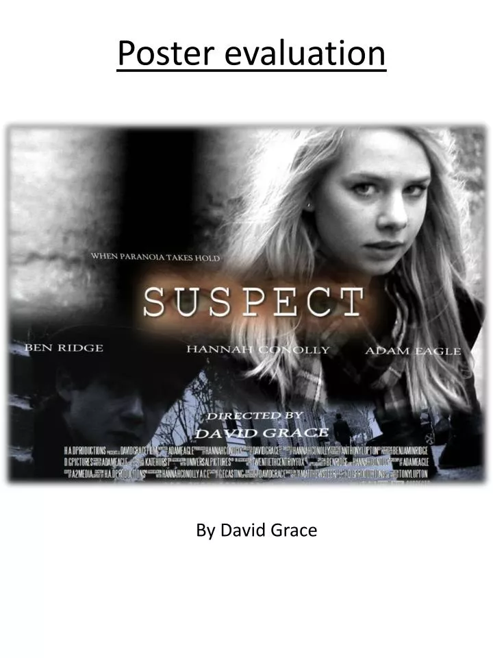
Poster evaluation. By David Grace. Images. The images I chose had to communicate the style and genre of the film, I decided to combine three images, to give a more complex appearance and show multiple aspects of the film, which is similar to what most films of the thriller genre do.

E N D
Poster evaluation By David Grace
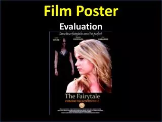
Images The images I chose had to communicate the style and genre of the film, I decided to combine three images, to give a more complex appearance and show multiple aspects of the film, which is similar to what most films of the thriller genre do. Hannah’s eye contact with the audience aids the posters ability to catch viewers interest. It also hints towards this characters position as the ‘watcher’. Ben’s character does not have the same eye match with the audience as Hannah’s character, inferring he is the ‘Suspect’, and is shown in shadow suggesting he is in the hiding position. In the final image on the bottom right, once again Ben’s character is shown as not communicating with the audience with his back to the camera in long shot emphasising his suspicious nature., whilst the feet reinforces the idea of his character being watched.
Title SUSPECT The title is positioned at the centre in order to attract prime attention, the white text allows it to be distinguished and stand out from the dark colours of the poster. I chose the type face in an attempt to obtain that classic typewriter print look, a look I associated with documents such as police records/reports, relating to the element of crime in the film. The eyes set behind the text ‘peering’ through the U and C suggest the idea of being watched, and adds a subtle element to the poster for the audience to pick up on and consider. This should lead them to the recognition of the theme of being watched. The positioning of the title in the centre follows the conventions posters of similar genre films, which more often than other genres, justifies their titles closer to the centre of the page, as opposed to the left or right or the most common of all centred at the bottom of the page. The titles size has been an issue throughout, as it is a common convention that the title is fairly large, and compared to its commercial counterparts, ‘Suspect’s title is rather small. However, I have been unwilling to change this as I feel the images work to focus attention on their point of convergence, where the title is positioned.
Billing Block The billing block included in this poster contains both fact and fictitious padding information to fill the space. We decided to include this fictional material in order to increase the size of the billing block which made the poster appear more professional, considering real movies billing blocks almost occupy a quarter of the space occasionally. We also borrowed logos such as ‘DTS’ and ‘THX’ to add to the realism of the effect. The font which is not standard on the computers we used, was downloaded from a free font source on the internet, allowing us to mimic the real products even closer. Suspect Product Real Product
Cast & Director titles The titles of the lead cast, and in our case our only cast, and the director are common place on almost all examples of real poster products. The names were orientated with the level of their priority in the film dictating who came first to the right, where the audiences eyes would commonly start. Although Ben and Hannah’s roles are arguably equal, the length of Hannah’s name forced me to the decision in place it in the centre balancing the two shorter names either side of it. This is because of the convention of symmetry, which I have noticed in many modern film posters, all content is balanced with proportion to the borders of the frame. Through judgment of the eye, the body form occupies a similar area on both sides. Longer name balances out the two shorter ones on the far left making the odd number symmetrical Line passes through the centralised title and bat logo.
Tag line The intent of the tag line is not to infer to much about the plot and detail of the film, but to often pose a question or problem which the audience them believes will be expanded upon or resolved within the film, thus making them want to go and see it. My tag line provides the audience with the prospect of a consequence, “when paranoia takes hold” ideally they should want to see this film to answer the curiosity of what does happen when paranoia take hold? The font I kept consistent with the other cast and director titles , however I applied 3D effects to it and by coupling this with 2D rotation left the text with a sort of reverse italics which peels away from the page, whilst also remaining on a very subtle skew. All of these element contribute to the idea of the twisting image which is to be associated with the effect of paranoia.
Colour Composition Through the multiple drafts of this poster, I experimented with many different approaches of grading the images. The example above on the left shows Hannah in a high contrast black an white, which I felt emphasized her features, especially the eyes. However, the effect on the poster as a whole meant there was too much white space, the final version of the right softens her expression, but does introduce a lot more grey to the white areas. The second example is of Ben’s image, the original (left) I felt in full colour mirrored the film to closely, especially as it was an actual shot from the film unlike the one of Hannah. I wanted to segregate the poster from the film, much like real posters do, which very rarely feature shots directly identifiable with when watching the film. My initial blue filter, felt was too strong and disguised his features beyond definition. The final composition applies the cold blue tint but the increased brightness level allowing the audience recognition of his features.
Conclusion In conclusion, my poster has mainly followed the conventions of real film products posters, therefore I feel confident in its ability as a successful poster. Although there are exceptions to the conventions including the size of the title, I have noted them and feel the surrounding composition lends its self to exaggerating the title. Much like the poster for the film the ‘Dark Knight’ featured on page 5, which also has a unconventionally small title, however, the characters image is so imposing, relating to Hannah’s eye contact, that the audience is drawn to the further information.