Download
1 / 4
40 likes | 149 Views
The internet looks completely different today than it did when the first websites went online, and it's amazing how much the web has changed. Designers are constantly coming up with new and cool ways to change the way we interact with the internet. Before we check out the latest trends in web design, let's take a look back at the evolution of web design. Visit http://www.digitalsuccessagency.com/blog to know more.<br>

E N D
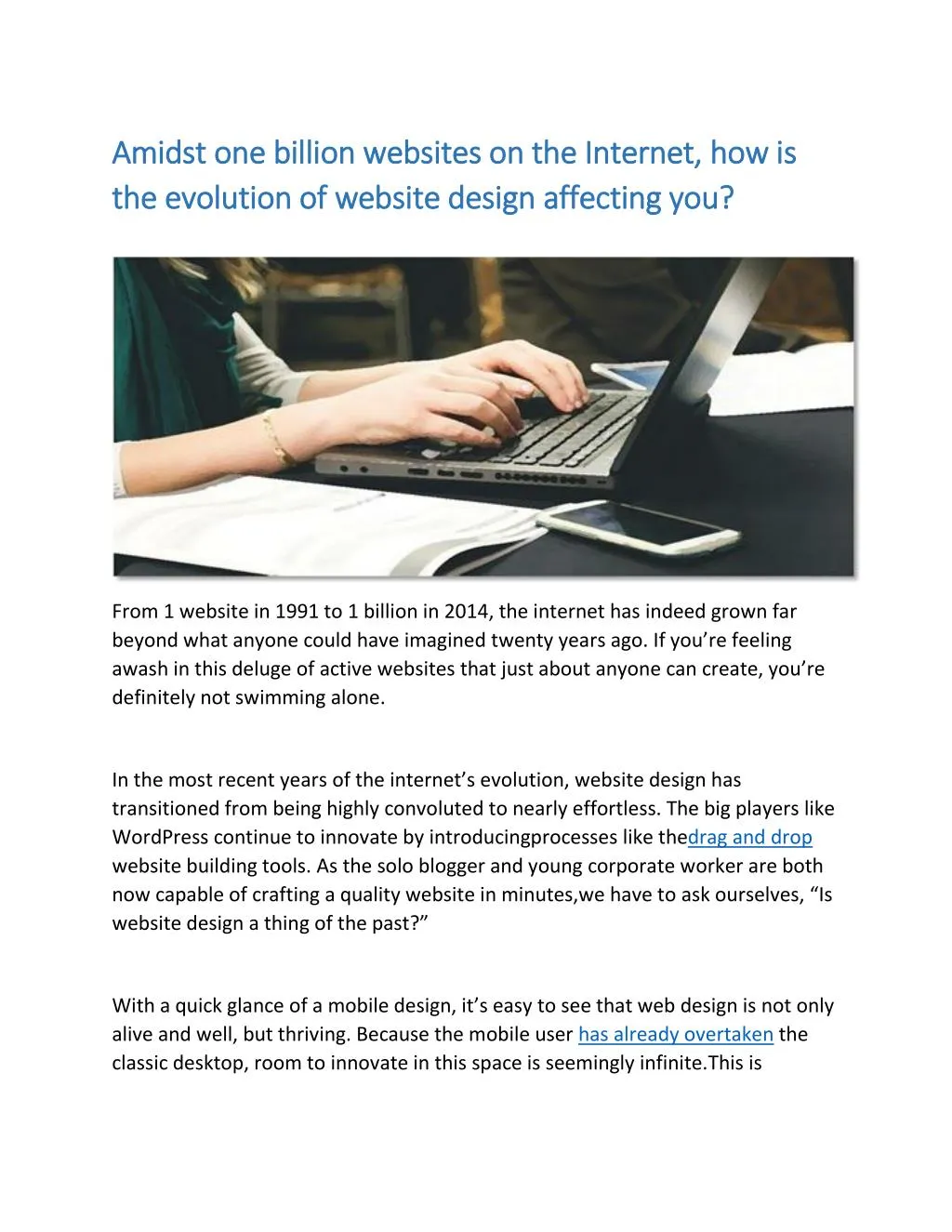
Amidst one billion websites on the Internet, Amidst one billion websites on the Internet, how is the evolution of website design affecting you? the evolution of website design affecting you? how is From 1 website in 1991 to 1 billion in 2014, the internet has indeed grown far beyond what anyone could have imagined twenty years ago. If you’re feeling awash in this deluge of active websites that just about anyone can create, you’re definitely not swimming alone. In the most recent years of the internet’s evolution, website design has transitioned from being highly convoluted to nearly effortless. The big players like WordPress continue to innovate by introducingprocesses like thedrag and drop website building tools. As the solo blogger and young corporate worker are both now capable of crafting a quality website in minutes,we have to ask ourselves, “Is website design a thing of the past?” With a quick glance of a mobile design, it’s easy to see that web design is not only alive and well, but thriving. Because the mobile user has already overtaken the classic desktop, room to innovate in this space is seemingly infinite.This is
especially true sinceless the half of a percent of all the active websites in the world actuallyhave a mobile app dedicated to their brand. As stated by Pete Thomas from Uniform, “The idea of the personal computer as we know it currently will be redundant in a few years’ time, with more and more people just using phones, tablets, TVs and games consoles to access apps that streamline the way they interact with the Internet.” The primary areas we foresee innovation to take place on mobile isin the creation of mobile apps and webpages from the ground up with the priority placed on mobile usage and the new innovations in UI and UX. User Experience and User Interface The infinitely related user interface and experience are both being heavily experimented with mobile websites and apps even today. As mobile internet usage is innately focused on being in the moment, UX and UI trends that have emerged are all centered on being simple, fast, and easy to use. And with the slow exodus of UX designers from desktops to mobile design, mobile is visually improving faster than ever before.In this case, web design may more accurately be called app design. The Taco Bell app is renowned as one among the most successful mobile apps to date, a few features of which you can see here:
The best thing about the Taco Bell app is that the designers analyzed the user experience and utilized different tools to create something unique when considering the customer’s journey. In considering this natural human element, Taco Bell launched this app with full emphasis on crisp visual stimulation in combination with simplicity. Analyzing the actions users take while interacting with your website or app will always lead to useful information on how to go about optimizing, something which Taco Bell fully knows. Mobile First Designing for mobile first is best described by Pascal Raabe from ustwo as: “You have to design the optimal experience from the content out, and progressively enhance functionality rather than reshuffling your large and bulky desktop site”
This quote shows that designing around mobile first places a priority on content that is precise, easy to understand, and smooth in itsintractability. These priorities dictate the trends we see on today’s best apps as they all employ a single theme on each page, they’re all simple, and they’re all are easy to navigate. Besides this, mobile first apps and websites are constantly following a single design that is fluid amongst different mediums, while still being optimized for touch. However, with the progression of HTML5 technology, designing for mobile first is posed to not only be a general set of best practices. Mobile app functionality is slowly creeping into the space we’ve traditionally designated for mobile web pages, thus the blurring of the lines between apps and mobile sites we see today. This is partially the reason mobile app usage has skyrocketed in the last few years- mobile apps are simply capable of creating a more unique user experience. With all the incredible things we’re seeing produced in both mobile apps and webpage design, it’s no wonder web design is moving quickly in this direction. This evolution is ushering in a new trend that is leveraging the sheer number of people using the internet from a mobile standpoint. Designing an engaging mobile app or webpage can be difficult, but it is entirely possible. Drop us a message and we’ll discuss what we can do to help you succeed. Image credit: https://twitter.com/digitas/status/567695587257360384 https://pixabay.com/en/startup-start-up-notebooks-creative-593324/


