Download
1 / 6
60 likes | 68 Views
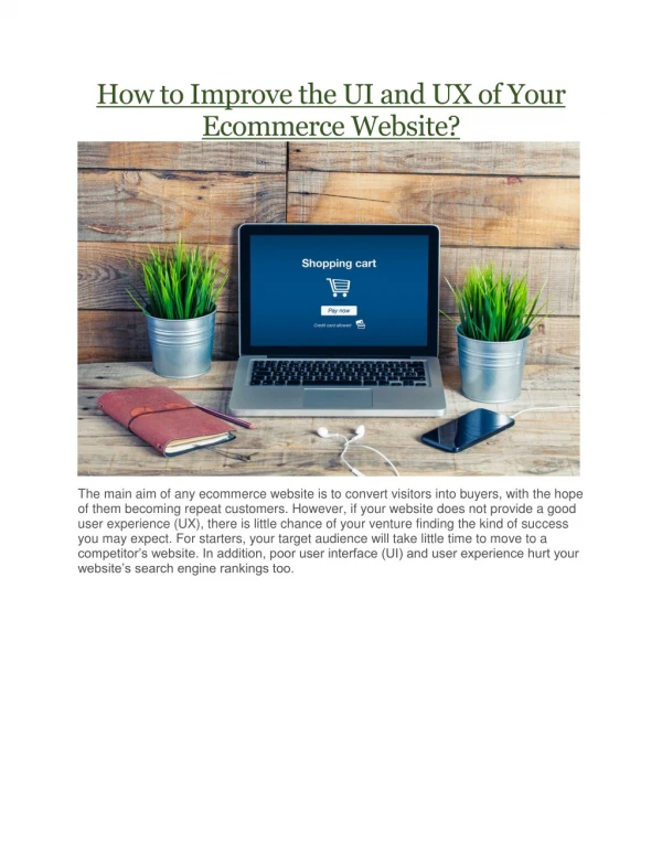
Every business understands the importance of user experience. Your website is a powerful tool that can also be your most powerful asset and a centerpiece of your marketing efforts. To Know more details, You can check this PDF

E N D
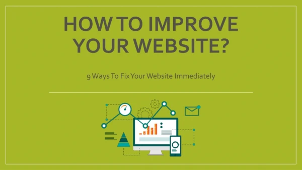
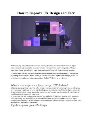
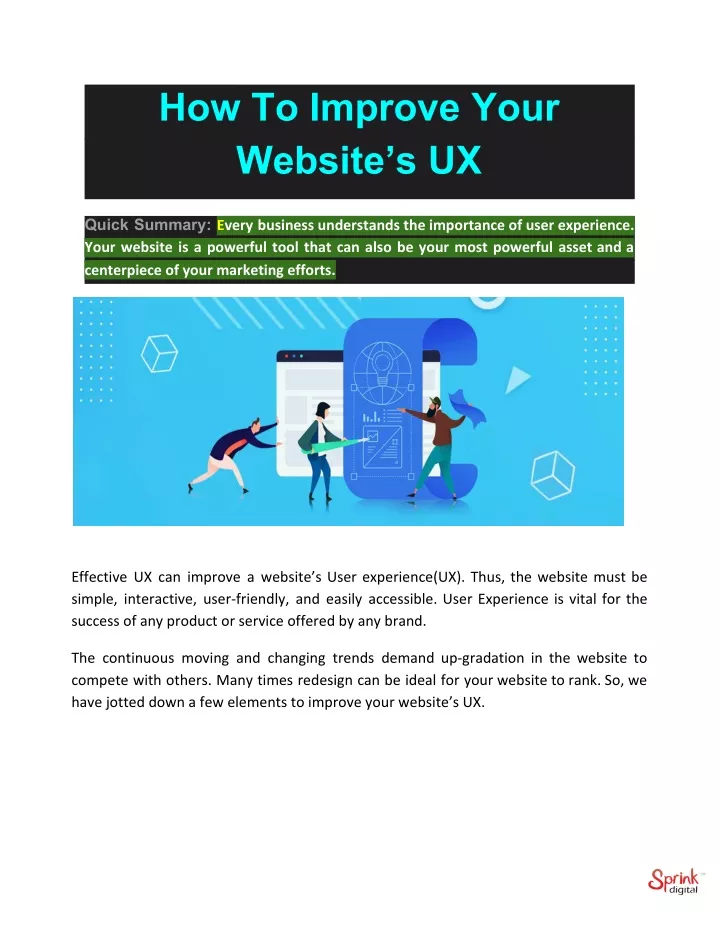
How To Improve Your Website’s UX Quick Summary: Every business understands the importance of user experience. Your website is a powerful tool that can also be your most powerful asset and a centerpiece of your marketing efforts. Effective UX can improve a website’s User experience(UX). Thus, the website must be simple, interactive, user-friendly, and easily accessible. User Experience is vital for the success of any product or service offered by any brand. The continuous moving and changing trends demand up-gradation in the website to compete with others. Many times redesign can be ideal for your website to rank. So, we have jotted down a few elements to improve your website’s UX.
Improve Website’s User Experience With These Tips You must have a website that can address different user problems at the same time when they visit it. Essential White Space White space is the space on your website page. However, most websites use this whitespace for advertising more of their services. White spaces are considered a part of good design. They make the content look neat and readable as well as maintaining the focus on the surroundings of the content. A survey was made to understand the impact of white spaces around text and found that white space increased user attention by 20%. Many websites use white spaces to draw focus on a particular aspect of the page. But, there is one downside to using whitespace. You may have a lot of content to write, but too much white space may replace content that is valuable to place. Hence, you can use your text on the top and surround it with the white space. One of the examples of White Space is BigDrop. Read Also:- Points to Keep in Mind While Designing Client’s Idea (UI/UX)
Optimize Your Page Speed Designs are no doubt essential, so is the page load speed. Maybe your designs are outstanding, but if the page takes too long to load, the user may abandon your website. Slow page load interrupts user experience and turns into a source of frustration. As per the Section.io survey extra, five seconds of page load time can increase the website’s bounce rate by more than 20%. To check your page load speed, you can look into Google’s free service. The free service also guides you to improve your load speed on both Mobile and Website. One simple tip to improve load speed is by compressing all your images before loading them on your website. Barnes and Nobles’ load speed is brilliant, no matter which device you are using. Include Well-Designed Headings Your text must fulfill the purpose of the customer’s finding. Your headings must also include keywords for targeting your message and captivating the right audience. Search engines focus on headings than the descriptive text. Thus choosing the right title will make it stand out and help in improving searchability. Use Animation Or Images Wisely Website Designing is turning more and more creative as the competition to attract maximum customers for a similar niche. Lounge Lizard landing page constitutes an animation that looks like branding a bar or lounge. Since people are getting smart and judge brands quickly through their website before scrolling about features and achievements of the brand. The images and animation you use on your website must be related to your brand instead of using stock photography. Stock photography may not look generic to the users and ultimately decrease the trust in them.
Keeping The Web Pages Designs Consistent Consistency means every page must have the same design font style, spacing, design elements, illustration styles, photo choices, white spaces, and more. As customers visit your website, they must be able to easily navigate through your site and have a beautiful experience. In case of difference in every page, your user can feel lost and confused & may lose trust in your site. Inconsistencies in design may lower the quality of products and services websites are providing. Don’t Avoid 404s Any link clicked by the user is expected to move to a new place or page, where they may find their desired product or services. 404, can be annoying to any user who is looking for something. Just like the slow page speed load time, 404 is another frustrating event for the user that can completely disrupt the user experience. You can use the Google Webmaster tools for your website to check and crawl the errors or use the broken link checker.
Make Designs Responsive Technologies have advanced, and everything has become mobile-friendly. Websites being a significant part of the evolution, have started to accept the change and promising users to visit them through any medium. Recently, Google has penalized those sites which aren't optimized for mobile devices. Thus this makes the need for responsiveness even more crucial. This necessity has turned into the most valuable way to improve the website’s visibility and enhance the customer experience. Differentiate Hyperlink And Attractive Call To Action Users generally are accustomed to seeing text in defined black color. Thus, websites do add color to their specific line or link to grab the attention of the user. This also encourages them to click through the link and discover what next to do they get. Another way to attract customers is through ingraining CTA – Call to Action. Creating buttons that are marked with actionable words can easily navigate to your site and get to the desired location. A study by Maxymiser, researches was shocking to find out that a website that uses Call to Action and color variation in their buttons receive an 11% increase in their clicks. Choose the right words that encourage and trigger the user’s emotional connection. In The Nutshell – Design for users, research, and identify your target audience and keep that in mind when designing a website. Your website must allow users to navigate to pages and get answers within your website. With changing technology, you must also ingrain them with time to keep pace with the competition. You can also refer to the UX design company for improving user experience. They can help you improve designs through ingraining proper CTA, design consistency,
hyperlink differentiation, choosing the right images that reflect the brand and optimizing page speed to avoid any delays. Source of this Article:- Click Here Contact us on Our Website:- https://sprinkdigital.com/ Our highly trained talented teams are committed to providing you with top-level, technical or any other support 24*7. Ready to get started? Give us a call. UNITED STATES +561 990 1920 SINGAPORE +65-91880705 INDIA +91 141 6622200/02 Thank you for giving us your Time.