Download
1 / 39

E N D
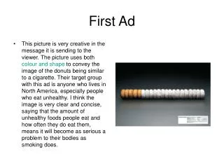
First Ad • This picture is very creative in the message it is sending to the viewer. The picture uses both colour and shape to convey the image of the donuts being similar to a cigarette. Their target group with this ad is anyone who lives in North America, especially people who eat unhealthy. I think the image is very clear and concise, saying that the amount of unhealthy foods people eat and how often they do eat them, means it will become as serious a problem to their bodies as smoking does.
In my opinion this ad is effective, because of the fact substitution was used in a perfect sense, giving the viewer an idea of how bad obesity is, by comparing it to a highly known health issue such as smoking. This ad is targeting the public reminding them to eat efficiently, choosing relatively healthier food rather then junk snacks “i.e donuts” The donuts substituted the original material of the cigarette. The sense used is in this ad is taste, mainly due to the fact that donuts are edible.
*Donuts* 1st ad I think it’s effective because the ad has lined up the donuts in two different colors of a cigarette and it makes them look like a cigarette. So it tells people that donuts are acting like “cigarettes” and they also showed the nutrition facts of a donut so people can see what’s in them that is bad for their health. The principles of design they used is the pattern because they used many donuts to create the shape of a cigarette. Also the donuts and the nutrition facts label are aligned properly. They used the transformation called, “multiplication”. They are appealing to your eyes because you see it and you think about it and then you can see that it looks like a cigarette. The target audience, I think is the parents or the adults because they are the ones who mostly are the ones concerned with diets and nutritional info. I think the message is getting across the audience because it uses proper elements and principles of design.
I think its effective because it’s how obesity is going to be more of a problem then smoking. • Color, form and shape are used. Also proportion and unity is used here.How • Target audience must be adults and teenagers. It’s to inform parents that the should watch out for what they and their family eats. • This is appealing to tasting and feeling. • It’s not that effective, but it’s getting across some how.
“Fries” 2nd Ad I think this ad is effective because it uses the transformation called “substitution” and the fries are replaced by the cigarettes showing that fries are harmful just like cigarettes are. They also gave the nutrition facts so that the people would know what fries have in them. The elements that they used are the “shape” and “color” of fries. This ad uses the principle called, “pattern” because they are number of cigarette’s shapes. The target audience would be parents and adults concerned with eating habits. I think the message is getting across pretty well because it looks like a very well-thought ad.
Second Ad • This ad uses many elements of design. Chiefly, this ad uses asymmetrical balance, or in other words, all over balance. It uses this method of balance to create a virtually impossible course to navigate through. However, at the far end of the ad, there is a Mini, meaning that the Mini is incredibly easy to handle. The ad targets anyone who can afford a car, and someone who wants a car that handles well. I believe the message is relayed very effectively to the viewer in stating that the Mini is very easy to handle.
This Ad has a series or dots. It uses two dimensional figures. What makes the picture seem realistic. It uses the most attracting colour that is red as an outline. In the inside black with white visible letters. • Has enough negative space. It doesn’t make it messy full neither empty .
It Emphasis on the car going fast on the road. • Rhythm. Where you can see the car movement. • And Pattern on the red dots.
Third Ad • For my final ad a chose one about weight loss. This ad uses the shape of a normal business card and then uses a horizontal to vertical transformation to send the message that if joining the company, they will go from looking horizontal to looking vertical (lose weight). Shape and Juxtaposition I believe that the ad attempts to target people from the ages of 25 and up, although it could appeal to anyone. In my opinion the message in the ad appeals to the idea of being fit and slim and conveys the message in an effective manner.
This ad is so simple yet very clear. It promotes weight loss, targeting all those who are heavy. The use of contrast and space is clever. The first image appears bigger because the card is held width-wise but in the following one, it is vertically held thus appearing thinner and attracting much more attention.
Weight Loss • This is in my opinion a very effective ad. It uses the piece of paper to somewhat showcase what would happen if you decide to attempt weight loss with their company. • Once again, this ad sort of follows the same guideline that the rest follow: simple and short.
Petro-Canada Shoes In this ad the use a shoe to replace a car and a shoe lace to simulate a gas pump tube mean that you should walk more. Also the Shoe lace stands out a lot more so it catches your attention.CONTRAST The whole bunch of the ad is on the bottom corner of the ad.
The ad has movement which is rhythm the way the shoe lass waves around shows that there is movement. This ad has emphasis because the make the shoe and the lass bigger then the writing. SUBSTITUTION
This Ad has the visual texture or dirty shoes and parts of cigarettes It has pattern within the shoes and the cigarettes And variety; the shape of the cigarettes and shoes are not exactly the same.
I think it’s effective because it’s stinky sneakers and I like how it says scratch it here, it goes well with the freshener. • Shape and form is used creatively here, also the texture is amazing. Pattern is used as well, repeating the sneakers, and proportion. • Target audience are people who play sports quite often and work out. • It’s appealing to the way it smells.The whole idea is that it probably doesn’t smell when you sniff. Because they have been sprayed by febreeze. • Yes, the message is getting across due to its creativity.
Title: Pencil Category: AD/11 - Out-of-Home Advertising - Single Principles: The principles that this ad includes is emphasis and proportion. The emphasis or focal point in the drawing is the Pencil because of its proportion which is extremely large compared to its supposed, original size. The transformation which it also includes is transference because of the pencil being in a place/environment not normally its own. Target Audience: Back to school shoppers Message: Come shop for school supplies atCanadian Tire! What senses are they appealing to? : They are appealing to our sense of sight, with the enlargement of an odd object; it keeps us aware and intrigued.
“Pencils” I think it’s effective because there is this pole kind of thing which looks like a big pencil and it’s bigger & taller than the normal pencil so people notice it on the street when they are walking and it’s related to what Canadian Tire is advertising about, “Stationery”. The principle of design that the advertisement uses is “shape”. The shape of the big pole kind of thing is like a pencil and it grabs people’s attention. The target audience is the parents and the kids who have to buy stationery for going back to school. The ad appeals to our ‘eyes’. The ad is telling people that if they want a pencil or just basically stationery, they should go to the Canadian Tire to shop for stationery for back-to-school. LAST AD
Title: Iron/Chair/Kitchen Category: AD/16 - Public Service/Charity Advertising - Series Principles: The principles that this ad includes is multiplication, in this case with the multiple hands shown on this man. The ad also includes unity and harmony with the colors; they are all mostly brown and pastels. The ad gives an accurate effect with the unified colors that they’re the usual stereotypical colors you would link with old people. Target Audience: ThePublic. Message: When you haveParkinson disease you twitch and have no control over you body just like the man in the picture the multiple hands are pulling him in different directions limiting his control.
Title: Rainbow • Category: AD/07 - Billboard Advertising - Single • Principles: The Principles that this ad includes is Painterly line which is created by putting two colors beside each other there is also a stream of colors on the rainbow which intensifies the ad. The ad definitely includes an emphasis known as the focal point which is the rainbow shining from the ad in the ad; also the big bolded number ‘27’ which leads you to a smaller but still bolded word ‘million’. • Target Audience: Lottery Buyers and people interested in easily gaining money. • Message: To bring attention to the Super 7 jackpot, they projected high-powered lights with colored gels into the sky, making the jackpot 'the pot of gold at the end of the rainbow.' • What senses are they appealing to? : They are appealing to our sense of sight, with the bright, rainbow like colors appearing out of the ad within the ad.
Diamond Shreddies I think the ad is effective because of how it’s designed. It’s the transformation called “multiplication” because the repeating images of diamond shapes are next to each other in grids. Another transformation used is “juxtaposition” because the diamond shape and the square shape are put next to each other for comparison. The principles of design used are “shape” of the cereal, “color” of the background, “texture” of the cereal and the background. The principles used are “balance” between the cereal things, the background and the text. There is also a “patterns” of “shapes”. I think the target audience is the teens and kids because they like new shapes and styles. It can also be the adults. I think they are getting the message across which is to be different and more fun. THIRD AD…
shape and EMPHASIS. IT USES IT USES EMPHASIS BECAUSE THEY PUT THE BATHING SUIT IN THE MIDDLE SO THAT IT STANDS OUT. THIS AD ALSO HAS COLOUR. THE YELLOW REALY MAKES IT THE WHOLE IMAGE STAND OUT. CONTRAST
This ad is very, very effective. The use of alignment, unity, space, colour, contrast and emphasis is perfect. The first text has appropriate negative space where the following two have nearly none. The smaller font, slightly darker background and lesser width add to the idea of paranoia. The last frame clearly indicates depression. The colour black to begin with represents solitude, lonliness, fears, etc. pessimism per say, but the highlighted words provides a focal point. It can target anyone because these diseases aren’t age differentiated.
In the Ad pertaining to Canadian Tire, the image utilizes Balance, Movement and Unity. The ad catches the eye easily because of the darker background contrasting with the bright colours around the signs. I like that the extension cord is plugged into the Christmas lights - connecting the two together – because it is provides movement in a logical way. The symmetrical balance is very nice as well it’s not uncomfortable to look at whereas; an unbalanced design may seem too hectic. Therefore it is very clear and concise as well as appealing, more so to adults though.
This ad has a lot of movement. It also has a lot of Shape LINE
I think this one is effective because if shows how if something is made out of sugar free it still is sweet. This is because ants get all over sugary things, and this has ant’s representing the same taste. • This image has shape, lines; it has movement, which makes your eyes follow. It also has unity, and is asymmetrical. • The target audience is mostly adults because they can buy sugar free things and make sure that they won’t feel the different taste and their children wont either. • They are appealing to taste. • Yes it’s getting across because it shows how it tastes as good as sugar.
War is Hell, Shopping is Worse • This is an excellent advertisement in my opinion. It shows off the sometimes brutal and intense battles shoppers go through for consumer products, such as electronics. • The toy soldiers, along with the “sale” tag also give a sense of humor when analyzing the ad. • juxtaposition
Lung Cancer • This advertisement is great mostly because it follows a good guideline: short and simple. • It effectively gets the message across and is just as potent as clear. The fact that the ad targets smokers (a very serious topic) also contributes to it’s effectiveness.
This ad is effective due to its relative large size, and creative appearance. The ad is targeting the public citizens of the desired location, a good reminder to consume cheese frequently. This is a prime example of Magnification: The "reconstruction" of a the cheese crater is on a much larger scale than of the original. This ad has High contrast, color manipulation (colour of cheese as orange) This ad targets the sense of taste.
Form: the picture has the use of form by making the billboard seem like a full 3d cheese grater. • Texture: It gives a textual feeling of the blades on the one end, there are pieces of cheese coming out of it, it seems like the blades are actually there. • Colour: It uses a bright orange to really bring out the intensity of the billboard; anyone coming by would quickly notice it. The word cheese is in white so it contrasts with the background orange. • Emphasis: The use of emphasis on the word Cheese, it’s in big bold white and you can easily notice the purpose of the billboard. • Proportion: This is a ridiculously larger form of a cheese grater than any normal person would have seen in their time. • The billboard takes an everyday object, a cheese grater, and turns it into a giant form of advertisement in a very clever way. There’s the huge orange block which represents the cheese, then the metal cheese greater on the other end of it.
This ad is effective because it shows a first person view of what to except when on the ride. The ad is targeting anyone who is willing to go on a ride, (customers). This is a prime example of Fragmentation, because the ad is divided into three segments. This add could also has some multiplication mainly because the image is the same in all three segments just rotated on a different angle. This ad has the sense of sight, gives the viewer a thought of how the individual will feel and see when on the ride. Movement
7up Ice This ad is very simple but very clean. It gets right to the point saying that 7 up is good when it is cold. The glass is in the very center and it makes it very clean looking. Colour- clean
This ad has proportion; black capital letters that people can easily read. • It has Emphasis on the bottle. • The ad has a pattern between the letters and the bottle.
Kids and Violence This one is say that kids are becoming more and more violent all the time. Having the three picture spread out draws your eye to them one at a time and it is just well done.
Contributions to the Class Powerpoint • Bashir • Fadi • Adam • Shukria • Cecilia • Saido • Sana • Trevor • Zainab • Kara
Proportion: The shark is shown as being large compared to the record player, so you know it's a fairly large shark and can take a guess at it. • Contrast: The image has contrast, it shows a record player in the middle of a dock area on an ocean with a shark hanging above it, pretty out of place in my opinion, like a few centuries maybe? • Form: Theres the use of form to show that it's supposed to be a realistic image by giving shape to both the shark and the record player. • Space: Theres a small use of space, not really that large in my own perspective, but theres a nice background in the back as negative space, it's just blue and sitting there, and then theres a orange circle with a shark beside it. • Movement: The eyes start at seeing a shark, and then looking at the circle beside it with the text, and you wonder what it's supposed to mean, until you suddenly look lower and see a really old record player • The shark has a record player, probably 19th or early 20th century. Then a circle beside it saying sharks can live to be 100. It's a good way to advertise science, gives the person a point of interest, like “hey cool, they can live to be 100” then you laugh at seeing the record player and decide to go to science world and check out more.
Colour: The use of a bright yellow pylon quickly pulls your attention to that. • Space: The pylon takes up just a small part in the middle and right part of the image, and the rest is just a gray background. • Form: There’s a pylon there in it's full 3d glory to make you know this ad means business...literally it's an ad for a business, Air Canada XD • Not much to say about this ad. It's making a joke about people working above, and by above it means in a plane in the sky. • Movement