Download
1 / 29
290 likes | 452 Views
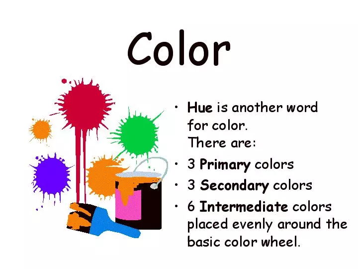
Printers Primaries CMYK Cyan, Magenta,Yellow, Black. Pigments: Red, Blue,Yellow All hues mixed together create black. Light Primaries: Red, Green, Blue Electronic Media -Computer screens/video/television. Value. Same Hues or Colors Value = different mixure of added white or black.

E N D
Printers Primaries CMYK Cyan, Magenta,Yellow, Black Pigments: Red, Blue,Yellow All hues mixed together create black
Light Primaries:Red, Green, Blue Electronic Media -Computer screens/video/television
Value Same Hues or Colors Value = different mixure of added white or black Light Value Medium Value Dark Value +white +black
HowdoGraphic ArtistsUseColor? To create an emotional reaction in the viewer. To enhance or reinforce the impact of the message subliminally. To emphasize certain parts of a message.
Reaction hard wired in human DNA: Enhances human metabolism, increases respiration rate, and raises blood pressure. Associated with blood, and with feelings that are energetic, exciting, passionate or erotic. Negative: evokes aggressive feelings, suggesting anger or violence. High visibility: stop signs, stoplights, and fire equipment Meanings: Courage, danger, energy. In advertising, red is often used to evoke erotic feelings (red lips, nails, red-light districts, 'Lady in Red', etc).
Orange combines the energy of red and the happiness of yellow. Joy, sunshine,the tropics, or the friendly warmth of the hearth fire. A visually HOT colorit gives the sensation of heat. Enthusiasm, fascination, happiness, creativity, determination, attraction, success, encouragement, and stimulation. Nevertheless, orange is not as aggressive as red. Psychologically positive: suggests closeness, approachability, informality.Orange increases oxygen supply to the brain, produces an invigorating effect, and stimulates mental activity. It is highly accepted among young people. As a citrus color, orange is associated with healthy food and stimulates appetite. Orange is the color of fall and harvest. In heraldry, orange is symbolic of strength and endurance. Orange has very high visibility, so you can use it to catch attention and highlight the most important elements of your design. Orange is very effective for promoting food products and toys. Dark orange can mean deceit and distrust. Red-orange corresponds to desire, sexual passion, pleasure, domination, aggression, and thirst for action. Gold evokes the feeling of prestige. The meaning of gold is illumination, wisdom, and wealth. Gold often symbolizes high quality.
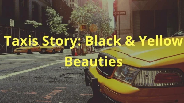
Yellow is the color of sunshine. This color is optimistic, upbeat, modern. The energy of yellow can become overwhelming. It stimulates mental activity, and generates muscle energy. Yellow is often associated with food. Bright, pure yellow is an attention getter, which is the reason taxicabs are painted this color. Yellow is seen before other colors when placed against black; often used to issue a warning When overused, yellow may have a disturbing effect; it is known that babies cry more in yellow rooms. In heraldry, yellow indicates honor and loyalty.Later the meaning of yellow was connected with cowardice.
Green suggests nature (plant life, forests), growth, harmony, freshness, fertility, life, stability, restfulness, naturalness. Green in some tones or certain contexts (such as green skin) might instead suggest decay (fungus, mold), toxicity, artificiality. Emotional: safety. Dark green is also commonly associated with money, stability and endurance. Green has great healing power, most restful color for the human eye; it can improve vision. Green suggests. Negative: lack of experience, a 'greenhorn' is a novice. In heraldry, green indicates growth and hope.Green, as opposed to red, means safety; it is the color of free passage in road traffic. Dull, darker green is commonly associated with money, the financial world, banking, and Wall Street. Dark greenis associated with ambition, greed, and jealousy. Yellow-greencan indicate sickness, cowardice, discord, and jealousy. Aquais associated with emotional healing and protection. Olive greenis the traditional color of peace.
Blue suggests coolness, distance, spirituality, or reserved elegance. Evokes sky and sea. , associated with depth and stability. Nagative: we can think of the "blues"-the implication being one of sadness, passivity, alienation, or depression. Symbolism:trust, loyalty, wisdom, confidence, intelligence, faith, truth, and heaven. In heraldry, blue is used to symbolize piety and sincerity. CALMS: Blue is considered beneficial to the mind and body. It slows human metabolism. Blue is strongly associated with tranquility Dark blue is associated with depth, expertise, and stability; it is a preferred color for corporate America.In advertising, Blue is used to promote products and services related to cleanliness As opposed to emotionally warm colors like red, orange, and yellow; blue is linked to consciousness and intellect. Blue is a masculine color; according to studies, it is highly accepted among males. BLUE supresses appetite Avoid using blue when promoting food and cooking,. Art: When used together with warm colors like yellow or red, blue can create high-impact, vibrant designs; for example, blue-yellow-red is a perfect color scheme for a superhero. Light blueis associated with health, healing, tranquility, understanding, and softness. Dark bluerepresents knowledge, power, integrity, and seriousness.
Violet is the color of fantasy, playfulness, impulsiveness, and dream states. In its negative mode, it can suggest nightmares, or madness. Purple combines the stability of blue and the energy of red. Purple is associated with royalty. It symbolizes power, nobility, luxury, and ambition. It conveys wealth and extravagance. Purple is associated with wisdom, dignity, independence, creativity, mystery, and magic. According to surveys, almost 75 percent of pre-adolescent children prefer purple to all other colors. Purple is a very rare color in nature; some people consider it to be artificial. Light purple is a good choice for a feminine design. You can use bright purple when promoting children's products. Light purple evokes romantic and nostalgic feelings. Dark purple evokes gloom and sad feelings. It can cause frustration.
Black:Black is a mysterious color associated with fear and the unknown (black holes). It usually has a negative connotation (blacklist, black humor, 'black death'). Black denotes strength and authority; it is considered to be a very formal, elegant, and prestigious color (black tie, black Mercedes). Meanings:Grief, death, mystery, evil, elegance, power Art: Black gives the feeling of perspective and depth, but a black background diminishes readability. A black suit or dress can make you look thinner. When designing for a gallery of art or photography, you can use a black or gray background to make the other colors stand out. Black contrasts well with bright colors. Combined with red or orange – other very powerful colors – black gives a very aggressive color scheme.
White : light, goodness, innocence, purity, and virginity. It is considered to be the color of perfection. White means safety, purity, and cleanliness. In heraldry, white depicts faith and purity. In advertising, white is associated with coolness and cleanliness because it's the color of snow. You can use white to suggest simplicity in high-tech products. White is an appropriate color for charitable organizations; angels are usually imagined wearing white clothes. White is associated with hospitals, doctors, and sterility, suggests safety for medical products, foods and dairy products.
Color Exercise Time: one class session 10pts • Open the color line design from the shared folder. • Create six new color schemes using the paint bucket tool and/or color picker to select your colors (refer to the color wheel.) Make sure you depict the following: • Complementary Colors • Double Complements • Triadic Complements • Near Complements • Multiple Complements • Warm colors or Cool colors (use pastel shades for this one) • Save to your folder and to the shared folder.