Download
1 / 2
20 likes | 89 Views
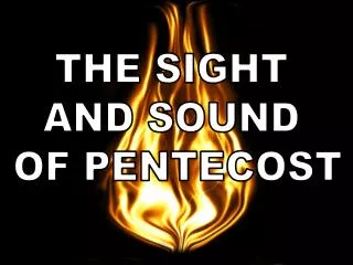
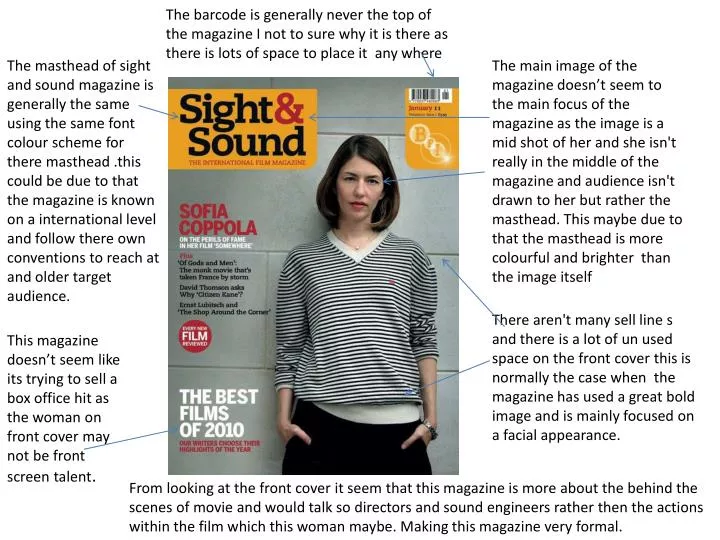
The barcode is generally never the top of the magazine I not to sure why it is there as there is lots of space to place it any where.

E N D
The barcode is generally never the top of the magazine I not to sure why it is there as there is lots of space to place it any where The masthead of sight and sound magazine is generally the same using the same font colour scheme for there masthead .this could be due to that the magazine is known on a international level and follow there own conventions to reach at and older target audience. The main image of the magazine doesn’t seem to the main focus of the magazine as the image is a mid shot of her and she isn't really in the middle of the magazine and audience isn't drawn to her but rather the masthead. This maybe due to that the masthead is more colourful and brighter than the image itself There aren't many sell line s and there is a lot of un used space on the front cover this is normally the case when the magazine has used a great bold image and is mainly focused on a facial appearance. This magazine doesn’t seem like its trying to sell a box office hit as the woman on front cover may not be front screen talent. From looking at the front cover it seem that this magazine is more about the behind the scenes of movie and would talk so directors and sound engineers rather then the actions within the film which this woman maybe. Making this magazine very formal.
The masthead is bright red which is eye catching and will draw the attention of the young male s as it its red which always symbolises a strong emotion. The masthead unlike empire doesn’t go across the full width of the page making it not as bold but the yellow background make up for it as it is much easier to read then empire and is clearer. Its seem that the front cover is filled with information by using sell lines and using a full body image which takes up most of the page the clever way in which the sell line follow megan fox’s body make s the magazine more eye catching then sight and sound and the use of the different sizes of font enforces that the target audience is of a young one. To me only three things stand out on this magazine cover which are the masthead one sell line and the slogan Which is unusual because one of them should be the image like empire magazine but yet due to its dull lighting its seem that there's a tin on the image that makes it dull and boring and it doesn’t stand out against the masthead. With empire it seems that all wording is built around the actor Megan fox as it seems that she is the main attraction and her sex appeal as she is half naked and there is a references to her being ‘HOT’ which is the third largest word on the cover. From the huge sex appeal the target audience is aimed at young men. Once again sight and sound has lots of space unused Unlike empire that has used most of there space this maybe due to that sight and sound aren't trying to sell what is the latest treat in the box office and rather the exclusive foresight of a director when editing a film and shooting techniques.