Download
1 / 30
300 likes | 425 Views
Perception. Organization. Communication. Audience. Layout. Using the principles and ideas from Chapter 7 of White Space Is Not Your Enemy , by Kim Golombisky & Rebecca Hagen. Other icons can distract; less is more. Create a Focal Point. Directs audience. Consistency.

E N D
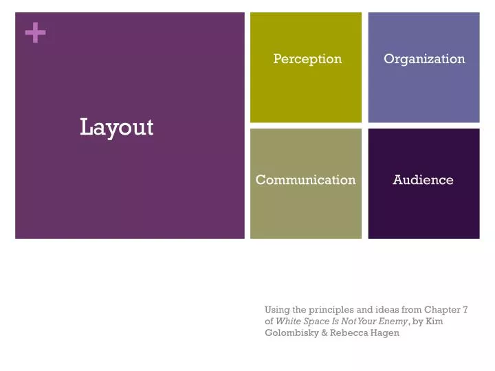
Perception Organization Communication Audience Layout Using the principles and ideas from Chapter 7 of White Space Is Not Your Enemy, by Kim Golombisky & Rebecca Hagen
Other icons can distract; less is more Create a Focal Point Directs audience
Consistency Creates focus in form
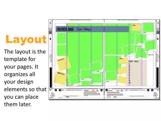
Body Copy Headline Modular design Byline Deck Simplicity creates space for creativity while remaining consistent Visual Cutline Sidebar
The Golden Ratio Mathematical formula for a grid of asymmetrical placement of a layout.
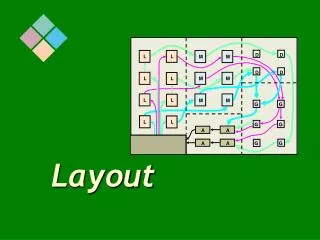
The rule of thirds Symmetrical Or asymmetrical Is all about Balance And Can create Guide the reader Create a 3x3 grid Pick a focal point
Interestingly, PowerPoint offers only a few slides or themes with a strict 3x3 grid as a default option.
So you’ll have to create your own or tweak existing slides… Interestingly, PowerPoint offers only a few slides or themes with a strict 3x3 grid as a default option.
Eseteiusmodtemporincidunt et labore et dolore magna aliquam. Utenim ad minim veniam, quisnostrudexerc. Irure dolor in reprehend incididuntutlabore et dolore magna aliqua. Utenim ad minim veniam, quisnostrud exercitation ullamcolaboris nisi utaliquip ex eacommodoconsequat. Duisauteirure dolor in reprehenderit in voluptatevelitessemolestaiecillum. Tia non obeasoluadincommodegeniumimprobfugiend. Eseteiusmodtemporincidunt et labore et dolore magna aliquam. Utenim ad minim veniam, quisnostrudexerc. Irure dolor in reprehend incididuntutlabore et dolore magna aliqua. Utenim ad minim veniam, quisnostrud exercitation ullamcolaboris nisi utaliquip ex eacommodoconsequat. Duisauteirure dolor in reprehenderit in voluptatevelitessemolestaiecillum. Tia non obeasoluadincommodegeniumimprobfugiend. “LoremIpsum”, or nonsense Latin, can aid in the initial layout stages as a placeholder Adding type Let the layout decide type placement Be mindful of Font Size Color Always proofread
Keep your headline and lead together • Reduce leading as needed on multiple-line headlines • Set copy in columns • Avoid fully justified or centered type • Watch for inelegant breaks in headlines or type • Avoid widows or orphans General guidelines
Keep your headline and lead together • Reduce leading as needed on multiple-line headlines • Set copy in columns • Avoid fully justified or centered type • Watch for inelegant breaks in headlines or type • Avoid widows or orphans General guidelines
General Guidelines • Keep your headline and lead together • Set copy in columns • Reduce leading as needed on multiple-line headlines • Avoid fully justified or centered type • Watch for inelegant breaks in headlines or type • Avoid widows or orphans
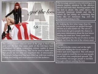
Placing Visuals Place visuals near the top of the layout Keep picture aligned to its content Don’t flip photos Don’t position a visual so that it interrupts the flow Pay attention to wrapped text
Placing Visuals Place visuals near the top of the layout Keep picture aligned to its content Don’t flip photos Don’t position a visual so that it interrupts the flow Pay attention to wrapped text
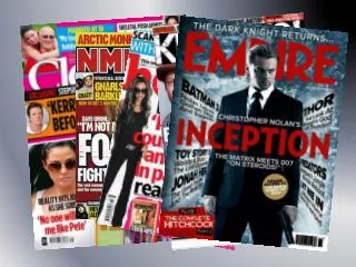
When using multiple visuals… Contrast sizes based on hierarchy of importance
When using multiple visuals… Contrast sizes based on hierarchy of importance Or use a grid of equal sizes for rhythm and pace
When using multiple visuals… Contrast sizes based on hierarchy of importance Or use a grid of equal sizes for rhythm and pace Balance
When using multiple visuals… Contrast sizes based on hierarchy of importance Or use a grid of equal sizes for rhythm and pace Balance Or cluster groups of images
Where to put negative space Consolidate negative space into larger pools
Where to put negative space Avoid trapped Space
Order and Organization:Gestalt theory • Proximity • Similarity • Continuity • Closure
Proximity “Fish and Boat” M.C. Escher
Relative position and size indicates importance Orderand organization Creating hierarchy Contrasting size Short Answer: Inform readers where to look and what to look at first, second, etc. Location Location Location Size Matters
Visual unity • Repeat compositional elements • Consistency above all Multipage Layouts (like, say, PowerPoint Presentations)
Loads of type • Break up pages of type • Use grids • Add visuals • Use white space strategically Multipage Layouts (like, say, PowerPoint Presentations)
Navigational signs • Visual signposts for readers • Table of contents • Specific to genre/medium Multipage Layouts (like, say, PowerPoint Presentations)
Goals • Layout serves good communication objectives • Capturing attention • Control flow • Convey information • Evoke reactions • Audience awareness is key • Know what your readers need • Know what you want your readers to understand