Download
1 / 25
250 likes | 304 Views
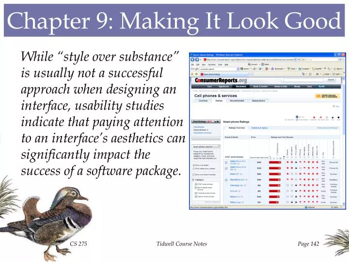
Chapter 9: Making It Look Good. While “style over substance” is usually not a successful approach when designing an interface, usability studies indicate that paying attention to an interface’s aesthetics can significantly impact the success of a software package. Same Content, Different Styles.

E N D
Chapter 9: Making It Look Good While “style over substance” is usually not a successful approach when designing an interface, usability studies indicate that paying attention to an interface’s aesthetics can significantly impact the success of a software package. Tidwell Course Notes
Same Content, Different Styles Set up in 2001 as a means for web designers to share design ideas, CSS Zen Garden allows graphic artists to use the same HTML file and attach their own Cascading Style Sheet, providing an array of styles to review. Tidwell Course Notes
The Tristimulus Theory of Color The thin layer of nerve cells at the back of the eye is called the retina. The light sensor cells on the retina that detect illumination are called rods. The section of the retina that reacts to color is called the fovea. Located within the fovea are highly sensitive light sensor cells called cones. The Tristimulus Theory of Color hypothesizes that each cone is sensitive to red, green, or blue light, and that all colors are essentially combinations of R,G, and B. Tidwell Course Notes
Color Sensitivity The visible spectrum of light, illustrated at right, ranges from about 400 to 700 nanometers in the electromagnetic energy spectrum. Empirical studies have indicated that the cones in the eye have different levels of sensitivity to different colors, indicating that the eye’s response to pure blue light is much less strong than its response to pure red or green light. The RGB phosphors used in cathode ray tubes do not exactly produce “pure” shades of red, green, and blue, as indicated in the figure above, showing the eye’s response to the excited pixel colors. Tidwell Course Notes
The RGB Cube One common way to specify colors to be displayed on an interface is the RGB cube, in which every color is a linear combination of red, green, and blue Tidwell Course Notes
Color Display Technologies Several display technologies have been developed to accommodate the RGB model. In cathode ray tube (CRT) displays, focused electron guns shoot charged beams at a screen coated with triads of red, green, and blue phosphors. The intensity of the beam determines how bright each pixel’s triad becomes, resulting in a particular RGB color for that pixel. In a liquid crystal display (LCD), each pixel has three transistors that apply a charge to an associated liquid crystal substance behind colored RGB filters. The intensity of each transistors charge determines how much light the liquid crystal allows to pass through, resulting in a particular RGB color for that pixel. A plasma screen is a network of RGB phosphors mounted between two thin layers of glass. A small electric pulse for each pixel excites the gases hovering over the phosphors, changing them to a plasma state, from which they react with the phosphors to produce CRT-like light. Tidwell Course Notes
The HSV Cone An alternative way to represent color is via HSV coordinates, using hue (i.e., pure color, represented by the angle around the central axis to the cone), saturation (i.e., level of purity, represented by the radial distance from the axis), and value (i.e., lightness, represented by the distance up the central axis). • This model has the intuitive appeal of the artist’s tint, shade, and tone model: • pure pigments are (i,1,1). • tints: adding white pigment is equivalent to decreasing S at constant V • shades: adding black pigment is equivalent to decreasing V at constant S • tones: decreasing S and V Tidwell Course Notes
HSV Separation The picture at right illustrates the HSV distinction. Setting saturation and value to constants, observe the variation in hue. Setting hue and value to constants, observe the variation in saturation. Setting hue and saturation to constants, observe the variation in value. Tidwell Course Notes
Interface Colors With the advent of advanced hardware and software technologies, it’s easy to set up interfaces with a variety of colors. Does the choice of colors make a difference? Tidwell Course Notes
Color: Warm Vs. Cool Yellows, oranges, and reds are warm colors, giving a sense of excitement and passion. Blues, purples, and greens are cool colors, giving a sense of calm and comfort. Tidwell Course Notes
Color: Light Vs. Dark Backgrounds Light backgrounds afford a somewhat friendlier mood. Dark backgrounds seem more serious, perhaps even foreboding. Tidwell Course Notes
Color: High Vs. Low Contrast A high contrast between foreground and background colors provides a sense of confidence and strength. A low contrast between foreground and background colors provides a sense of relaxation and weakness. Tidwell Course Notes
Color: Saturated Vs. Unsaturated Saturated color combinations tend to cause excessive eyestrain. Unsaturated color combinations tend to produce blander, less eye-catching results. Tidwell Course Notes
Typefaces The typeface used in an interface helps to determine the readability of the interface, as well as its overall “voice”. Serif fonts (like that at left) are often hard to read for small fonts due to the small pixel size in displays; sans-serif fonts (like that at right) tend to work better. Proportional fonts are easier on the eye, but monospace fonts lend themselves to lining up into nice, neat columns. Font Metrics: Baseline: imaginary horizontal line on which characters rest Descent: distance between the baseline and the lowest descending glyph in a typeface Ascent: distance between the baseline and the top of the glyph that reaches farthest from the baseline Tidwell Course Notes
Boldface & Italics While using boldface or italics traditionally lends emphasis to certain text, italicized text tends to be less readable on a display screen. The five boxing wizards jump quickly. The five boxing wizards jump quickly. The five boxing wizards jump quickly. The five boxing wizards jump quickly. The five boxing wizards jump quickly. The five boxing wizards jump quickly. The five boxing wizards jump quickly. The five boxing wizards jump quickly. Tidwell Course Notes
Stylized Fonts Ornamental typefaces, while certainly adding “personality” to an interface, frequently do so at the expense of readability. Tidwell Course Notes
Space A major design decision involves the determination of how best to utilize the available space on an interface. • Too much whitespace can be wasteful, in this case at the expense of readable font sizes. • Crowding the interface contents tends to increase visual tension. • The challenge is to balance airy openness with effective display utilization. Tidwell Course Notes
Desktop Vs. Web There are several differences between designing an interface for the desktop and designing an interface for the Web. • Desktop Advantages • Direct interaction with hardware (helpful in real-time applications like games and CAD/CAM) • Updates data only instead of updating entire display • Web Advantages • Familiar look-and-feel • Simple to update • Heavy processing performed by server instead of end station • Web Disadvantages • HTML limitations (e.g., no absolute positioning, no input masking) • Browser-dependent appearance • Desktop Disadvantages • Reinstallation required with new workstations • Third-party development tools make standardization difficult Tidwell Course Notes
Pattern #88: Deep Background To make the contents of a display more eye-catching, use a background that appears to recede into the distance. Example: Microsoft visual Studio 2008 employs a layered look to provide a sense of relative prominence. The title section is darkly shaded with a faint design directed away from the overall center of the display. The main canvas background possesses a dark-to-light color gradient that provides a sense of depth. The internal panes are brightly colored with a subtle shadow effect behind them, making them focal points. Tidwell Course Notes
Pattern #89: Few Hues, Many Values To avoid clutter and visual confusion, limit the interface to one or two different hues. Example: When inserting an organizational chart into a Microsoft Word document or Microsoft PowerPoint presentation, the default color scheme utilizes the blue-hued pattern on the left, rather than the more distinctive, but potentially misleading, color scheme on the right. Tidwell Course Notes
Pattern #90: Corner Treatments Provide an interface a more distinctive look by using a unified pattern of curves or diagonals in place of standard right angles. Example: Apache Software Foundation’s Eclipse SDK uses a curved corner/circular button motif that accentuates its main logo shape. Tidwell Course Notes
Pattern #91: Borders That Echo Fonts Use the same style for significant lines and borders within an interface as for one of the interface’s major fonts. Example: Microsoft’s AutoRoute uses thick pastel-colored lines to draw routes on a map, which is similar to the thick, pastel-colored font used to describe those routes. Tidwell Course Notes
Pattern #92: Hairlines To add a level of sophistication, use pixel-wide lines to separate sections of an interface. Example: Symantec’s Norton SystemWorks separates list items with tapering horizontal hairlines, making the design somewhat more distinctive than it would be if that region of the display were merely filled with whitespace. Tidwell Course Notes
Pattern #93: Contrasting Font Weights To separate two types of textual information on a display, use two different fonts, distinguished by boldness, italicization, or color. Example: When viewing a modified document in Microsoft Word, a user may examine the details of the modifications via the View Markup command, which highlights the changes in red. Tidwell Course Notes
Pattern #94: Skins Permit the users of an application to have as much flexibility as possible in customizing the look-and-feel of the interface. Example: Microsoft Media Player allows the user to select a “skin” to be used as a display platform for music and video clips. Example: In Microsoft Solitaire, users may select from a variety of card back styles. Tidwell Course Notes