Download
1 / 29
320 likes | 507 Views
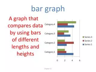
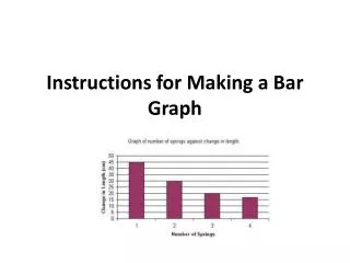
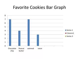
Bar Graph. A single bar graph uses the same color or shade of bar to compare amounts, such as number of students per class. STUDENTS PER CLASS. 30. 15. Number of Students. 0. 6. 7. 8. Grade. 20. Boys. Girls. 10. Number of Students. 0. 6. 7. 8. Class Number.

E N D
A single bar graph uses the same color or shade of bar to compare amounts, such as number of students per class. STUDENTS PER CLASS 30 15 Number of Students 0 6 7 8 Grade
20 Boys Girls 10 Number of Students 0 6 7 8 Class Number A double bar graph uses two or more colors or shades of bars and a key to compare amounts, such as the number of boys and girls in each class. STUDENTS PER CLASS
Since a bar graph uses rectangular bars then with a quick glance, you can see… • How data items compare to each other • The least and greatest data items
A histogram is a special kind of bar graph that shows how ranges of data change or differ from one another.
A histogram is also used to compare data clearly and efficiently. Number of students receiving grades
This histogram groups the data into ranges or intervals. Number of students receiving grades What is the interval? Letter Grades: A 90-100 B 80-89 So forth
A pictograph has a keythat tells the value of each picture. KEY
A pictograph is similar to the bar graph and histogram because it is also used best to compare data.
Average Daily Temperature for January 1-7 in Degrees Fahrenheit A single line graph uses one line to show how something changes over time.
A multiple line graph compares two or more groups of data during the same time period. Average Studying Time Each group of data will have its own line. 3hrs 6th 2hrs 7th 1hrs 0 1990 1995 2000
A line graph shows trends, or how things change over time. By looking at the line(s) on a line graph, you can tell whether something is increasing, decreasing or staying the same.
A steady trend may be used to help predict what will likely happen in the future.
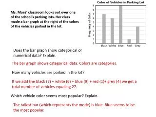
Additional Example 2: Reading a Line Graph Use the line graph to answer each question. A. In which year did CDs cost the most? 2002 B. About how much did CDs cost in 2000? $15 C. Did CD prices increase or decrease from 1999 through 2002? Increase
Check It Out: Example 2 Use the line graph to answer each question. A. In which year did CDs cost the least? 1999 B. About how much did CDs cost in 1999? $13 C. Did CD prices increase or decrease from 2001 to 2002? Increase
A line plot uses a horizontal line and individual data points (usually Xs) to show how the data groups or clusters.
Line plots are a quick way to determine the mode because it is the number on the scale with the most Xs.
Number of Pets in each Household Outliers, or data items that are much larger or smaller than the rest of the items are easy to spot as well.
Check It Out: Example 1A A table shows the number of feet of grass each neighbor must mow. Which graph would be more appropriate to show the data-a line graph or bar graph? Draw the more appropriate graph.
Check It Out: Example 1A Continued Think: is the information in the table describing a change over time? Is the information in the table divided into different categories? The table shows the number of feet each neighbor mows. The data should be displayed in separate categories. So a bar graph is more appropriate than a line graph.
Check It Out: Example 1B The table shows the number of tickets each student purchased for the school carnival. Which graph would be more appropriate to show the data-a line plot or line graph?
1 2 3 4 5 6 7 8 9 Check It Out: Example 1B Continued Think: is the information in the table describing the frequency of values? Is it describing a change over time? A line plot shows the frequency of values on a number line. So a line plot is more appropriate than a line graph. xxx x x