Download
1 / 6
100 likes | 315 Views
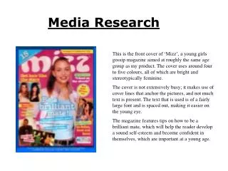
Media Studies Magazine Analysis Take a Break-Women’s real life and gossip magazine. Layout The layout of the page is cramped but organized. The busy page draws the readers eye straight to the main articles and images, making details such as the price, date and issue number less obvious. Images

E N D
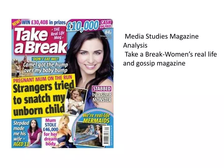
Media Studies Magazine AnalysisTake a Break-Women’s real life and gossip magazine
Layout The layout of the page is cramped but organized. The busy page draws the readers eye straight to the main articles and images, making details such as the price, date and issue number less obvious.
Images Because the magazine is targeted for women, they’ve cleverly used images that would spark a reaction from women: a young mother with her baby, a woman clearly looking distraught and miserable and a woman who be called either “fake” or “beautiful”. They used the images to stir maternal, caring and jealous reaction in women so they have an interest in the article about that person and the magazine.
Title and Sell-lines The title, Take a Break, is just very simple, and gives the impression that it’s a very quick, light read and is easy to relax with. The sell-lines are blunt and have very little or no description, which makes potential buyers inquisitive and wonder what happened.
Colour and Font choices The background colour is a light pastel colour, which contrasts with the bright colour of article boxes and sell-line fonts. The fonts are bold and stand out well on the page, which, with the contrasting colours, draws your eye to the page and would make you have some interest in it.
Target Audience-Women (late teens and over) I think the cover does well in attracting it’s target audience with it’s combination of images, colours and sell-lines. They’ve carefully chosen images that would get a reaction from women, used colours which are light and appeal to women better than darker colours. The sell-lines appeal to the inquisitive side within everyone, not just women, due to how blunt they are.