Download

1 / 78
781 likes | 1.01k Views
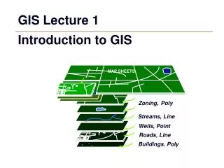
GIS Tutorial 1. Lecture 2 Map design. Outline. Choropleth maps Colors Vector GIS display GIS queries Map layers and scale thresholds Hyperlinks and map tips. Lecture 2. Choropleth maps. Choropleth maps. Color-coded polygon maps Use monochromatic scales or saturated colors

E N D
GIS Tutorial 1 Lecture 2 Map design
Outline • Choropleth maps • Colors • Vector GIS display • GIS queries • Map layers and scale thresholds • Hyperlinks and map tips GIS TUTORIAL 1 - Basic Workbook
Lecture 2 Choropleth maps
Choropleth maps • Color-coded polygon maps • Use monochromatic scales or saturated colors • Represent numeric values (e.g. population, number of housing units, percentage of vacancies) GIS TUTORIAL 1 - Basic Workbook
Choropleth map example Map using color or pattern to show different values over space (uses a color ramp) GIS TUTORIAL 1 - Basic Workbook
Choropleth map example • Percentage of vacant housing units by county GIS TUTORIAL 1 - Basic Workbook
Classifying data Process of placing data into groups (classes or bins) that have a similar characteristic or value • Break points • Breaks the total attribute range up into these intervals • Keep the number of intervals as small as possible (5-7) • Use a mathematical progression or formula instead of picking arbitrary values Break points GIS TUTORIAL 1 - Basic Workbook
How to classify ranges in ArcMap GIS TUTORIAL 1 - Basic Workbook
Classifications • Natural breaks (Jenks) • Picks breaks that best group similar values together naturally and maximizes the differences between classes • Generally, there are relatively large jumps in value between classes and classes are uneven • Based on a subjective decision and is the best choice for combining similar values • Class ranges specific to the individual dataset, thus it is difficult to compare a map with another map GIS TUTORIAL 1 - Basic Workbook
Classifications • Quantiles • Places the same number of data values in each class • Will never have empty classes or classes with too few or too many values • Attractive in that this method produces distinct map patterns • Analysts use because they provide information about the shape of the distribution. • Example: 0–25%, 25%–50%, 50%–75%,75%–100% GIS TUTORIAL 1 - Basic Workbook
Classifications • Equal intervals • Divides a set of attribute values into groups that contain an equal range of values • Best communicates with continuous set of data • Easy to accomplish and read • Not good for clustered data • Produces map with many features in one or two classes and some classes with no features GIS TUTORIAL 1 - Basic Workbook
Classifications Use mathematical formulas when possible. • Exponential scales • Popular method of increasing intervals • Use break values that are powers such as 2n or 3n • Generally start out with zero as an additional class if that value appears in your data • Example: 0, 1–2, 3–4, 5–8, 9–16, and so forth GIS TUTORIAL 1 - Basic Workbook
Classifications Use mathematical formulas when possible • Increasing interval widths • Long-tailed distributions • Data distributions deviate from a bell-shaped curve and most often are skewed to the right with the right tail elongated • Example: Keep doubling the interval of each category, 0–5, 5–15, 15–35, 35–75 have interval widths of 5, 10, 20, and 40. GIS TUTORIAL 1 - Basic Workbook
Original map (natural breaks) U.S. population by state, 2000 GIS TUTORIAL 1 - Basic Workbook
Equal interval scale Not good because too many values fall into low classes GIS TUTORIAL 1 - Basic Workbook
Quantile scale Shows that an increasing width (geometric) scale is needed GIS TUTORIAL 1 - Basic Workbook
Custom geometric scale • Experiment with exponential scales with powers of 2 or 3. GIS TUTORIAL 1 - Basic Workbook
Normalizing data Divides one numeric attribute by another in order to minimize differences in values based on the size of areas or number of features in each area Examples: • Dividing the number of vacant housing units by the total number of housing units yields the percentage of vacant units • Dividing the population by area of the feature yields a population density GIS TUTORIAL 1 - Basic Workbook
Nonnormalized data Number of vacant housing units by state, 2000 GIS TUTORIAL 1 - Basic Workbook
Normalized data Percentage vacant housing units by state, 2000 GIS TUTORIAL 1 - Basic Workbook
Nonnormalized data California population by county, 2007 GIS TUTORIAL 1 - Basic Workbook
Normalized data California population density, 2007 GIS TUTORIAL 1 - Basic Workbook
Right-click the layer you want to draw showing a quantitative value in the table of contents and click Properties. • Click the Symbology tab. • Click Quantities and click graduated colors. • Click the Value drop-down arrow and click the field that contains the quantitative value you want to map. • Click the Normalization drop-down arrow and click a field to normalize the data. • ArcMap divides this field into the Value to create a ratio. Normalize Data to conform to a standard GIS TUTORIAL 1 - Basic Workbook
To Create More Meaningful Text in Legends 1. Left click to highlight the layer in the TOC 2. Type the desired text 3. When the legend is added on the layout, the new text will display TOC TOC Layout View GIS TUTORIAL 1 - Basic Workbook
OR- To Create More Meaningful Text in Legends • 1 In Layout View, right click the legend box • 2 Select Convert To Graphics • 3 Right click the Graphics text box legend, select Ungroup • 4 Double left click text, then type desired text 1 2 4 3 Layout View GIS TUTORIAL 1 - Basic Workbook
To sort value ranges in descending order: • Right-click the layer you want to draw showing a quantitative value in the table of contents and click Properties. • Click the Symbology tab. • Click Quantities and click graduated colors. • Click the Value drop-down arrow and click the field • that contains the quantitative value you want to map. • Click the Range tab and click Reverse Sorting. • ArcMap places the ranges in descending order. • Select OK • To reverse the symbol color: • Select the symbol tab • Select Flip Symbols • Select OK Symbol- Flip Symbols Result Range- Reverse Sorting GIS TUTORIAL 1 - Basic Workbook
Other Types of Thematic Maps: Graduated Symbols GIS TUTORIAL 1 - Basic Workbook
Other Types of Thematic Maps: Proportional Symbols GIS TUTORIAL 1 - Basic Workbook
Other Types of Thematic Maps: Dot Density GIS TUTORIAL 1 - Basic Workbook
Other Types of Thematic Maps: Unique Values GIS TUTORIAL 1 - Basic Workbook
Lecture 2 colors GIS TUTORIAL 1 - Basic Workbook
Color overview • Hue is the basic color • Value is the amount of white or black in the color • Saturation refers to a color scale that ranges from a pure hue to gray or black GIS TUTORIAL 1 - Basic Workbook
Color wheel Device that provides guidance in choosing colors • Use opposite colors to differentiate graphic features • Three or four colors equally spaced around the wheel are good choices for differentiating graphic features • Use adjacent colors for harmony, such as blue, blue green, and green or red, red orange, and orange GIS TUTORIAL 1 - Basic Workbook
Light vs. dark colors • Light colors associated with low values • Dark colors associated with high values • Human eye is drawn to dark colors GIS TUTORIAL 1 - Basic Workbook
Contrast The greater the difference in value between an object and its background, the greater the contrast GIS TUTORIAL 1 - Basic Workbook
Monochromatic color scale • Series of colors of the same hue with color value varied from low to high • Common for choropleth maps • The darker the color in a monochromatic scale, the more important the graphic feature • Use more light shades of a hue than dark shades in monochromatic scales • The human eye can better differentiate among light shades than dark shades GIS TUTORIAL 1 - Basic Workbook
Monochromatic map Values too similar GIS TUTORIAL 1 - Basic Workbook
Monochromatic map A better map, more contrast GIS TUTORIAL 1 - Basic Workbook
Dichromatic color scale • An exception to the typical monochromatic scale used in most choropleth maps • Two monochromatic scales joined together with a low color value in the center, with color value increasing toward both ends • Uses a natural middle point of a scale, such as 0 for some quantities (profits and losses, increases and decreases) GIS TUTORIAL 1 - Basic Workbook
Dichromatic map • Symmetric break points centered on 0 make it easy to interpret the map GIS TUTORIAL 1 - Basic Workbook
Color tips • Colors have meaning • Political and cultural • Cool colors • Calming • Appear smaller • Recede • Warm colors • Exciting • Overpower cool colors GIS TUTORIAL 1 - Basic Workbook
Color tips • Do not use all of the colors of the color spectrum, as seen from a prism or in a rainbow, for color coding • If you have relatively few points in a point layer, or if a user will normally be zoomed in to view parts of your map, use size instead of color value to symbolize a numeric attribute GIS TUTORIAL 1 - Basic Workbook
Color tips If you have many polygons to symbolize, it is better to use polygon centroid points with color rather than polygon choropleth maps. GIS TUTORIAL 1 - Basic Workbook
Changing colors in ArcMap • Choose color, more colors… GIS TUTORIAL 1 - Basic Workbook
Learn more about GIS colors • Website • http://colorbrewer2.org/ • Books • Brewer, Cynthia A. 2008. Designed Maps: A Sourcebook for GIS Users. Redlands: ESRI Press • Brewer, Cynthia A. 2005. Designing Better Maps: A Guide for GIS Users. Redlands: ESRI Press GIS TUTORIAL 1 - Basic Workbook
Lecture 2 Vector gis display GIS TUTORIAL 1 - Basic Workbook
Points, lines, polygons • Point • x,y coordinates • Line • starting and ending point and may have additional shape vertices (points) • Polygon • three or more lines joined to form a closed area GIS TUTORIAL 1 - Basic Workbook
Feature attribute tables • Store characteristics for vector features • Layers can be displayed using attributes GIS TUTORIAL 1 - Basic Workbook
Displaying points • Single symbols • All CAD calls GIS TUTORIAL 1 - Basic Workbook
Displaying points • Same features, different points • Based on attributes GIS TUTORIAL 1 - Basic Workbook