Download
1 / 10
100 likes | 104 Views
This article explores the serve speeds of Serena Williams and Rafael Nadal at the US Open tennis tournament, analyzing gender differences and adjusting Nadal's serve speed to match Serena's within their gender groups.

E N D
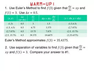
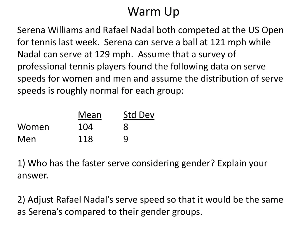
Warm Up Serena Williams and Rafael Nadal both competed at the US Open for tennis last week. Serena can serve a ball at 121 mph while Nadal can serve at 129 mph. Assume that a survey of professional tennis players found the following data on serve speeds for women and men and assume the distribution of serve speeds is roughly normal for each group: MeanStdDev Women 104 8 Men 118 9 1) Who has the faster serve considering gender? Explain your answer. 2) Adjust Rafael Nadal’s serve speed so that it would be the same as Serena’s compared to their gender groups.
Announcements 1) To qualify for the $5 AP testing fee you need to complete the application for free and reduced lunch with San Jose Unified. The website is: https://nutrition.sjusd.org The deadline is September 25. 2) The Chapter 2 Quest is scheduled for Monday, September 16.
Assessing Normality To use the Standard Normal Distribution (Table A or normalcdf) to analyze a data set we need to be sure the data is roughly normal. Skew and/or outliers mean the data is not roughly normal – meaning we can’t use Table A or normalcdf for analysis.
Methods of Assessing Normality 1) Make a plot of the data. Good – Histogram or Stemplot Bad - Boxplot 2) Use the 68-95-99.7 Rule Determine the % of the data within +/- 1 standard deviation of the mean – should be close to 68% Determine the % of the data within +/- 2 standard deviation of the mean – should be close to 95% 3) Make a normal probability plot.
Example of Normal Probability Plot - #1 This data set is approximately normal.
Example of Normal Probability Plot - #2 This data set is not roughly normal - it has an outlier.
Example of Normal Probability Plot - #3 This data set is right skewed and is not normal.
Practice The following data is the egg weight (in grams) for a sample of 10 eggs (Indian Journal of Poultry Science, 2009). Use a normal probability plot to assess if this data is approximately normal. 53.04 53.50 52.53 53.00 53.07 52.86 52.66 53.23 53.26 53.16
Data Collection – Assessing Normality We will generate data on tossing a penny as close to the wall as possible. Your partner is sitting across from you. You will stand about 6 feet from the wall and toss 2 pennies, trying to get as close to the wall as possible. Your partner will measure the distance from the penny to the wall to the nearest inch. Each person will toss 2 pennies with their partner measuring the distance. Write your data on the board.
Data Collection - Assessing Normality 1) Enter the data into your calculator and determine the mean and standard deviation. 2) Make a histogram of the data. Is it roughly normal or not? 3) Sort the data and then calculate the actual percentage of the data within +/- 1 std dev of the mean and within +/- 2 std dev of the mean. Are the actual percentages close to the targets of 68% and 95%? What does this mean? 4) Make a normal probability plot of the data using a graphing calculator and sketch a copy. Comment on the linearity of the normal probability plot. 5) Summarize your results – Is the data approximately normal?