Download
1 / 75
760 likes | 983 Views
Statistics. How can you best represent statistical information and draw conclusions from it?. What is statistics?. Statistics is the branch of mathematics that is concerned with the collection, organization, display and interpretation of data. Graphical Methods for Describing Data.

E N D
Statistics How can you best represent statistical information and draw conclusions from it?
What is statistics? Statistics is the branch of mathematics that is concerned with the collection, organization, display and interpretation of data.
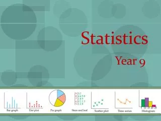
S.1 Organizing Data • How can data be shown on a table or in a graph and how can you read such data? • What is categorical data? • When should you use a pie chart and how are they made? • How do you organize a frequency distribution?
Data types: categorical and numeric • Categorical—any non numeric data • Use frequency distributions • Bar charts • Pie charts • Numeric—anything that can be measured and list by number • Dotplots • Stem and leaf • Frequency distributions • histograms
Does this data mean anything to you and can you answer questions about it in its current form? • Example • Leisure time activities • W T A W G T W W • C W T W A T T W • G W W C A W A W • W W T W W T • W=walking T=weight training C=cycling • G= gardening A=aerobics
Displaying Catagoric Data • How can you display and interpret catagoric data? • catagoric—anything that can’t be measured and listed by number • Frequency distributions • Bar Charts • Pie Charts
Frequency Distribution • Displays all categories and a tally for each • Relative frequency—the percentage as a decimal of time this category appears in the data / ---- / / / / ---- / / / / ---- / / / 15 .5 Leisure time activities W T A W G T W W C W T W A T T W G W W C A W A W W W T W W T ---- / / / / / / 2 7 / / / / / / / / / / / / / / / / / / / / / 2 / 2 / / / / / / / / / / 2 2 / / 4 2 / / / / Total = 1 Total = 30
Bar Chart • Graphs the frequency of categorical data • Bars DO NOT touch • Categories are on the x-axis • Frequencies are on the y-axis Walking Wt Training Cycling Gardening Aerobic
Pie Charts (circle graphs) • Used when there are not too many categories • Rule of thumb 8 or fewer • Each “slice” is determined by the relative frequency • Degrees in slice = rel freq x 360
Homework • Worksheet 1
S-2 Displaying Numeric Data EQ: How do you construct and read stem and leaf plots, dotplots, frequency distributions and histograms? • Numeric—anything that can be measured and list by number • Dotplots • Stem and leaf • Frequency distributions • histograms
Dotplots • Simple way to represent small amounts of data • Each piece of data has its own dot • Dots stack vertically above the position on the x-axis • Depending on the data set, you may lose the exact value for each piece • 615 524 632 645 • 592 716 618 521 • 675 549 523 651 5 6 7
Stem Plot • Works for a small to moderate set of data • Stems go in a vertical column • Stems may be split low and high (0-4 and 5-9) • Comparative or double stemplot—shows multiple data sets 5 6 7 • 51 61 52 63 64 • 57 59 71 61 52 • 68 67 54 52 65 1 2 2 2 4 7 9 1 2 2 2 4 7 9 1 1 5 7 8 1 1 3 4 5 7 8 • 51 61 52 73 54 • 57 59 71 61 52 • 68 67 74 52 65 1 3 4 1
Histograms • A bar chart for numeric data • Center the rectangle over the indicated value on the x-axis—the bars touch • Can be drawn off of the frequency or the relative frequency distribution
Shapes of Histograms • Unimodal—has one peak • Bimodal—has two peaks • Multimodal—has more than two peaks
Types of Unimodal Curves • Symmetric Normal or Bell Shaped Light Tailed-- Having short tails Smaller Standard dev. Heavy tailed-- Having long tails Larger standard dev.
Skewed Curves Lower (left) tail Upper (right) tail When there is an outlier to the right, the curve is skewed right When there is an outlier to the left, the curve is skewed left Skewness is judged by the tail not where the majority of the data lies. Skewness is judged by the tail not where the majority of the data lies. Skewness is judged by the tail not where the majority of the data lies.
Frequency DistributionsContinuous and Discrete Data • Discrete Data • Individual data points • The range is always from the set of integers or whole numbers • Continuous Data • Data that may include decimals
Frequency Distributions • There are no natural breaks for continuous data • We create our own • Ex. The fuel efficiency of a particular car ranges from 25.3 to 29.8 mpg we decide to use an interval of .5 • Note: • Always start at an even increment lower than the lowest piece of data and go to an even increment higher than the highest piece of data In which interval would you place 27.5 mpg?
Homework Numeric Data • Worksheet 2
Density Graphs • When data is unevenly distributed • You may want to use unequal groups or intervals • This may only be done if you graph the density
S-3 Describing the Center of a Data Set EQ: What are the measures of central tendency and how can they be determined?
Center and Spread • Two of the most critical descriptors of a data set • Graphical methods such as those in the last chapter give a general impression of both • Numerical methods give precise value that can be compared in detail
The three M’s • Mean • Median • Mode • Also known as the average • Also called the middle • Most Frequent
The Mean formula for the sample mean • x= each piece of data • xi= iindicates the position of the data from within the original data set • n= number of pieces of data in the data set • ∑ = Greek letter Sigma means to add what follows Always use more accuracy (more decimals) than any one piece of data has. µ is used for the population mean Greek letters are always used for population values
The Median • The middle value in a list of ordered values • Median has no symbol but is often abbreviated • Med • If n is odd then the median is the exact middle number • If n is even then the median is the mean of the two middle numbers
Comparison and Contrast of the Mean and Median • Median divides the data into two equal parts • 50% of the data is on either side of the median • Mean is where the fulcrum would cause the “data scale” to balance if the values had weight • It is very sensitive to outliers
Balancing the “data scale” Normal/Bell curve mean median Skewed Right Skewed Left
Trimmed Mean • Makes the mean less susceptible to outliers • Order the data • Remove the same number of pieces of data from each end • Recalculate the mean % x n = number of pieces to be removed from EACH end A small to moderate trim is 5% to 25%
Trimmed Mean • Example: Find the 15% Trimmed mean of: 3, 6, 8, 2, 9, 10, 7, 15, 4, 12, 20, 36, 15, 5, 3, 7, 10, 16, 17, 12 Order the numbers: 2, 3, 3, 4, 5, 6, 7, 7, 8, 9, 10, 10, 12, 12, 15, 15, 16, 17, 20, 36, 20 items • .15 = 3 4, 5, 6, 7, 7, 8, 9, 10, 10, 12, 12, 15, 15, 16 =
Weighted Mean • is similar to an arithmetic mean (the most common type of average), where instead of each of the data points contributing equally to the final average, some data points contribute more than others.
S-4 Spread What are the quartiles, percentiles, and box plots?
Range High - Low
Interquartile Range • IQR IQR = upper quartile (Q3) – lower quartile (Q1) Lower quartile—the median of the lower half Upper quartile—the median of the upper half IF n is odd, the exact median is excluded from the quartiles Used because it is resistant to outliers There is no special name for the population IQR
Boxplot • Can be used for many types of summarizations • Iqr = Q3 – Q1 • Outlier = data more than 1.5•iqr from the end of the box • Extreme=data more than 3•iqr from the end of the box 25% 25% 25% 25%
Modified Boxplot Outlier (closed circle) Extreme Outlier (open circle)
Percentages and percentiles: Percentage: “ the score “ * 100 total possible points Percentile: “The position of the score w/in an ordered list”*100 the total number of items EX: 10 students took a 90 point test 60, 65, 68, 74, 75, 80, 81, 81, 84, 90 (note: an ordered list) 1 2 3 4 5 6 7 8 9 10 What is the percent and the percentile for a score of 81? Percent: 81/90 *100=90% Percentile: 7/10*100= 70ieth percentile
the median • the first quartile • the third quartile • the interquartile range • the mode • the percentile for .271 • the value closest to the 60th percentile EXAMPLE: Given a stem and leaf plot FIND: • 2 5 7 • 1 6 • 5 8 9 9 • 2 3 5 7 8 • 2 • 60 3 6
S-5 Measures of Variability • How do the measures of variability help us to better understand what our data set might look like?
S-5 Measures of Variability • Range = high – low • Deviation from the mean= xi – • if positive then xi is larger than the mean • if negative then xi is smaller than the mean • Mean deviation is the average of the deviations • Sample Variance
Sample Standard Deviation • “average distance” the items fall from the mean • A small s or s2 indicates low variability • A high s or s2 indicates large variability
Population Variance (knowing all the data) • Population Standard Deviation compute to the same accuracy as the population
Uses of the IQR • Standard deviation can be approximated by • SD = IQR/1.35 • If SD > IQR/1.35 it suggests heavier or longer tails than the normal curve
Example • 20, 15, 12, 18, 17, 15, 17, 16, 18, 25 • Reorder 12, 15, 15, 16, 17, 17, 18, 18 20, 25 range = iqr = sd = Median= 17 Q1= 15 Q3= 18