Download
1 / 13
130 likes | 471 Views
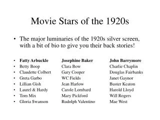
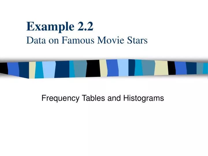
Example 2.2 Data on Famous Movie Stars. Frequency Tables and Histograms. Objective. To use StatPro’s histogram procedure to plot the distribution of actors’ salaries. ACTORS.XLS. Contains information on 66 movie stars.

E N D
Example 2.2Data on Famous Movie Stars Frequency Tables and Histograms
Objective To use StatPro’s histogram procedure to plot the distribution of actors’ salaries.
ACTORS.XLS • Contains information on 66 movie stars. • The data set includes the name of each actor and the following four variables: • Gender • DomesticGross : average domestic gross of star’s last few movies (in $ millions) • ForeignGross: average foreign gross of star’s last few movies (in $ millions) • Salary: current amount the star asks for a movie (in $ millions) • A portion of the data set is shown on the next slide.
Frequency Tables • A frequency table indicates how many observations fall in various categories. • To obtain a frequency table for data that are essentially continuous, such as the Salary variable, we must first choose appropriate categories. • There is no set rule for choosing categories. We want to have enough categories so that we can see a meaningful distribution, but we don’t want so many categories that there are only a few observations per category.
Frequency Tables -- continued • A good rule of thumb is to divide the range of values into 8 to 15 equally spaced categories, plus a possible open-ended category at either end of the range. • For this data set we choose the categories 0-2, 2-4, 4-6, 6-8, 8-10, 10-12, 12-14, 14-16, 16-18, 18-20, and over 20.
Histograms • A histogram is the graphical analog of a frequency table. • To create histograms in Excel we us the StatPro add in.
Creating frequency tables and histograms • Place the cursor anywhere in the data set. • Select the StatPro/Charts/Histogram(s) menu item. • A list of numerical variables in the data set appear. You should select one of these to obtain the frequency table and histogram for the variable you select. For now, select the Salary variable.
Creating frequency tables and histograms -- continued • The histogram is placed on a separate Excel “chart” sheet. Enter a name for this sheet such as SalHist. • A sheet with the name you entered plus the appendix “Data” is added to capture the frequency table. (This sheet is added as a “hidden” sheet. To view select the Format/Sheet/Unhide menu item.) Click On OK to add this sheet.
Creating frequency tables and histograms -- continued • Next comes the important part of specifying the categories. You need to enter (1) the upper limit of the first (leftmost) category, (2) the total number of categories, and (3) the typical length of a category in the dialog box shown below.
Creating frequency tables and histograms -- continued • For this example, enter 2, 11, and 2. Click OK. • The resulting histogram and frequency table for the Salary variable appear.
Creating frequency tables and histograms -- continued • It is clear that most salaries are in the $2 to $10 million range, but a few are considerably larger. • Specifically, 17 of the 66 actors, or about 25% make more than $10 million, and 6 of the 66, or about 9%, are in the highest salary bracket, from $18 to $20 million. • If you aren’t satisfied with this histogram (you may want fewer categories), just repeat the procedure. Using the same sheet names will allow you to overwrite the previous output.


![Data Warehouse [ Example ]](https://cdn0.slideserve.com/577245/data-warehouse-example-dt.jpg)