Download
1 / 22
230 likes | 367 Views
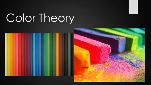
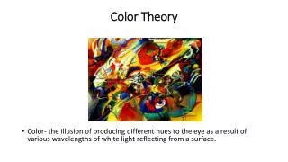
Color Theory. Color- the illusion of producing different hues to the eye as a result of various electromagnetic wavelengths of white light reflecting from a surface. Description of Color. Hue – Is the name of the color itself, the dominant wavelength of light or the choice of pigment.

E N D
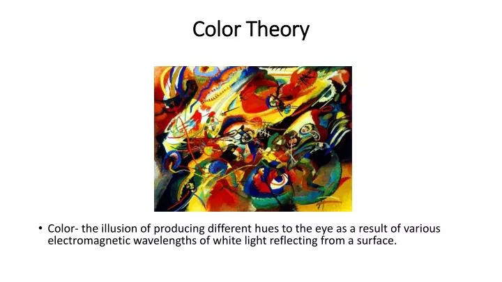
Color Theory • Color- the illusion of producing different hues to the eye as a result of various electromagnetic wavelengths of white light reflecting from a surface.
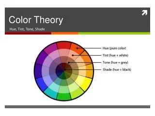
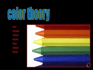
Description of Color • Hue – Is the name of the color itself, the dominant wavelength of light or the choice of pigment. • Lightness(brightness) – Is the lightness or darkness of the color, the amount of light reflected or transmitted. • Saturation – Color Purity • Tint– Base color plus white. • Tone – Base color plus grey. • Shade – Base color plus black. • Value – How light or dark a color is. • Warm Colors- The yellows, oranges, and reds. These come towards the eye more (spatially) and are generally 'louder' than passive colors. • Cool Colors- The greens, blues, and violets. These recede from the eye more (spatially) and are generally 'quieter' than the aggressive colors.
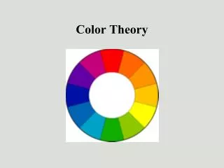
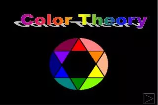
A primary color is a color that cannot be made from a combination of any other colors. A secondary color is a color created from a combination of two primary secondary colors. Tertiarycolor is a combination of three colors (primary or).
Warm Colors- The yellows, oranges, and reds. These come towards the eye more (spatially) and are generally 'louder' than passive colors.
Cool Colors- The greens, blues, and violets. These recede from the eye more (spatially) and are generally 'quieter' than the aggressive colors.
Color Schemes • An orderly arrangement of colors on the color wheel used within a piece of artwork.
Achromatic – An achromatic color scheme is one that is colorless – using blacks, whites and grays.
ComplementaryColorsColors that are opposite one another on the color wheel. Our eyes perceived these colors to pulsate or vibrate when placed next to each other.
Complementary– A complementary color scheme is one that uses colors directly across from each other on the color wheel. This can be accomplished by using two colors or hues that are opposites such as red and green or violet and yellow. In this color scheme any two complements, all the semi-neutrals and the neutral they produce can be used. Black and white can also be used. Since you can choose from varying colors and hues which can give a bold and dramatic effect, this color scheme is best used for dramatic, strong, or bold statements.
Monochromatic – A monochromatic color scheme is a one-color color scheme. However, the color can be neutralized by adding its complement to lower the intensity of the color. Black and white can also be used to darken and lighten the value of the color. It is achieved by using one color or hue, utilizing that colors’ various tints, tones and shades. Using a monochromatic scheme with multiple textures creates character and maintains unity.
Analogous– An analogous color scheme is any three adjacent primary, secondary, or tertiary colors on the color wheel. These schemes can be warm or cool. Each can be neutralized by use of its complement, and black and white can be used. Analogous colors "harmonize" well and produce a definite mood to a composition. This can create a very harmonious color scheme.
Color Triad – A triadic color scheme are colors that are an equal distant from each other on the color wheel. Any three colors equidistant around the color wheel form a triad and can be used in this color scheme (eg., red, yellow and blue). Semi-neutrals are mixed using two of the colors in the triad and the third can be added to further neutralize the pair. Black and white can also be used. This can create a very balanced scheme.
Split Complementary – A split complimentary color scheme is similar to complimentary but instead of just two colors directly opposite on the color wheel, two of the three colors are adjacent to one of the colors that is opposite. More simply, choose one color and use the color on each side of its complement (eg., blue, yellow-orange and red-orange). Any three adjacent primary, secondary, and tertiary colors can be used, plus the complement of the middle hue. This complement is used subordinately and to produce semi-neutrals of the three colors while maintaining color harmony. Black and white can also be used.