Download
1 / 4
40 likes | 135 Views
In order to support different platform,you need to devise some strategies as every device may use any number of web browsers. Also due to the significantly decrease in screen sizes,it’s hard to reach atoptimal solution. In this article, we have put together some best practice guidelines to tackle these issues for creating effective mobile web development.

E N D
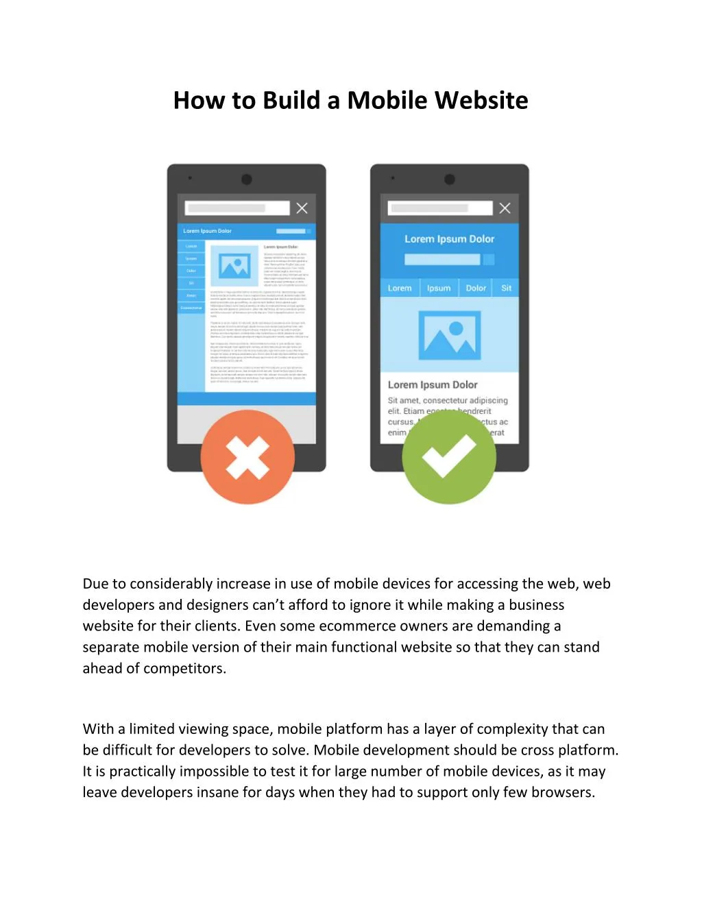
How to Build a Mobile Website Due to considerably increase in use of mobile devices for accessing the web, web developers and designers can’t afford to ignore it while making a business website for their clients. Even some ecommerce owners are demanding a separate mobile version of their main functional website so that they can stand ahead of competitors. With a limited viewing space, mobile platform has a layer of complexity that can be difficult for developers to solve. Mobile development should be cross platform. It is practically impossible to test it for large number of mobile devices, as it may leave developers insane for days when they had to support only few browsers.
In order to support different platform,you need to devise some strategies as every device may use any number of web browsers. Also due to the significantly decrease in screen sizes,it’s hard to reach atoptimal solution. In this article, we have put together some best practice guidelines to tackle these issues for creating effective mobile web development. How To Implement Mobile Stylesheets What To Change With Mobile Stylesheets Beyond Stylesheets Special Concerns For iPhone / iPad 1. How to Implement Mobile Stylesheets The first step is to include a special stylesheet to adjust the CSS for mobile devices: - SERVER-SIDE METHODS & THE UA STRING
To include mobile stylesheets one approach is detecting the user agent string with a server-side language such as PHP. - CLIENT-SIDE METHODS & MEDIA QUERIES An easiest approach involves detecting the mobile device on the client side. <link rel="stylesheet" href="site.css" media="screen" /><link rel="stylesheet" href="mobile.css" media="handheld" /> @import url("screen.css"); @import url("antiscreen.css") handheld; @import url("antiscreen.css") only screen and (max-device-width:480px); 2. What to Change with Mobile Stylesheets Increase and alter screen real estate Reduce Bandwidth Improve readability by increasing the font size 3.Beyond Stylesheets Add a number of special mobile features: Clickable Phone Numbers Special Input Types Viewport Dimensions and Orientation 4. Special Concerns For iPhone / iPad No Flash Special IPhone /iPad Enhancements
Conclusion As the mobile users surpassed the desktop ones, hand held device support will also become popular. Hopefully this article will help you develop a separate mobile website design although the techniques described in this article are only temporary, so it is your duty update yourself with this ever-changing technology to stay on the top of this competitive field.