Download
1 / 48
490 likes | 678 Views
Major Points. Scatterplots The correlation coefficient Correlations on ranks Factors affecting correlations Testing for significance Intercorrelation matrices Other kinds of correlations. The Problem. Are two variables related?

E N D
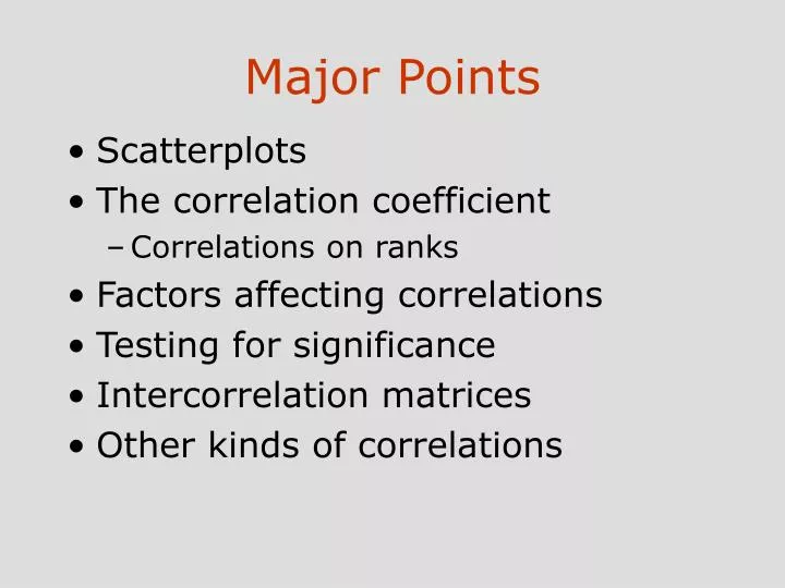
Major Points • Scatterplots • The correlation coefficient • Correlations on ranks • Factors affecting correlations • Testing for significance • Intercorrelation matrices • Other kinds of correlations
The Problem • Are two variables related? • Does one increase as the other increases? e. g. skills and income • Does one decrease as the other increases? e. g. health problems and nutrition • How can we get a graphical representation of the degree of relationship?
1 Relation between father and son’s height: Pearson, (1896) • Reliability
Another dataset:Heart Disease and Cigarettes • Landwehr & Watkins report data on heart disease and cigarette smoking in 21 developed countries • Data have been rounded for computational convenience. • The results were not affected.
Scatterplot of Heart Disease • CHD Mortality goes on y axis • Cigarette consumption on x axis • What does each dot represent? • Best fitting line included for clarity
2 30 20 CHD Mortality per 10,000 10 {X = 6, Y = 11} 0 2 4 6 8 10 12 Cigarette Consumption per Adult per Day
3 30 20 CHD Mortality per 10,000 10 {X = 6, Y = 11} 0 2 4 6 8 10 12 Cigarette Consumption per Adult per Day
What Does the Scatterplot Show? • As smoking increases, so does coronary heart disease mortality. • Relationship looks strong • Not all data points on line. • This gives us “residuals” or “errors of prediction”
4 y x x x x x x x x x x x x x x x x x x x x x x Example Scatterplots High correlation Low correlation y x x x x x x x x x x x x x x x x x x x x x x
5 Scatter plots: r = .00
6 r = .40
7 r = .99
10 120 100 80 60 40 20 0 0 20 40 60 80 100 120 r = -.79 Guessing correlations: from Rice University
11 Another way to visualize a correlation Variance in A Variance in b Variance in b Variance in A Covariance Covariance
What is a Correlation Coefficient • A measure of degree of relationship. • Sign refers to direction. • Based on covariance • Measure of degree to which large scores go with large scores, and small scores with small scores • Pearson’s correlation coefficient is most often used
Cigarette Consumption and Coronary Heart Disease Mortality for 21 countries Cigarette Consumption: per adult per day Coronary Heart Disease: Mortality per 10,000 population
Covariance • The formula • Index of degree to which both list of numbers covary • When would covXY be large and positive? • When would covXY be large and negative?
Calculation • CovXY = 11.13 • sX = 2.33 • sY = 6.69
Correlation Coefficient • Symbolized by r • Covariance ÷ (product of st. dev.)
Correlation in a random sample Generated 6 sets of random numbers (100 each) The correlation Matrix
Factors Affecting r • Range restrictions • Outliers • Nonlinearity • e.g. anxiety and performance • Heterogeneous subsamples • Everyday examples
80 60 40 20 0 -20 Pros -40 -40 -20 0 20 40 60 80 The effect of outliers on correlations Dataset: 20 cases selected from darts and pros DARTS r = .80
12 Dataset: one case altered to give more extreme values 80 60 40 20 0 -20 Pros -40 -40 -20 0 20 40 60 80 DARTS r = .58
Summary of effect of outliers • A few extreme values can have extreme effects • Especially when sample size is sample • You cannot randomly toss out data! You need to have a theoretical or statistical justification
Restriction of range: Countries With Low Consumptions Data With Restricted Range Truncated at 5 Cigarettes Per Day 20 18 16 14 12 CHD Mortality per 10,000 10 8 6 4 2 2.5 3.0 3.5 4.0 4.5 5.0 5.5 Cigarette Consumption per Adult per Day
R between between grades in high school and grades in college. Scatter plot for students who have GPA equal to or greater than 3.5 Scatter plot for 250 students who vary on High School GPA
Effect of linear transformations of data • no effect on Pearson's correlation coefficient. • Example: r between height and weight is the same regardless of whether height is measured in inches, feet, centimeters or even miles. • This is a very desirable property since choice of measurement scales that are linear transformations of each other is often arbitrary.
An example: • Scores on the Scholastic Aptitude Test (SAT) range from 200-800. • 200 to 800 is an arbitrary range. • You could subtract 100 points from each score and multiply each score by 3. Scores on the SAT would then range from 300-2100. Test would remain the same. • r between SAT and some other variable (such as college grade point average) would not be affected by this linear transformation.
13 Non linear relationships Example: Anxiety and Performance r = .07
The interpretation of a correlation coefficient • Ranges from –1 to 1 • No correlation in the data means you will get a is 0 r or near it • Suffers from sampling error (like everything else!). So you need to estimate true population correlation from the sample correlation.
Correlations in the sample differ from the correlations in the population by some amount (sampling error) • Sometimes it is higher than population correlation, sometimes it is lower, rarely on the target. • How do you know when to accept and when to reject correlation?
Possible ways to decide • Accept it if it fits your hypothesis, reject it otherwise! • Toss a coin • Democratically: Ask your officemates to vote.
Fisherian Statistics: Null and Alternative Hypothesis • Sampling error implies that sometimes the results we obtain will be due to chance (since not every sample will accurately resemble the population) • The null hypothesis expresses the idea that an observed difference is due to chance. • For example: There is no difference between the norms regarding the use of email and voice mail
The alternative hypothesis • The alternative hypothesis (the experimental hypothesis) is often the one that you formulate: there is a correlation between people’s perception of a website’s reliability and the probability of their buying something on the site • Why bother to have a null hypothesis? • Can you reject the null hypothesis
An Example • Relationship between browsing and buying on an electronic commerce site • Data gathered from server logs • Hypothesis: Those who browse longer also tend to purchase • Hypothesis can be framed in another way: There is no relationship between time spent browsing and likelihood of purchase (Null Hypothesis)
Testing the significance of a r • Population parameter = • Null hypothesis H0: = 0 • What would a true null mean here? • What would a false null mean here? • Alternative hypothesis (H1)
Tables of Significance • Table in Appendix E.2 • For N - 2 = 19 df, rcrit = .433 • Our correlation > .433 • Reject H0 • Correlation is significant. • More cigarette consumption associated with more CHD mortality.
SPSS Printout • SPSS Printout gives test of significance. • Double asterisks with footnote indicate p < .01.
OPTIM OPTIM RELINFL RELINV RELHOPE RELINFL 1.000 .272 ** .167 ** .266 ** OPTIM RELINFL .272 ** 1.000 .449 ** .419 ** RELINV .167 ** .449 ** 1.000 .544 ** RELHOPE .266 ** .419 ** .544 ** 1.000 RELINV RELHOPE A matrix of scatterplots **. Correlation is significant at the 0.01 level (2-tailed).
A review of Scatterplots • next three slides • Infant mortality and number of physicians • Life expectance and health care expenditures • Cancer rate and solar radiation