Download
1 / 13
220 likes | 497 Views
Typography as a design element. How the effective use of type and whitespace can combine to create attractive packages. What is typography?. The art and technique of arranging type The cornerstone of any designer’s skillset Much more than making words legible.

E N D
Typographyas a design element How the effective use of type and whitespace can combine to create attractive packages
What is typography? • The art and technique of arranging type • The cornerstone of any designer’s skillset • Much more than making words legible
It is impossible to become skilled in typography without understanding the basic rules of the craft — even if you mean to break them.
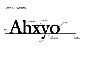
Basic concepts • Size. Not just the font size, the character size. • Leading. The vertical space between each line of type. • Kerning. Refers to the space between characters. • Measure. The width of the text block. • Hierarchy. The order of elements.
Leading • Leading should be a larger number than font size • General rule: between one and two sizes greater • FUN FACT! It’s called leading because, in the days of metal typesetting, strips of lead were used to separate lines of type.
Leading Check out this example of leading right here. It’s very important to get your leading right for legibility reasons. This is too loose. Check out this example of leading right here. It’s very important to get your leading right for legibility reasons. This is too tight. Check out this example of leading right here. It’s very important to get your leading right for legibility reasons. This is just right.
Kerning • Kerning describes the act of adjusting the space between characters to create a harmonious pairing. • Example: where an uppercase ‘A’ and ‘V’ meet AV(the top left of the ‘V’ sits above the bottom right of the ‘A’)
Hierarchy • Provides the reader with a roadmap • Font size is not the only way to define hierarchy • Color • Spacing • Weight • Dominant elements are bigger • Things get smaller down the page
Whitespace • Serves as a subtle, visual clue • Balance is key • Whitespace can never be underrated • My opinion: Too much is better than too little
Whitespace “The black space can never be beautiful until the white space is beautiful.”
What is good design? • What you don’t notice • Focuses on the content • Attractive • Consistent in every detail (most important!)
“Perfection is achieved, not when there is nothing left to add, but when there is nothing left to remove.” —Antoine de Saint-Exupéry