Download
1 / 9
150 likes | 602 Views
“Don’t Make Me Think” a common sense approach to web usability By: Steve Krug. Presentation by Diosvany Pallet. Steve Krug. Krug is an information architect and user experience professional based in Chesnut Hill, Massachusetts.

E N D
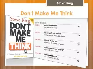
“Don’t Make Me Think”a common sense approach to web usabilityBy: Steve Krug Presentation by Diosvany Pallet
Steve Krug • Krug is an information architect and user experience professional based in ChesnutHill, Massachusetts. • Lectures and teaches people how to make more user friendly web pages.
Krug’s 3 Laws of Usability • 1) “Don’t make me think.” • 2) “It doesn’t matter how many times I have to click, as long as each click is a mindless, unambiguous choice.” • 3) “Get rid of half the words on each page, then get rid of what’s left.”
Don’t make me think • Overarching guideline for all design and usability • Web pages should be simple and straight forward • Users should be able to interact seamlessly with a web page without expending any effort in thinking about it • Web pages that are self evident are more user friendly overall, and people tend to have better experiences with these types of pages.
How we really use the web • Most users scan web pages and don’t actually read the content • Scan for words relative to what they are looking for • Usually click on the first relative thing they find • Tend to “muddle” through things rather than learning how they work
Billboard design 101 • Create a clear visual hierarchy • Take advantage of conventions • Break pages up into clearly defined areas • Make it obvious what’s clickable • Minimize noise
Animal, vegetable, or mineral • “Three mindless, unambiguous clicks equal one click that requires thought”(Krug 41). • Users appreciate having the ability to decide what to click without having to think • Things that forces the user to think causes frustration and confusion.
Omit needless words • Avoid using “Happy talk” and keep instructions to a minimum • “Get rid of half the words on each page, then get rid of half of what’s left”(45). • This helps to reduce distractions and enhance clarity
Contact info: • Name: Diosvany Pallet • E-Mail: Diosvany@buffalo.edu • Web Page: http://www.acsu.buffalo.edu/~diosvany/MFC%20215hp.html THANK YOU!