Download
1 / 22
220 likes | 430 Views
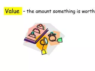
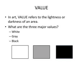
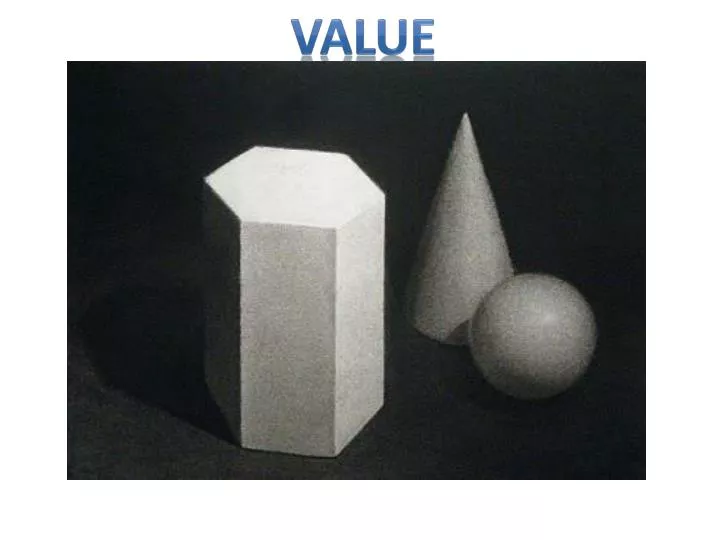
VALUE. Don't use outlines. Outlines only define visible edges and don't tell us anything about light and dark. Focus on areas of value.

E N D
Don't use outlines. • Outlines only define visible edges and don't tell us anything about light and dark. • Focus on areas of value. • Build up the shading. Often the 'outline' will be at the join between two different values, and is created by the contrast between the light and dark area.
Use the background to define foreground objects. • Pay attention to drawing the shadows and background. Use them to provide contrast • A 'halo' of shading, like a vignette around the subject, is rarely successful. • Leaving the background blank can work, but remember its okay to let an edge fade into the background - don't outline.
Using the Pencil: • Keep your pencils sharp, and apply the tone with small rapid circular or sideways movement of the hand. • Randomly varying the stopping/starting point of the shading will help avoid unwanted bands running through an area of shading. • Use a slightly harder pencil to work back over an area done with a soft pencil, to even out the tone and fill the tooth of the paper. An eraser can be used to lift off highlights. • Avoid blending or smudging, but rather learn to get the most out of the pencil mark.
Don’t Be Afraid of Black • Often when shading, the shadows don't go past dark gray. • If your value range is restricted to in some cases half what it should be, you are limiting the modeling and depth in your drawing. • Don't be afraid to go dark. Really dark. • Most successful drawings have a strong contrast in values
Find the light source. • Every image has a light source. • Where the light comes from is going to make an impact. • Hard light sources are often not very flattering because they do not contribute to creating shadows. (Think about a sunny day when the sun is directly overhead. Things appear washed out and do not have much variety in light and shadow.) • Side lighting will create strong contrast, and will bring out the detail in your subject. • Back lighting makes your subject dramatic and softer in appearance.
scumbling- tiny, squiggly circular lines - sort of like "controlled scribbling" hatching - a row of lines, all facing in the same direction. More dense and concentrated in the areas that appear darker. cross-hatching - similar to hatching, except with the addition of criss-crossing lines. stippling - placing many, many dots on the paper to indicate shading. Probably the most time consuming of all the methods, but creates some neat effects. contour-hatching - follows the contour, or curve or outline, of the object. In this case, the hatching is rounded to match the shape of the circle.
Find the values. • Now that you know where your light source is, you can start to pick out the values. • You will see bright, almost white areas, light values, middle grays, and dark, almost black areas. • Generally, the shadows created by objects on your subject and shadows cast by your subject will be the middle to dark values. • The brighter values are highlights and the light to middle values are the areas in between. • Highlights also occur when the light source is bouncing off of a reflective surface, like water, metal or eyeballs.
Find the relationships between the values. • Most drawings – especially drawings that are going for a realistic look – do not have strong lines between the values. • You may notice that when a hard line divides different values, the result appears forced. This is a good technique when you are developing contrast, but when your goal is creating a representational drawing those hard lines should be avoided. • The relationships between values can be created with blending (also called tonal value) or drawing yet another value that lies between the two values sitting beside each other.
Where are the light values? Look for the lightest areas on the object. The very brightest of the lightest values are called highlights. • Where are the dark values? Dark values often reveal the sections of the object that are in shadow. By locating shadows, you can usually identify the light source. • Where is the cast shadow? The section of the cast shadow closest to the object is usually the darkest value in a drawing. By locating an object's cast shadow, you can easily discover the direction from which the light source originates.
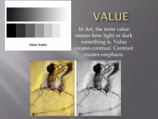
Squinting to see values and simple shapes • Seeing values is key to drawing in the third dimension. • Many artists can visually simplify complex drawing subjects by simply squinting their eyes. • Squinting helps you screen out details and see simple values and shapes. • When you can see the shapes created by different values, you can draw your subject more accurately. • Squint your eyes until the image seems to go out of focus. • Compare the darkest values to the lightest, and try to see the abstract shapes created by the different values.
Direct Light – Lighting in which the light goes straight from the source to the lit object. An example is a light bulb or the sun. Compare that to indirect lighting, which is when there is no single direct light source. The object is lit by scattered or bounce light. For example on a cloudy day when the sun is covered by clouds, its rays are scattered and everything is lit indirectly. All forms, when lit with direct light have the same elements – highlight, halftone, core shadow, reflected light, and cast shadow. It’s an essential skill to be able to quickly identify each element on a given object and to execute each accurately. A. HighlightB. HalftoneC. Core ShadowD. Reflected LightE. Cast Shadow
The first step to successful pencil shading is to control the movement of your pencil, making sure that every mark you make on the paper works towards creating the shading or modeling effect that you want. • Decide whether you want to use the point or side of the pencil to shade with. The example at left is shaded with the point, at right, with the side. • The side shading has a grainier, softer look and covers a large area quickly (a chisel-point pencil will also give this effect). • Using a sharp point to shade allows you more control, you can do much finer work, and get a greater range of tone out of the pencil. • Experiment with both to see how they look on your paper. Try shading with hard and soft pencils, too.
An alternative to regular 'sideways' pencil shading is to use small, overlapping circles. This is similar to 'scumbling', except that the object here is to minimize texture, rather than create one. • To do this, you need to use a light touch with the pencil, and work an area in an irregular, overlapping pattern to gradually build up the graphite on the page. A particularly light touch is required for lighter areas to avoid a 'steel wool' texture developing.
Direction. Don't underestimate it! Here's a really rough change of direction: with two coarsely shaded areas side by side - there's no missing the difference! Drawn like this, it is screamingly obvious: one has a big horizontal movement, the other vertical, and the edge between the two is very clear. • Now, if you are shading an object, even if your shading is more even and the pencil marks less obvious, this effect is still there - just more subtly. You can use it, to create a suggestion of an edge or a change of plane. • But it will also suggest a change of plane even if you don't intend it to: you don't want to randomly change direction in the middle of an area. The eye will read it as 'meaning' something. • Control the direction of your shading. • Try shading an object in various ways: using no visible direction (circular shading), one continuous direction, few big changes, and many subtle changes.
Contour pencil shading uses directional shading which follows the contours of a form. • In this example, contour shading is used in combination with lineweight, adjusting the pressure to create light and shade. • This allows you to create strong dimensional effects in your pencil drawing. You can control these factors precisely or use a relaxed and expressive approach. • Be sure to take perspective into account, so that the direction of shading changes correctly along a form drawn in perspective.
If you are doing a quick sketch or roughly shading an area, the direction of the pencil marks can be very obvious, and even quite dense shading can still reveal directional marks. • A common mistake that beginners make is to begin shading along one edge of an object in perspective, and to continue that direction all the way down, so that by the time they reach the bottom, the direction of shading is working against the perspective, as in the panel to the top right. • Beside it is a panel shaded horizontally: again the shading fights against the perspective and flattens the drawing. • In the second example, the direction of shading follows the perspective correctly, with the angle changing gradually so that it is always along an orthogonal (vanishing line). • With a practiced eye, you can do this by instinct, or, as you see in the example, you can draw subtle guidelines back to the vanishing point first. The right panel of this box is shaded vertically. This doesn't accentuate the foreshortening as perspective shading does, but it also doesn't fight against it. Another good option is to use circular shading and avoid creating any directional movement at all.
When using directional shading, you can vary the pressure on the pencil to create light and dark tones. • Controlling it very precisely can allow you to model smooth forms. • A more relaxed approach to lifting and re-weighting the pencil for a fairly continuous line is useful for creating highlights across textures like hair or grass.
What’s with all the drama? • Contrast! Remember the hard lines between values? Well, those hard lines form contrast. Of course, contrast comes in shades of gray, too. High contrast is when subjects are illuminated by a bright light source and cast dark shadows – which can look dramatic. Silhouettes are good examples of high contrast. Light and dark values will be next to each other. In the value chart, you would be skipping a value or two (or more!). Low contrast, on the other hand, often uses values that are next to each other on the value chart. (In fact, something that has only one value would be “no contrast”). With low contrast, values close together will define the bulk of the subject. You could selectively highlight or accentuate portions with lights or darks.
In the example shown here, a detail from a still-life study, a glass of wine provides interesting reflections and highlights. • Sometimes it can seem odd, drawing strange shapes across the smooth surface, or light value when you know the wine is dark, or letting the edge vanish against the background when you want to draw a line; but if you trust your eyes and try to capture what you see, a realistic drawing will emerge.