Download
1 / 16
160 likes | 234 Views
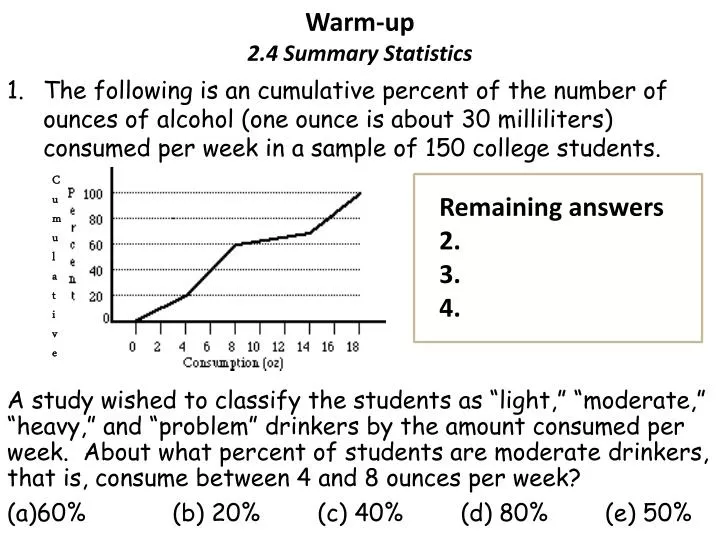
Warm-up 2.4 Summary Statistics. The following is an cumulative percent of the number of ounces of alcohol (one ounce is about 30 milliliters) consumed per week in a sample of 150 college students.

E N D
Warm-up2.4 Summary Statistics • The following is an cumulative percent of the number of ounces of alcohol (one ounce is about 30 milliliters) consumed per week in a sample of 150 college students. A study wished to classify the students as “light,” “moderate,” “heavy,” and “problem” drinkers by the amount consumed per week. About what percent of students are moderate drinkers, that is, consume between 4 and 8 ounces per week? • 60% (b) 20% (c) 40% (d) 80% (e) 50% Cumulative Remaining answers 2. 3. 4.
Name the Normal Distribution Plushie • This is the traveling prize for getting the highest score on a test • If there are more than one highest score, I will randomly select a person. • OR I will pick the person who has not had the chance to take the plushie home. • VOTE for your favorite name on EDMODO Write suggested names on the board. I will place the names in a poll on Edmodo for you to vote on!
2.4 Summary StatisticsConverting Units Find the 5 number summary and for the record low temperatures and draw the box plot. Now convert the temperatures to Celsius and see what happens to the 5 number summary and box plot. C = (F – 32)* 5/9
Using the calculator for Boxplots Hit the TRACE button and use the cursor to get your 5 number summary. OR you could use 1 – Variable Stats
Mean vs. Median Suppose you were working with a realtor to find a new home. You are interested in a particular area, but you are not sure if the houses are in your budget. The realtor has access to the median and mean price of homes in different areas. Which one do you believe most accurately represents the neighborhood and why? Think about the answer for 2 minutes. Then share at your table and decide which one decided and why.
Pg E#48 on pg 81Mean or Median, select and explain why. a. b. c.
2.1 to 2.4 Reviewsheet • Complete as much as you can for a participation grade. • You will need to complete #1 to 6 by ______. • If you finish early start the h.w. E#47 and 53. • Review all your notes from 2.1 to 2.4 for the quiz. Know the vocabulary and formulas. Review the investigations on recentering and rescaling. Know when to use mean vs. median. • We will go over some of the answers to the reviewsheet this block and the rest next block.
Answers for 1 -6 1. IQR = Q3 – Q1 = 5 2. There are outliers that are low. Outlier < Q1 – IQR(1.5); Outlier < 37 - (42-37) 1.5 = 29.5 So both 24 and 25 qualify as outliers. 3. The mean would double to 78.44; the standard deviation would double as well to 10.12. 4. The mean would be best because it takes into account the outliers. 5. Be sure your graph has labels, a title and equal intervals. Mode = 40; Q1 = 37; Median = 40; Q3 = 42
6. With a very low score of 5, it would bring down the mean, but it will not affect the median or mode.
Answers to D#16, and E#29 - 33 D16. a. Within the box, is the middle 50%. Within the lower whisker, if there are no outliers, is the lower 25% of the data. Within the upper whisker is the top 25% of the data, if there are no outliers. b. If the data is skewed right the left and lower whiskers will be closer than the right box and right whisker. If the data is skewed left, the left whisker and box, will be further spread out than the right box and whisker. If the data is symmetric, the whiskers should be same distance away from the median, along with the Q1 and Q3. c. To estimate the IQR, you subtract the upper mark for the box, from the lower mark for the box. For the range you take the value from the lowest mark (end of lower whisker if no outliers) away from the highest mark (end of top whisker if no outliers). d. A box plot is missing a whisker if the min, or max, is the same as the Q1 or Q3. When the top 25% or lower 25% of the data is the same number. e. With historgams will be harder to find the 5 number summary. Histograms display shapes more easily. One can see gaps in data with a histogram. Box plots, when are modified box plots, show outliers.