Download
1 / 45
450 likes | 603 Views
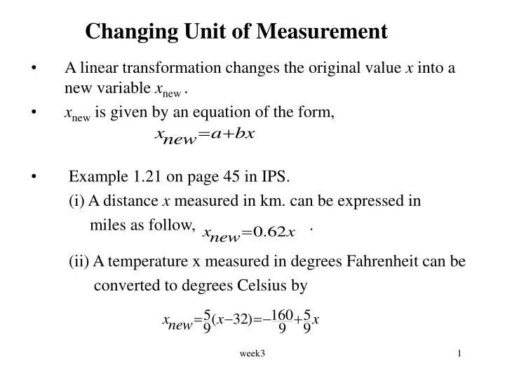
A linear transformation changes the original value x into a new variable x new . x new is given by an equation of the form, Example 1.21 on page 45 in IPS. (i) A distance x measured in km. can be expressed in miles as follow, .

E N D
A linear transformation changes the original value x into a new variable xnew. xnew is given by an equation of the form, Example 1.21 on page 45 in IPS. (i) A distance x measured in km. can be expressed in miles as follow, . (ii) A temperature x measured in degrees Fahrenheit can be converted to degrees Celsius by Changing Unit of Measurement week3
Multiplying each observation in a data set by a number b multiplies both the measures of center (mean, median, and trimmed means) by b and the measures of spread (range, standard deviation and IQR) by |b| that is the absolute value of b. Adding the same number a to each observation in a data set adds a to measures of center, quartiles and percentiles but does not change the measures of spread. Linear transformations do NOT change the overall shape of a distribution. Effect of a Linear Transformation week3
A sample of 20 employees of a company was taken and their salaries were recorded. Suppose each employee receives a $300 raise in the salary for the next year. State whether the following statements are true or false. The IQR of the salaries will be unchanged increase by $300 be multiplied by $300 The mean of the salaries will be unchanged increase by $300 be multiplied by $300 Example 1 week3
Density curves • Using software, clever algorithms can describe a distribution in a way that is not feasible by hand, by fitting a smooth curve to the data in addition to or instead of a histogram. The curves used are called density curves. • It is easier to work with a smooth curve, because histogram depends on the choice of classes. • Density Curve Density curve is a curve that • is always on or above the horizontal axis. • has area exactly 1 underneath it. • A density curve describes the overall pattern of a distribution. week3
The area under the curve and above any range of values is the relative frequency (proportion) of all observations that fall in that range of values. • Example: The curve below shows the density curve for scores in an exam and the area of the shaded region is the proportion of students who scores between 60 and 80. week3
The median of a distribution described by a density curve is the point that divides the area under the curve in half. A mode of a distribution described by a density curve is a peak point of the curve, the location where the curve is highest. Quartiles of a distribution can be roughly located by dividing the area under the curve into quarters as accurately as possible by eye. Median and mean of Density Curve week3
Normal distributions • An important class of density curves are the symmetric unimodal bell-shaped curves known as normal curves. They describe normal distributions. • All normal distributions have the same overall shape. • The exact density curve for a particular normal distribution is specified by giving its mean (mu) and its standard deviation (sigma). • The mean is located at the center of the symmetric curve and is the same as the median and the mode. • Changing without changing moves the normal curve along the horizontal axis without changing its spread. week3
The standard deviation controls the spread of a normal curve. week3
There are other symmetric bell-shaped density curves that are not normal e.g. t distribution. • Normal density function is mathematical model of process producing data. • If histogram with bars matching normal density curve, data is said to have a normal distribution. • Notation: A normal distribution with mean and standard deviation is denoted by N(, ). week3
In the normal distribution with mean and standard deviation , Approx. 68% of the observations fall within of the mean . Approx. 95% of the observations fall within 2 of the mean . Approx. 99.7% of the observations fall within 3 of the mean . The 68-95-99.7 rule week3
The distribution of heights of women aged 18-24 is approximately N(64.5, 2.5), that is ,normal with mean = 64.5 inches and standard deviation = 2.5 inches. The 68-95-99.7 rule says that the middle 95% (approx.) of women are between 64.5-5 to 64.5+5 inches tall. The other 5% have heights outside the range from 59.5 to 69.5 inches, and 2.5% of the women are taller than 69.5 . Exercise: 1) The middle 68% (approx.) of women are between ____to ___ inches tall. 2) ___% of the women are taller than 66.75. 3) ___% of the women are taller than 72. Example 1.23 on p72 in IPS week3
If x is an observation from a distribution that has mean and standard deviation , the standardized value of x is given by A standardized value is often called a z-score. A z-score tells us how many standard deviations the original observation falls away from the mean of the distribution. Standardizing is a linear transformation that transform the data into the standard scale of z-scores. Therefore, standardizing does not change the shape of a distribution, but changes the value of the mean and stdev. Standardizing and z-scores week3
The heights of women is approximately normal with mean = 64.5 inches and standard deviation = 2.5 inches. The standardized height is The standardized value (z-score) of height 68 inches is or 1.4 std. dev. above the mean. A woman 60 inches tall has standardized height or 1.8 std. dev. below the mean. Example 1.26 on p61 in IPS week3
The Standard Normal distribution • The standard normal distribution is the normal distribution N(0, 1) that is, the mean = 0 and the sdev = 1 . • If a random variable X has normal distribution N(, ), then the standardized variable has the standard normal distribution. • Areas under a normal curve represent proportion of observations from that normal distribution. • There is no formula to calculate areas under a normal curve. Calculations use either software or a table of areas. The table and most software calculate one kind of area: cumulative proportions . A cumulative proportion is the proportion of observations in a distribution that fall at or below a given value and is also the area under the curve to the left of a given value. week3
The standard normal tables • Table A gives cumulative proportions for the standard normal distribution. The table entry for each value z is the area under the curve to the left of z, the notation used is P( Z ≤ z). e.g. P( Z ≤ 1.4 ) = 0.9192 week3
Standard Normal Distribution The table shows area to left of ‘z’ under standard normal curve
The standard normal tables - Example • What proportion of the observations of a N(0,1) distribution takes values a) less than z = 1.4 ? b) greater than z = 1.4 ? c) greater than z = -1.96 ? d) between z = 0.43 and z = 2.15 ? week3
Properties of Normal distribution • If a random variable Z has a N(0,1) distribution then P(Z = z)=0. The area under the curve below any point is 0. • The area between any two points a and b (a < b) under the standard normal curve is given by P(a ≤ Z ≤ b) = P(Z ≤ b) – P(Z ≤ a) • As mentioned earlier, if a random variable X has a N(, ) distribution, then the standardized variable has a standard normal distribution and any calculations about X can be done using the following rules: week3
P(X = k) = 0 for all k. • The solution to the equation P(X≤ k) = p is k = μ + σzp Where zpis the value z from the standard normal table that has area (and cumulative proportion) p below it, i.e. zp is the pth percentile of the standard normal distribution. week3
1. The marks of STA221 students has N(65, 15) distribution. Find the proportion of students having marks (a) less then 50. (b) greater than 80. (c) between 50 and 80. 2. Example 1.30 on page 65 in IPS: Scores on SAT verbal test follow approximately the N(505, 110) distribution. How high must a student score in order to place in the top 10% of all students taking the SAT? 3. The time it takes to complete a stat220 term test is normally distributed with mean 100 minutes and standard deviation 14 minutes. How much time should be allowed if we wish to ensure that at least 9 out of 10 students (on average) can complete it?(final exam Dec. 2001) Questions week3
General Motors of Canada has a deal: ‘an oil filter and lube job in 25 minutes or the next one free’. Suppose that you worked for GM and knew that the time needed to provide these services was approximately normal with mean 15 minutes and std. dev. 2.5 minutes. How many minutes would you have recommended to put in the ad above if it was decided that about 5 free services for 100 customers was reasonable? 5. In a survey of patients of a rehabilitation hospital the mean length of stay in the hospital was 12 weeks with a std. dev. of 1 week. The distribution was approximately normal. • Out of 100 patients how many would you expect to stay longer than 13 weeks? • What is the percentile rank of a stay of 11.3 weeks? • What percentage of patients would you expect to be in longer than 12 weeks? • What is the length of stay at the 90th percentile? • What is the median length of stay? week3
Normal quantile plots and their use • A histogram or stem plot can reveal distinctly nonnormal features of a distribution. • If the stem-plot or histogram appears roughly symmetric and unimodal, we use another graph, the normal quantile plot as a better way of judging the adequacy of a normal model. • Any normal distribution produces a straight line on the plot. • Use of normal quantile plots: If the points on a normal quantile plot lie close to a straight line, the plot indicates that the data are normal. Systematic deviations from a straight line indicate a nonnormal distribution. Outliers appear as points that are far away from the overall pattern of the plot. week3
Histogram, the nscores plot and the normal quantile plot for data generated from a normal distribution (N(500, 20)). week3
Histogram, the nscores plots and the normal quantile plot for data generated from a right skewed distribution week3
Histogram, the nscores plots and the normal quantile plot for data generated from a left skewed distribution week3
Histogram, the nscores plots and the normal quantile plot for data generated from a uniform distribution (0,5) week3
Looking at data - relationships • Two variables measured on the same individuals are associated if some values of one variable tend to occur more often with some values of the second variable than with other values of that variable. • When examining the relationship between two or more variables, we should first think about the following questions: • What individuals do the data describe? • What variables are present? How are they measured? • Which variables are quantitative and which are categorical? • Is the purpose of the study is simply to explore the nature of the relationship, or do we hope to show that one variable can explain variation in the other? week3
Response and explanatory variables • A response variable measure an outcome of a study. An explanatory variable explains or causes changes in the response variables. • Explanatory variables are often called independent variables and response variables are called dependent variables. The ides behind this is that response variables depend on explanatory variables. • We usually call the explanatory variable x and the response variable y. week3
A scatterplot shows the relationship between two quantitative variables measured on the same individuals. Each individual in the data appears as a point in the plot fixed by the values of both variables for that individual. Always plot the explanatory variable, if there is one, on the horizontal axis (the x axis) of a scatterplot. Examining and interpreting Scatterplots Look for overall pattern and striking deviations from that pattern. The overall pattern of a scatterplot can be described by the form, direction and strength of the relationship. An important kind of deviation is an outlier, an individual value that falls outside the overall pattern. Scatterplot week3
There is some evidence that drinking moderate amounts of wine helps prevent heart attack. A data set contain information on yearly wine consumption (litters per person) and yearly deaths from heart disease (deaths per 100,000 people) in 19 developed nations. Answer the following questions. What is the explanatory variable? What is the response variable? Examine the scatterplot below. Example week3
Interpretation of the scatterplot • The pattern is fairly linear with a negative slope. No outliers. • The direction of the association is negative . This means that higher levels of wine consumption are associated with lower death rates. • This does not mean there is a causal effect. There could be lurking variables. For example, higher wine consumption could be linked to higher income, which would allow better medical care. • MINITAB command for scatterplot Graph > Plot week3
To add a categorical variable to a scatterplot, use a different colour or symbol for each category. The scatterplot below shows the relationship between the world record times for 10,000m run and the year for both men and women. Categorical variables in scatterplots week3
Correlation • A sctterplot displays the form, direction and strength of the relationship between two quantitative variables. • Correlation (denoted by r) measures the direction and strength of the liner relationship between two quantitative variables. • Suppose that we have data on variables x and y for n individuals. The correlation r between x and y is given by week3
Family income and annual savings in thousand of $ for a sample of eight families are given below. savings income C3 C4 C5 1 36 -1.42887 -1.45101 2.07331 2 39 -1.02062 -1.03144 1.05271 2 42 -0.61237 -0.61187 0.37469 5 45 -0.20412 -0.19230 0.03925 5 48 0.20412 0.22727 0.04433 6 51 0.61237 0.64684 0.39611 7 54 1.02062 1.06641 1.08840 8 56 1.42887 1.34612 1.92343 Sum of C5 = 6.99429 r = 6.99429/7 = 0.999185 MINITAB command: Stat > Basic Statistics > Correlation Example week3
Properties of correlation • Correlation requires both variables to be quantitative and make no use of the distinction between explanatory and response variables. • Correlation r has no unit if measurement. • Positive r indicates positive association between the variables and negative r indicates negative association. • Correlation measures the strength of only the linear relationship between two variables, itdoes not describe curved relationship! • r is always a number between –1 and 1. • Values of r near 0 indicates a weak linear relationship. • The strength of the linear relationship increases as r moves away from 0. Values of r close to –1 or 1 indicates that the points lie close to a straight line. • r is not resistant. r is strongly affected by a few outliers. week3
MINITAB analyses of math and verbal SAT scores is given below. Variable N Mean Median TrMean StDev SE Mean Verbal 200 595.65 586.00 595.57 73.21 5.18 Math 200 649.53 649.00 650.37 66.35 4.69 GPA 200 2.6300 2.6000 2.6439 0.5803 0.0410 Variable Minimum Maximum Verbal 361.00 780.00 Math 441.00 800.00 GPA 0.3000 3.9000 Stem-and-leaf of Verbal N = 200 Leaf Unit = 10 1 3 6 4 4 034 19 4 566888888889999 52 5 000000122222222333333333444444444 (56) 5 55555555555556666666777777777777778888888888888889999999 92 6 00000000011111111222222333333333444444444444444 45 6 555555666666666778888888889999 15 7 0011112244 5 7 55568 Question from Term test, summer 99 week3
Stem-and-leaf of Math N = 200 Leaf Unit = 10 1 4 4 3 4 79 12 5 001222234 38 5 55555666677777778888889999 (63) 6 000000000000001111111111112222222222222222333333333344444444444 99 6 555555555666666666666667777777777788888889999999 51 7 000000000011111111111112222222333334444 12 7 5566777789 2 8 00 week3
Find the 25th percentile, 75th percentile and the IQR of the math SAT scores. • You were one of the students of this study and your math SAT score was 532. What is your z-score and percentile standing? • If the math SAT scores were in fact left (negatively) skewed, but the mean was still 650, what could you say about the percentile standing of someone who obtains a score of 650? • What is the class width ? • of the histogram for verbal SAT scores? • of the stemplot of the verbal SAT scores? • Describe both the verbal and math score distributions and compare one with the other. week3
g) Give a rough sketch of how a normal probability plot would look if the verbal scores were • Right (positively) skewed • Uniform in shape h) For verbal scores, aside from running through the data and tallying, can you determine the approx. percentage of scores which fall between 523 and 668? If so give the percentage. week3