Download
1 / 10
100 likes | 185 Views
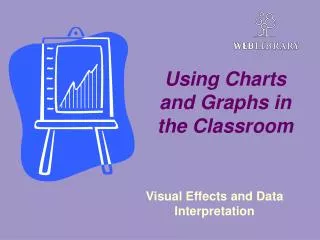
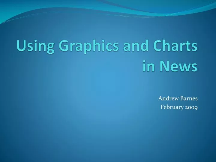
Using Graphics and Charts in News. Andrew Barnes February 2009. Why use charts and graphics?. It gives a visual representation to numbers and statistics. It is simple to use and easy to create.

E N D
Using Graphics and Charts in News Andrew Barnes February 2009
Why use charts and graphics? • It gives a visual representation to numbers and statistics. • It is simple to use and easy to create. • Microsoft Excel 2007 can create strong visual representation of data that readers will find useful.
The first graphic (1869): Depicting Napoleon’s 1812 Invasion of Russia and retreat.
Types of Charts and Graphs: • Pie- for describing size of items which constitute a whole (ex: budgets). It always equals 100%. • Fever or Line- compares two variables (ex: temperature over a period of time). It is really useful to show trends or movement. • Bar Graph- can compare two different variables, much like a line graph, but makes comparison between specific items, easier to see (ex: year by year comparisons for business growth).
Creating Graphs and Charts with Microsoft Excel • Creating Excel 2007 charts simpler and easier than before…. • The insert tab leads you directly into chart-making. • You can import or copy and paste charts into Microsoft Word documents and other programs.
Creating Graphs and Charts with Microsoft Excel (cont’d) • Example: You want to show which industry in the area grew over the past few years. You have a set of data… This….