Download
1 / 8
80 likes | 173 Views
Designing is an art. It is hugely dependent on your creativity, But there are also some basics that you can follow to get a decent output. Here we discuss some of such tips that will help you to design a brochure better. For more info visit http://www.brochureguru.com/.

E N D
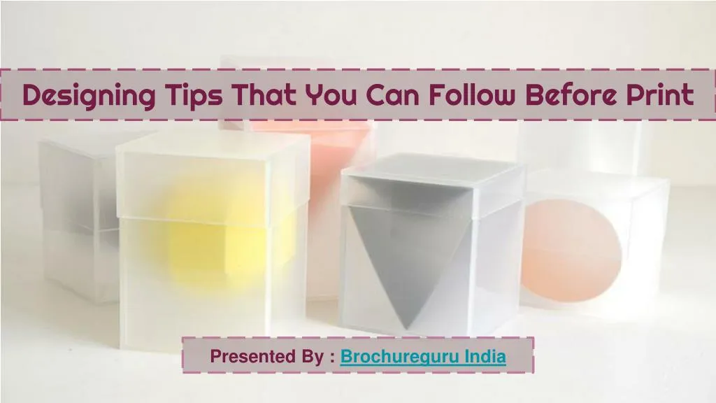
Designing Tips That You Can Follow Before Print Presented By : Brochureguru India
Planning Content Carefully Like any other advertising tool, a handout always has its limitations. You will only have four or six panels of paper on which to put your message. With the loads of data about your company, you only have to pick the best ones to include. Otherwise, you may make the brochure unattractive and overloaded. A significant part of brochure designing involves picking only the most essential content.
Keeping The Desired Output In Mind The size of paper is one of the most important aspects to be decided. This is because size has an impact on how images and text are rendered. Once you have paper size and folding specifications, you need to pick images, designs and fonts that fit best. If you do not start with the end in mind, you may have to shrink or stretch your design elements which may distort the end result.
A Creative Cover Is Necessary The most important part of brochure designing is the front cover. This is the first part people see and will convince them to either pick up your promotional material or go past it. It should therefore be the part that should receive the most creative attention. It is recommended to put images and catchphrases in this section and steer clear of substantial text and small fonts.
Using High Resolution Images Don't imagine that images that you see on your computer screen will come out just as they appear when you print them. Some images that look good don't print well. One should always go for high resolution images when designing brochures. Anything that is 300 dpi and above would be a good choice.
Choosing The Right Colours Promotional materials with a lot of colours can be very expensive. So, you got to choose your colours very carefully, such that the expense is less and at the same time it’s attractive. Studies suggest that people are more likely to respond to a colourful brochure than its monochrome counterparts.
Let Colours Stretch Over Borders You can't expect a cutting machine to always make accurate cuts if you've ordered hundreds or thousands of pieces. To make sure your design isn't compromised, let your page color go beyond the regular print borders of the printing paper. If cuts are a little off the mark, you won't end up with a thin uncolored line on the sides.