Download
1 / 43
430 likes | 462 Views
Uncover the power of ggplot2 in R for creating visually appealing and informative data visualizations. Learn the essential syntax, aesthetics, geoms, and techniques for telling compelling stories through graphs. Practice on real datasets to hone your skills.

E N D
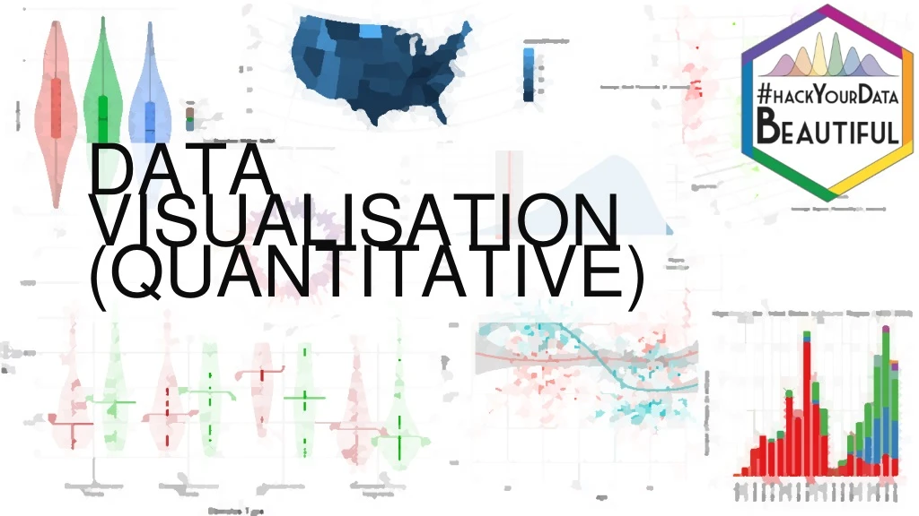
DATA VISUALISATION (QUANTITATIVE)
Visualising Data • More important than statistical tests!(?) • Telling a story in a graph • R has some great packages for visualising your data, especially ggplot
ggplot2 • Part of (and complementary to) the tidyverse collection • Beautiful and informative code, for beautiful and informative graphs • Expects tidy data; one observation per row • (See tidyverse introduction from this morning)
Plan for the Session • Introduce ggplot2 • Explain how it works, and show some example output • Practice on some data we’re interested in
ggplot2 Syntax Load in packages library(tidyverse) iris %>% ggplot(aes(x=Sepal.Length, y=Petal.Length)) + geom_point() Data Pipe data into the plot Build ggplot object Add feature to ggplot object Plot feature
ggplot2 Syntax - Pipes library(tidyverse) iris %>% ggplot(aes(x=Sepal.Length, y=Petal.Length)) + geom_point() Remember, this is equivalent to…
ggplot2 Syntax - Pipes library(tidyverse) ggplot(iris, aes(x=Sepal.Length, y=Petal.Length)) + geom_point()
ggplot2 syntax iris %>% ggplot(aes(x = Sepal.Length, y = Petal.Length)) + geom_point()
geom_x • Multiple possible “geoms” • Which geom you want will depend on what your variables are like: • How many? • Are they discrete (categorical) or continuous (numerical)? • Most useful geoms can be found on the ggplot cheat sheat • A full list of geoms is available on the ggplot reference page • Google to find the geom you want, e.g.: “ggplot scatter graph” will return results showing that you want geom_point()
ggplot2 syntax iris %>% ggplot(aes(x = Sepal.Length, y = Petal.Length)) + geom_point()
ggplot2 syntax iris %>% ggplot(aes(x = Sepal.Length, y = Petal.Length)) + geom_smooth()
ggplot2 syntax iris %>% ggplot(aes(x = Sepal.Length, y = Petal.Length)) + geom_point() + geom_smooth()
ggplot2 syntax iris %>% ggplot(aes(x = Sepal.Length, y = Petal.Length)) + geom_point() + geom_smooth(method = “lm”)
Aesthetics: aes() • Tells ggplot what variables to plot, and which visual features should represent them • Possible aesthetics include: • x • y • colour / color • fill • shape
ggplot2 syntax iris %>% ggplot(aes(x = Sepal.Length, y = Petal.Length)) + geom_point()
ggplot2 syntax iris %>% ggplot(aes(x = Sepal.Length, y = Petal.Length, colour = Species)) + geom_point()
ggplot2 syntax iris %>% ggplot(aes(x = Sepal.Length, y = Petal.Length, colour = Species)) + geom_point() + geom_smooth(method = “lm”)
Visualising Distributions - Histograms iris %>% ggplot(aes(x = Sepal.Width)) + geom_histogram(binwidth = 0.1)
Visualising Distributions – Density Plots iris %>% ggplot(aes(x = Sepal.Length)) + geom_density()
Visualising Distributions – Density Plots iris %>% ggplot(aes(x = Sepal.Length, fill = Species)) + geom_density()
Visualising Distributions – Density Plots iris %>% ggplot(aes(x = Sepal.Length, fill = Species)) + geom_density(alpha = 0.5)
Ban the Bar Graph! • Bar graphs can show us summaries about our data, but don’t tell us much about the underlying distributions.
One Alternative – Violinbox Plots iris %>% ggplot(aes(x = Species, y = Sepal.Length, fill = Species)) + geom_violin(alpha = 0.5) + geom_boxplot(width = 0.2)
Example data • Available in the .zip folder: haggis.csv • Heights for two groups, based on lifetime breakfast habits: • Porridge eaters • Haggis eaters • 64 Participants in each group (128 participants in total) • Who will be taller?
SPSS and Microsoft Excel – Bar Graphs (Yuck!) *Error bars show SEM
So Haggis Eaters are Taller than Porridge Eaters, right? • Well, let’s load the data and have a gander! TASK 1: • Create a new (or use an existing) .Rmd file to make notes in • Load in the tidyverse packages • Load in the dataset hint: read_csv() Have a go, and then we’ll go through it together
So Haggis Eaters are Taller than Porridge Eaters, right? • Well, let’s load the data and have a gander! TASK 1: • Create a new (or use an existing) .Rmd file to make notes in • Load in the tidyverse packages • Load in the dataset hint: read_csv() Have a go, and then we’ll go through it together
Task 1 – Solution haggis <- read_csv("haggis.csv")
Task 2 – Visualise Height by Breakfast Group • Create a violinbox plot, showing how height differs between haggis and porridge eaters. Have a go, and then we’ll go through it together
Task 2 – Solution haggis %>% ggplot(aes(x = group, y = height, fill = group)) + geom_violin(alpha = 0.5) + geom_boxplot(width = 0.1)
Task 3 – Check the Distributions Create two density plots to see: • How the distribution of height differs between pop fans and classical fans • How the distribution of age differs between pop fans and classical fans Have a go, and then we’ll go through it together
Task 3 – Solution a) haggis %>% ggplot(aes(x = height, fill = music_taste)) + geom_density(alpha = 0.5)
Task 3 – Solution b) haggis %>% ggplot(aes(x = age, fill = music_taste)) + geom_density(alpha = 0.5)
Task 4 – Does Age predict Height? • Draw a scatter plot to see how age predicts height. Add a line showing the linear relationship between age and height. Have a go, and then we’ll go through it together
Task 4 – Solution haggis %>% ggplot(aes(x = age, y = height)) + geom_point() + geom_smooth(method = "lm")
Task 5 – Does Age interact with Breakfast Habits? • Recreate the previous graph, but colour the points and line by participants' breakfast habits. Have a go, and then we’ll go through it together
Task 5 – Solution haggis %>% ggplot(aes(x = age, y = height, colour = group)) + geom_point() + geom_smooth(method = "lm")
Task 6 – Does Music Taste interact with Breakfast Preference? • Create a violinbox plot as you did in Practice Question 2, but split by music taste *as well as* breakfast group. Have a go, and then we’ll go through it together
Task 6 – Solution haggis %>% ggplot(aes(x = group, y = height, fill = music_taste)) + geom_violin(alpha = 0.5) + geom_boxplot(width = 0.2, position = position_dodge(width = 0.9))
Conclusion + = ?
Conclusion Well… no. • We don’t know anything about the possible causal relationships, and only looked at our data in an exploratory way • Also, the data was kind of made up.
Real Conclusion • Data Visualisation in R is fun, easy, and informative! • If we’re looking at differences between groups, it’s important to not hide the distributions behind bar graphs and summary statistics. • Googling for R solutions is a skill in itself.