Download
1 / 5
50 likes | 204 Views
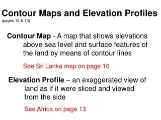
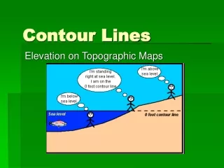
Contour Maps. Lots of weather observations plotted on a map look like a sea of numbers—hard to see patterns. Solution: draw contour lines or isolines to help us visualize the patterns.

E N D
Contour Maps • Lots of weather observations plotted on a map look like a sea of numbers—hard to see patterns. • Solution: draw contour lines or isolinesto help us visualize the patterns. • “Iso” = “same” (from Greek). A contour line or isolineconnects places on the map that all have the same value of some quantity. • For example: • line of same or constant pressure is an isobar • line of same or constant temperature is an isotherm. • line of constant wind speed is an isotach.
Drawing Contour Lines on a Map • For more complete picture of a pattern: • draw multiple contour lines • each line has a different “contour value” • Infinite number of possible values--need to choose a few! • Decide which contour values to use: • Pick a reference value to start (e.g., 1000 mb, or 0°F, etc.) • Pick a contour interval. What’s reasonable? Use a standard value, or: • Find the highest and lowest values on your map • Calculate the range of values on your map (range = highest – lowest) • Divide range by 10 • Round up or down to a nice, round number (e.g., 1, 2, 4, 5, 10, etc.) • Result: ~ 10 contour lines—not too many, not too few • On sea-level pressure map of North America, standard choice is 4 mb. • Generate list of candidate values: • Values at intervals = contour interval, above and below the reference value
Drawing Contour Lines on a Map • Which contour line should I draw first? • first candidate contour value above the lowest value on the map; or • first candidate contour value below the highest value on the map • Where do I start drawing my first line? • If lucky, a station reports exactly that value. Start there. • If no luck, must interpolate values between stations. • Find two adjacent stations, one reporting a value higher than your contour value, the other reporting a lower value. • Estimate where between stations the value equals your contour value. • Put a dot there. Your contour line passes through that point.
Drawing Contour Lines on a Map • I have a dot. How do I make a line? • Find two more, adjacent stations nearby, one reporting a value higher and the other lower than your contour value. • Estimate where between them the value equals your contour value. • Put a dot there. • Repeat for two more, adjacent stations nearby that new dot. Keep repeating, until you reach edge of reported observations or end up where started. • Connect the dots.
Drawing Contour Lines on a Map • Label the contour line with its value • Repeat the preceding for the next contour value on your candidate list. Repeat until list is exhausted. • At spots where values are lower than surrounding areas, write an “L”. Where values are higher than surrounding areas, write “H”. • Label the map: • The quantity that you’re contouring (e.g., “Sea-Level Pressure”) • The contour interval [e.g., “(4 mb intervals)”]