Download
1 / 8
80 likes | 210 Views
The National Identity for Local Public Health. Visibility and Recognition. Local health departments lack a visual identity that is universally known. Many health departments have their own logos, but some do not.

E N D
Visibility and Recognition • Local health departments lack a visual identity that is universally known. Many health departments have their own logos, but some do not. • Often, public health personnel go about their work in a way that is invisible in the neighborhoods and communities where they work. • How many people in your community know who the health department is and what it does?
Why do you recognize these images? • Using a visual symbol consistently over time helps build public awareness of an organization or service. • What is the equivalent for health departments and public health?
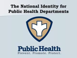
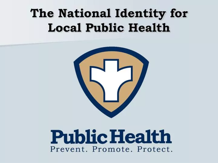
The National Identity for Local Public Health • NACCHO developed a new logo and message to help fill this gap and to serve health departments: • As a service to those departments who lack the resources to develop their own symbol and message • To offer all health departments a common symbol and message that has the potential to become universally recognized and understood
The National Identity for Local Public Health The logo has three main components: SYMBOL: The three pointed shield and stylized plus symbol have universal recognition associated with health, with protection and with growth. COLORS: Blue, white and khaki are the colors of the USPHS uniforms and are neutral so they can work in a variety of settings. WORDS: The tag line is a simple, elegant statement about what public health does-and what public health achieves.
Recognizable Service Identities The silhouette is unique and identifiable, and fills an important gap
Using the Logo • Voluntary, but encouraged • Can be customized to add the name of your local health department • Can be used alone or alongside existing local health department logos • Using the logo shows pride in the people and power of public health, who are at work every day in every community. It is time for local health departments to be visible and understood by all. Adopting a consistent visual identity is one important way to achieve that goal. • www.naccho.org/LocalPublicHealthBrand
Thank You! It is our sincere hope that all public health departments will use the logo to show pride in the people, power and purpose of public health. Like other public services that quietly (and sometimes not so quietly) ensure safety and respond in times of crisis, it is time for public health to be visible and understood by all.