Download
1 / 45
450 likes | 560 Views
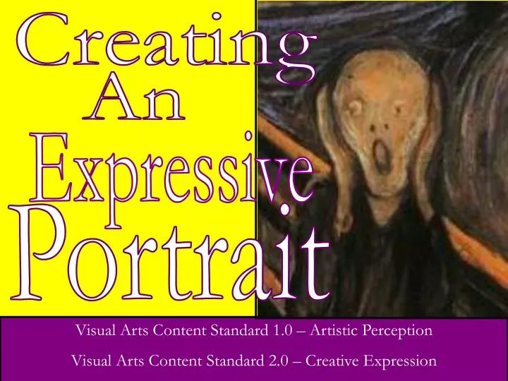
Creating. An. Expressive. Portrait. Visual Arts Content Standard 1.0 – Artistic Perception Visual Arts Content Standard 2.0 – Creative Expression. Part One: Introduction. To Expressionism. “Expressive” & Expressionism. In this assignment you will create an “expressive” portrait.

E N D
Creating An Expressive Portrait Visual Arts Content Standard 1.0 – Artistic Perception Visual Arts Content Standard 2.0 – Creative Expression
Part One: Introduction To Expressionism
“Expressive” & Expressionism In this assignment you will create an “expressive” portrait. Our faces make “expressions” all the time –our faces share how we feel (our “emotional state”). “Expressionism” is an art movement that is similar. So let’s look at what it is.
What is “Expressionism?” Early 20th Century Art Movement Mainly based in Germany Defined art as coming solely from the personal perspective. Should reflect the emotions of the artist about the subject. Not concerned with realism, good proportion or lighting of subject. Detail from Self-Portrait as a Soldier by Ernst Ludwig Kirchner,, 1915
What is “Expressionism?” • Designed to show the subjective (personal) feeling of a subject • Not intended to show objective (actual) appearance of the subject. • Based on the artist’s emotions • Does not have to be realistic • Based on artist’s emotions about subject Detail from The Dancer Anita Berber by Otto Dix, 1925
An Expressionist – Edvard Munch Born in Norway, Munch had a troubled childhood with his mother & sister dying of tuberculosis. Raised very religiously but with a strong belief in the supernatural. He said he received “the seeds of madness” from his father. Edvard Munch, Self-Portrait with Burning Cigarette, 1895
An Expressionist – Edvard Munch Munch attended the Royal School of Art and Design. He experimented with other styles but was not satisfied with the lack of emotional impact. Began to feel like life was meaningless. He hung out in bars, drank heavily & liked to get in fights. Detail from Jealousy by Edvard Munch, 1907
An Expressionist – Edvard Munch He found answers in his own emotions. He felt art should express emotion & anxieties. No longer should interiors be painted, people reading and women knitting: there would be living people, breathing and feeling, suffering and loving. - Munch Edvard Munch, Inheritance, 1897
An Expressionist – Edvard Munch Later in life, he had a mental breakdown with delusions, paranoia & hallucinations. Art was hated by Nazis. Hitler called work “degenerate.” Died in 1944 in Oslo (occupied by the Nazis) afraid for his life & fearing his art collection would be destroyed. Detail of Self-Portrait in Hell by Edvard Munch, 1903
An Expressionist – Edvard Munch Most famous work is The Scream (1893). It shows a distorted & pained figure screaming against a blood red/orange sky. Technically this piece is not difficult, so why do you think this piece is considered to be so compelling? Edvard Munch, The Scream, 1895
Part Two: Concepts For Your Expressive Portrait
Concepts for your Project There are several key concepts you will be working with: Proportion - when an object’s parts are the correct size (or scale) in relation to each other. Distortion - when an object’s parts are not the correct size (or Scale) in relation to each other. Color Harmony – a selection of colors that work well together visually. Color Symbolism – the unconscious meanings color have to us as viewers.
Proportion vs. Distortion Proportion is when an object has all of its parts depicted in a realist scale to one another. This Rembrandt self-portrait has realistic proportions with appropriately sized features for a human face as shown below. (Left) This diagram shows normal human features in terms of size, placement and proportion Rembrandt Van Rijn, Self Portrait, 1660
Proportion vs. Distortion Distortion is when an object’s parts are not realistically depicted. This revision of Rembrandt’s work shows distortion. The features are not in proportional scale, nor are they in the correct positions. (Left) Rembrandt’s original work Jade Gabb, Distortion of Rembrandt’s Self Portrait, 2011
Color Harmonies There are lots of crayons in the box, but only a small child “grab and goes.” True artists make specific often intentional decisions about which colors to use and which to not use in their artworks.
Color Harmonies Different combination of colors have different effects on the “feel” of a piece & its effect. Basic color theory uses five “color schemes.” 1) Monochromatic 2) Warm 4) Analogous 3) Cool 5) Complementary
Monochromatic Monochromatic works use a single hue but have a full range of tints (colors mixed with white) and shades (colors mixed with black). Monochromatic works look very unified as they have so little color variety.
Warm Colors The Warm Colors are Yellow, Red & Orange. Warm Colors are dynamic, active and exciting visually. They remind us of “hot things” – like the sun, blood and fire.
Cool Colors Cool Color use Blue, Green, and Violet. They are soothing, calming and relax us visually. They remind us of “cool things” – like water, trees, or shadows on snow.
Analogous Colors Analogous Color uses Color “Neighborhoods” - 3 or 4 Colors with Intermediate or Tertiary colors. Analogous Colors give a sense of unity and “togetherness.” Example: Yellow-Orange, Orange, Red-Orange and Red Example: Blue, Blue Green, Green
Complementary Colors Complementary Color Schemes are based on two colors that are opposite on the Color wheel (and their tints and shades). A Primary and its opposite Secondary Color are usually used (although Intermediate or Tertiary Colors could be used as complements as well.) Primary Secondary
Complementary Colors As opposites, Complementary Colors have strong Contrast & “stand out” from each other. When things stand out, they create visual interest. This can create emphasis as well. ComplementaryColor Fact: when mixed together, Complementary Colors make brown.
Color Symbolism Colors to the human mind can convey emotion, concepts and ideas. This is called ColorSymbolism. Different colors have different (and sometimes conflicting) meanings depending their use in the artwork. Let’s look at these meanings…
Color Symbolism Red - Excitement, energy, passion, love, desire, speed, strength, power, heat, aggression, danger, fire, blood, war, violence. Blue - Peace, tranquility, calm, depression, harmony, unity, trust, truth, confidence, order, security, cleanliness, loyalty, technology Yellow - Joy, happiness, optimism, idealism, imagination, hope, summer, philosophy, hazard dishonesty, cowardice, jealousy, deceit.
Color Symbolism Green - Nature, environment, healthy, good luck, renewal, youth, spring, generosity, fertility, jealousy, inexperience, envy, misfortune, vigor Orange – Energy & force. Balance, Vitality. Endurance. Enthusiasm. Attention-seeking. Warmth. Good times. Fruitfulness. Wealth. Violet - Royalty, nobility, spirituality, ceremony, mysterious, transformation, wisdom, enlightenment, cruelty, arrogance, mourning.
Color Symbolism White - Reverence, purity, simplicity, innocence, cleanliness, peace, humility, winter, good, sterility, marriage, death, medical Black - Power, formality, elegance, wealth, mystery, fear, unhappiness, depth, style, evil, sadness, remorse, anonymity, mourning, death. Brown - Earth, stability, hearth, home, outdoors, reliability, comfort, endurance, simplicity, and comfort.
Part Three: Creating Your Expressive Portrait
Your Assignment Create an artwork based on a person modeling for you or a photo you take of person. Option:Take a photograph or “Selfie” of yourself instead. Your subject must have a distinct expression showing a recognizableemotion. I’m so Angry!
Your Assignment Although your subject will have perfect Proportion, draw the portrait using Distortion. Do not copy the picture. Show emotion through the distortions. Make distortions meaningful. He looks angrier now, doesn’t he? I’m even Angrier!
Your Assignment Use color by considering Color Symbolism to select an appropriate Color Harmony. Here our emotion is Anger. Think in terms of Color Symbolism, Red might be a color for Anger. So perhaps a Monochromatic Red scheme would work well.
Your Assignment However, Here’s another idea! Red eyes for Anger Orange for Energy (the force Anger creates). Yellow for Fear (perhaps we get angry at what we fear). So, perhaps a Warm Color Scheme would work better.
A Sample Photos Different Expressions and Emotions need different color schemes. Any suggestions for this one? Why? What is the emotion? What Color Scheme would work well with it? What might you Distort?
A Sample Work This piece was created to show Fear. What was Distorted? Its uses a Complementary Color scheme of Yellow (symbolic for fear or cowardice) and violet ( a color of cruelty).
A Sample Student Work This piece just screams “friendly” with its yellow, yellow-orange and orange colors. These Analogous Colors create a near perfect harmony with no mixed feelings.
A Sample Student Work This Analogous work is more Contemplative. Its colors show deep quite thought. Its use of blue, blue-violet & violet create a reflective piece.
A Sample Student Work This work is also Analogous and is about Sorrow. Its colors blue, blue-violet and violet create a sad & lonely feel The addition of black in the negative space helps to also show loss.
A Sample Student Work This work is Analogous yellow, yellow-green & green. It is about the feeling of shock – so bad it makes you feel sick. How does the heavy use of black effect the piece?
Reviewing The Project’s Goals • Expressive Portraits must show: • - The face of the subject • - A clearly recognizable Emotion • - Distortion of your subject’s • features to add to the emotion • - A symbolic Color Scheme that • fits the subject’s emotion Detail of Portrait of Dr. Heinrich Staadelmnn by Otto Dix, 1922
Part Four: Critiquing Your Expressive Portrait
Critiquing Your Piece Is the artwork a portrait from the front drawn from observation or a photo you took? Optional: Is the artwork a self-portrait from the front drawn from observation or a photo (a "selfie")? 10 Points C
Critiquing Your Piece Does the portrait (or self-portrait) fill the paper? 5 Points C
Critiquing Your Piece Do the facial features clearly show a distinct expression on the portrait (or self-portrait)? 5 Points C
Critiquing Your Piece Are at least two of the facial features (eyes, mouth, nose, etc.) distorted (made larger or smaller) to show expression or feeling ? 5 points per Feature 10 Points Eyes Bigger C Mouth Bigger
Critiquing Your Piece Does the piece have a Color Scheme (monochrome, warm, cool, complementary or analogous) that fits the emotion? 10 Points C
Critiquing Your Piece Is the art work neat without smudges, drips, stray marks, etc.? 10 Points C