Download

1 / 17
170 likes | 315 Views
Steps to Design. INFSCI 1052. Overview. We created a series of steps to create future web designs for class homework. Some of these steps we already have the skills while others will require some practice. It is time to not just build a website but to start *designing* a website.

E N D
Steps to Design INFSCI 1052
Overview • We created a series of steps to create future web designs for class homework. • Some of these steps we already have the skills while others will require some practice. • It is time to not just build a website but to start *designing* a website. • So, be creative, open-minded and develop your skills through practice.
The Theme or Topic • This is your starting point. • In class we discussed doing a web page on potholes and college cheating. • Second, you need to think of an angle or purpose of the website. Here are some examples: • College Cheating • It's a good thing (parody) • Educational – show techniques , stats, videos of student • Pittsburgh Potholes • Educational – how formed, stats • Call to Action – Who to call, politics, stories with results
The Theme or Topic • So, it's not just a topic – it is how you present the topic – tone and purpose. Here are some questions to ask yourself? • Is this site educational – will it teach or inform? • What about humor – is it serious? • Are you pro or con? – Ex. Gun Control • Is it simply entertaining? A game , fun facts. • AND NUMBER ONE IS: • WHO IS YOUR TARGET AUDIENCE?????
Target Audience • List and describe the qualities of your target audience: • Children • Teens • Tweens • Young Adults • Adults • Seniors • A specific town, culture, country • A specific affinity: Alums of a school, chess players, tennis aficionados, computer lovers, movie nuts.
Colors • Now that you have a theme, tone and purpose, start thinking about colors. • Initially stay away from a group of vibrant colors like red, orange and yellow of equal quantity because it is difficult to master. • Choose a major color (large quantity) and then some accent colors. Kind of like a couch (major color) and pillows (accent color) • Match colors to your purpose and tone
Colors • Sometimes we just aren't very good with color selection so lets look at some tools to help us: • http://www.hypergurl.com/colormatch.php • So, we adjust the sliders and find the major color we want to work with and a palette of matching colors will appear. Pretty cool. • https://kuler.adobe.com/explore/most-popular/?time=month • Nice, a social networking tool of people uploading color palettes of matching colors. Click on Explore and Most Popular to see the top winners. And, you can search on keywords like calm, sad, anger.
Colors • Eyedropper • Start with an image and use an eyedropper tool to sample a major color(s) from the image. Photoshop has an eyedropper tool or you can get the add-on Colorzilla for Firefox or Chrome. Remember , I look at your web pages in Firefox. • http://www.colorzilla.com/ • Look at web pages already on the web that you like and sample their colors and keep a list of hex numbers for sample palettes. This is very useful. • So, with Potholes Pittsburgh we may look for more gray, brown or earth tones - a more dreary look especially if our tone is negative. And now our accent color will really stand out.
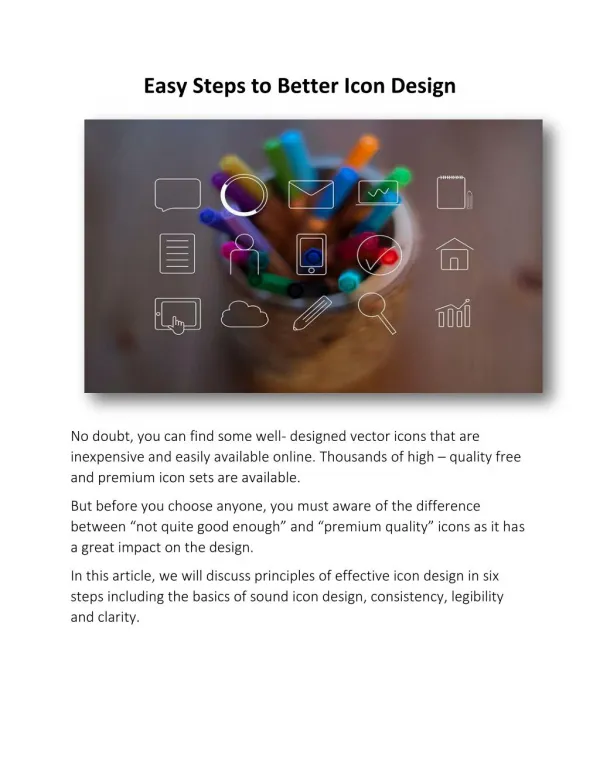
Images • Ok, here is the fun part. Start searching for images that relate to your theme and tone. We reviewed searching strategies before along with repositories. • Resize, crop or lighten/darken if necessary. Distortion is never acceptable.
Layout • Think about your layout. So far we have traditional one column layout and the doggie page layout. • Probably the most common layout is the header, nav, main(content) and footer layout. Source:https://chnm.gmu.edu/digitalhistory/links/cached/chapter4/4_14c_bestwebdev.htm
Layout • Create a wrapper div to encase all of your html from beginning body tag to end body tag. • Create a div tag for the header, nav, main, and footer. <body> <div id="wrapper"> <div id="header"> </div> <div<id="nav"> </div> <div id="main"> </div> <div id="footer> </div> </div> <!--This is a comment. End of wrapper div--> </body>
Layout • Next, center your wrapper div and give it width. You can use 960 px as a starting point and adjust as necessary. Centering was covered in the doggie tutorial • Because we have ID's for each section we can apply CSS to it. • The header we can leave alone and let the height be determined by the content or we can set the height through the height property • The nav will be floated to the left – make sure you give it a width!! • The Main will floated to the left or right dependent upon your needs • Then stop the float!! You don't want the footer to creep up too • Create an empty <div id="stopfloat"> </div> after the Main div and in the CSS write #stopfloat{clear:both;}
Layout • Sometimes the nav will be too close to the left - it will hug the border. Or , if you float right the Main there will be a gutter too big between the nav and main. • Margins, width adjustments to the rescue. • Apply margin right or left to either the nav, main or both to adjust so that your layout looks balanced. • FLOAT DROP – Look out – if the width of your nav + main + any borders, padding and margins exceeds the width of your wrapper div, then your layout will break.
Headers • It is time to make our headers look more professional. Ideas? • Add a background color • Add a background texture • Add a gradient • Check out the Photoshop Tutorial on gradients and some links to texture sites. • Use PHOTOSHOP to write some nice text. • http://anxietypanichealth.com/ • Position a small graphic (s) in the header • Scroll down and check out the header The Firke Files • http://www.kristarella.com/2009/02/css-custom-headers/
Write Your Text • KNOW YOUR AUDIENCE • Write to the level of your audience and their knowledge level. • Start with attention getting text • Cheating example • Have you ever cheated? Vs Cheating is a major problem today blah blah blah • Pothole Pittsburgh – Alliterations are fun • Proofread • Typography time – size, typeface, line height underline, italic, at a minimum
Adjustments • Use Firebug and make adjustments to margins, padding of divs, images, paragraphs, unordered lists etc. • Remember your page should breathe – not be too crowded. • Let it sit and come back to it the next day and see if you need to make further adjustments. • Practice your skills with positioning, floats, margins, padding, and PHOTOSHOP – and play with color!!!!
Okay, check out the homework and lets see some great design for next week.