Download
1 / 38
390 likes | 792 Views
Colour. CPSC 533C February 3, 2003 Rod McFarland. Ware, Chapter 4. The science of colour vision Colour measurement systems and standards Opponent process theory Applications. The science of colour vision. Receptors and trichromacy theory. Red . Green . Blue .

E N D
Colour CPSC 533C February 3, 2003 Rod McFarland
Ware, Chapter 4 • The science of colour vision • Colour measurement systems and standards • Opponent process theory • Applications
The science of colour vision • Receptors and trichromacy theory Red Green Blue
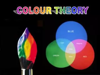
Colour measurement systems and standards • Any colour can be matched using a combination of three “primaries”. • The primaries are not necessarily red, green, and blue. Any three different colours can be used. The range of colours that can be produced from a given set of primaries is the gamut.
CIE (Commission Internationale d’Éclairage) Primaries chosen for mathematical properties: do not actually correspond to colours. These “virtual” colours X, Y, and Z are called tristimulus values. Y is the same as luminance Colour standards
CIE – Chromaticity • Chromaticity is derived from tristimulus values: • Since x+y+z=1, just use x, y values and luminance (Y). • Chromaticity diagram:
Uniform colour space: a representation where equal distances in space correspond to equal distances in perception Useful for: Specification of colour tolerances Color coding (maximum distinction) Pseudocolour sequences to represent ordered data values CIE XYZ color space is not uniform CIEluv is a transformation of the chromaticity diagram Uniform Colour Space - CIEluv
CIEluv does not solve all problems: • Contrast effects • Small colour patches: difficult to distinguish colours in the yellow-blue direction
Black-white (luminance), red-green, and blue-yellow opponents Has basis in biology and culture Should use opponent colours for coding data Opponent process theory
Properties of Colour Channels • Isoluminant / Equiluminous patterns: a colour pattern whose components do not differ in luminance • Red-green and yellow-blue channels carry only about 1/3 of the detail carried by black-white.
Yellow Text on a Blue Background • Is fairly easy to read unless the text is isoluminant with the background colour. As the luminance of the background becomes the same as the luminance of the text, it is very difficult to make out what the text says. So much so, that at this point I can write just about anything I want here and hardly anyone would want to put in the effort to see what it was I had written.
Other isoluminance effects • Stereoscopic depth is not detectable with isoluminant colours • Isoluminance in animation makes it appear to be slower than the same animation in black-and-white • Shape and form are best shown using luminance:
Colour appearance • Contrast • Saturation • Brown low high
Applications • Colour selection interfaces • Colour naming • Natural Colour System (NCS) e.g. 0030-G80Y20 • Blackness 00, intensity 30, green 80, yellow 20 • Pantone, Munsell: standard colour chips
Applications • Colour for labelling (nominal information encoding) • Distinctness • A rapidly distinguished colour lies outside the convex polygon defined by the other colours in CIE space
Applications • Colour for labelling (2) • Unique hues: “universally recognized” hues (red, green, blue, yellow, black, white) should be used • Contrast with background: border around objects
Applications • Colour for labelling (3) • Colour blindness: majority of colour-blind people cannot distinguish red-green, but most people can distinguish blue-yellow • Number: only 5-10 codes easily distinguished
Applications • Colour for labelling (4) • Size • Colour-coded objects should not be very small (about ½ degree minimum size). • Smaller objects should be more highly saturated, large colour-coded regions should have low saturation. Text highlighting should be high-luminance, low-saturation. • Conventions • Common usage of colours, e.g. red=stop, green=ready, blue=cold…
Applications • Colour for labelling (5) • Ware’s 12 recommended colours (in order of preference):
Applications • Pseudocolour sequences for mapping • Pseudocolouring is the practice of assigning colour to map values that do not represent colour • Medical imaging • Astronomical images • Mapping nonvisible spectrum information to the visible spectrum (astronomy, infrared images) • Gray scale best for showing surface shape • Colour best for classification
Applications • Colour for mapping (2) • For orderable sequences, black-white, red-green, blue-yellow, or saturation (dull-vivid) sequence can be used. • For detailed data, the sequence should be based mainly on luminance. For low letail, chromatic or saturation sequences can be used. • Uniform colour spaces can be used to create colour sequences where equal perceptual steps correspond to equal metric steps. • Where it is important to be able to read off values from a colour map, a sequence that cycles through many colours is preferable.
Applications • Colour for mapping (3) • A “spiral” through colour space (cycling through several colours while continuously increasing in luminance) is often a good choice. Hue 0, 50,…250, 45, 95… Luminance 0, 25, 50… 225
Applications • Colour for mapping (4) • Perception: even if the sequence is smooth, people tend to see discrete colours, potentially miscategorizing data. • My personal division into blue, green, yellow, orange, red, purple: very nonlinear
Applications • Colour for mapping (5) • Using colour for 3-D information mapping • Difficult to read accurately • May be used to identify regions • Satellite images: regions of invisible spectrum mapped to red, green, blue channels
Applications • Colour for multidimensional discrete data • 5-D plot using (x, y) position, red, green, blue • Possible to identify clusters • Ambiguous: is a point low-red or high-green? • Other methods needed to analyze clusters once identified
Rogowitz et al. How Not to Lie with Visualization • Visual representation of data affects the perceived structure of the data.
Enhancing data interpretation using Colour • Perceptual impact of a colour is not predictable from the red/green/blue components of the colour • Mapping different aspects of colour to different data is not intuitively decodable by users. • Default colour maps: rainbow • Perceptual nonlinearity • False contours • Yellow attracts attention
Guiding colour map selection • Constrain the set of colour maps available to the user based on: • Data type • Data spatial frequency • Visualization task • Other design choices made by user
Representing Structure • Nominal data • Object should be distinguishably different but not perceptually ordered • Ordinal data • Distinguishable with perceptual ordering • Interval data • Equal steps in data correspond to equal steps in perceived magnitude • Ratio data • Zero point distinguishable in colour sequence
Structure • Magnitude of a variable at every spatial position • Use luminance (gray scale) or saturation
Spatial Frequency high spatial frequency low saturation-based luminance-based
Segmentation • Low frequency – more segmentation steps can be used
Highlighting Luminance-based map can be highlighted using hue variations. The highlighted regions have the same luminance value as the rest of the map.
PRAVDA • Perceptual Rule-Based Architecture for Visualizing Data Accurately • Part of IBM’s Visualization Data Explorer (http://www.research.ibm.com/dx/) • Provides choices for colour maps based on spatial frequency, data type, and user-selected goal: isomorphic (structure-preserving), segmentation, highlighting